John Hurrell – 16 January, 2016
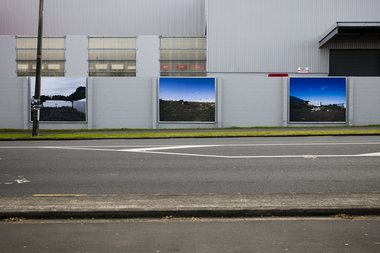
If seen as c-print images framed and spread out in a gallery, these images would be probably be perceived as contemplative - for the reasons described above. However when greatly enlarged as public billboards at the side of a busy road they change. Their mood becomes intensified. They become nihilistic and mischievous, even aggressive, presenting a challenging confrontation accompanied by sardonic laughter.
Pakuranga
Talia Smith
Plants and Rags
1 August 2015 - 21 February 2016
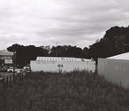
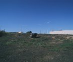
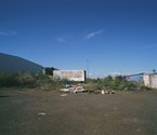
Talia Smith’s large photographic images in Pakuranga - on the Reeves Road wall opposite the Te Tuhi frontage - examine commercial lots where buildings have been unbuilt (anticipated but never constructed), demolished or removed, allowing nature to take over so that weeds proliferate and detritus accumulates. Her three hoardings are not symmetrically positioned as you might expect, for the lefthand one is surprisingly in black and white. It unsettles. All three are bleak and subtly confrontational because she forces us to look at sections - addresses we would normally hurry past - to study their surroundings and their contents.
There is a lot of nasty dirt, unpleasant unfecund earth, peppered with mangy weeds and dumped domestic junk (furnishings and suitcases), presented within symmetrical compositions where conspicuous boulders, white walls (with black numbers) or weathered billboards are plonked in each centre. It may not be but the soil does not seem user friendly. It has the ambience - the appearance - of toxicity. Ubiquitous in vacant industrial lots that are uninviting.
The dated and faded advertising on the hoardings seems strangely tragic here - exhausted and forgotten. KD Autoparts dominates one; white bread promotion another - an empty Tranz Link container is dumped nearby.
While the Te Tuhi brochure says that through her depicted sections “Smith seeks to capture a quiet beauty in their transitional state” these images are grittier than that. They seem steeped in melancholy, not so much in terms of loss (say, absent industrial architecture or unused square meterage), but more the contamination that urbanisation inevitably brings. Nature (such as blue skies) seems pure and joyous (providing glimpses of discovered celebratory beauty) while civilization only pollutes. Collectively the three billboards are unrelenting.
There are also meanings here to do with the lack of local economies and sustaining markets that would encourage the ‘constructive’ use of the land in terms of providing goods or services. Smith’s images raise questions about wastage, transience and market vulnerability, and various assumptions we might have about that notion. What might be the sensible or constructive use of these spaces? Is there a range of feasible alternative possibilities?
If seen as c-print images framed and spread out in a gallery, these images would be probably be perceived as contemplative - for the reasons described above. However when greatly enlarged as public billboards at the side of a busy road they change. Their mood becomes intensified. They become nihilistic and mischievous, even aggressive, presenting a challenging confrontation accompanied by sardonic laughter.
That is because most drivers would see them as ugly, presenting an unsightly form of landscape many would prefer to be covered over or ignored. Like ‘flipping the bird’ with the middle finger, these questioning images in a public space have a heaviness. They snarl at the shopping motorists, sneering at the franchises and store owners perpetuating the fickle consumer economy.
John Hurrell
 Advertising in this column
 Two Rooms presents a program of residencies and projects

This Discussion has 0 comments.
Comment
Participate
Register to Participate.
Sign in
Sign in to an existing account.