John Hurrell – 27 September, 2016
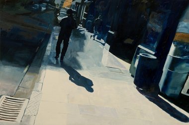
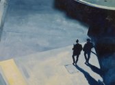
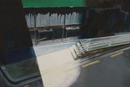
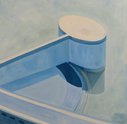
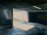
Carter has a flair for describing solitary loiterers seen from dramatic angles from high above, accompanied by long shadows in desolate narrow streets - in the TS Eliot modernist urban tradition. The best works here are restrained in their use of detail. They avoid busy paint application and fiddly descriptive marks by being loose and relaxed manually, and controlled in spatial alignment via tonal mixing, using an effective earthy palette.
Auckland
Matthew Carter (with Freeman White)
New Paintings
8 September - 28 September 2016
Matthew Carter has been around for a few years. I remember his stylish, fluid and brusherly paintings from an AUT post graduate show. They are quite distinctive, and fittingly, some are in the Wallace Collection. In this country he fits in with figurative artists like Richard McWhannell and Euan McLeod through his interest in the vertical human form and urban architecture. (There are also affinities with Tony Fomison, Catherine Manchester or John Walsh, but without their enthusiasm for myth, narrative or hessian.)
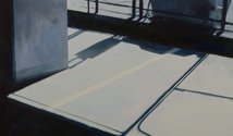
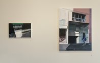
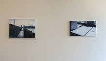
With an assured and sensual handling of oil paint (with Hopperesque overtones), Carter’s modestly sized works at nkb Gallery look restrained and comparatively raw compared to the much sweeter hued, pastoral (and sea) panoramas of Freeman White on the opposite wall, which are more directed toward an accumulation of fine intricate detail.
Carter has a flair for describing solitary walkers seen at dramatic angles from high above, accompanied by long shadows in desolate narrow streets - in the TS Eliot modernist urban-imagery tradition. The best works here are restrained in their use of detail. They avoid busy paint application and fiddly descriptive marks by being manually loose and relaxed, and controlled in spatial alignment via tonal mixing, using an effective earthy palette.
There are some terrific paintings in this show. Nevertheless I suspect that Carter is capable of even more adventurous work. While his interest in warm blue/grey light, and dramatic cityscape views out of high windows - using tilted perspective to achieve deep space - brings wonderfully haunting and atmospheric results, the paintings overall seem a little timid in scale, for he is only presenting ten items - mostly on one wall. Hopefully he will in the future end up presenting a solo presentation, using the whole gallery. That would allow him to flex his creative muscles with more impact, to substantially vary his stretcher size and engage with his audience in a more bodily fashion. Obviously very gifted, he deserves a wider appreciation.
John Hurrell


 Advertising in this column
 Two Rooms presents a program of residencies and projects
This Discussion has 0 comments.
Comment
Participate
Register to Participate.
Sign in
Sign in to an existing account.