John Hurrell – 28 September, 2016
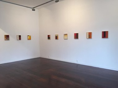
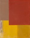
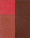
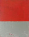
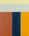
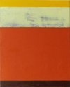
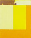
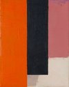
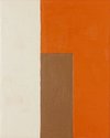
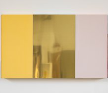
These are modest paintings of delicate sensitivity - shrewd investigations of texture, tone, extension, spatial positioning, proportion and alignment - but inescapably there is an issue with the framing and monotonous regularity of the two sizes.
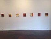
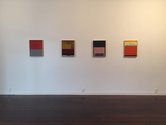
This is one of those shows that teases its audience about commodification and room furbishing, using exhibition and work titles tinged with mischievousness and nudging humour about room decoration; openly referencing salability. The purchasable items are available in two sizes, lined up on opposite walls like toy soldiers.
Being small, regular, very tasteful abstractions that are tidily framed, they obviously allude in their paint application to sixties/seventies ‘international’ painters like Brice Marden and John Hoyland (so beloved by Damian Hirst) - but much domesticated in scale - and certain eighties conceptualists who examined marketing mechanisms, like Haim Steinbach and Allan McCollum.
Is Robin Neate (a Christchurch academic teaching in a university) walking a tightrope here between acknowledging those anxious about art consumerism, and the market - potential purchasers who want to contemplate beautiful objects? Is there something shocking about this show?
Well, it is hardly outrageous: his prices are reasonable, and even though they are pitched at those owning small intimate domestic spaces, he is providing a genre of old fashioned visual pleasure for those who want it. The work is likely to be ignored by intellectual heavyweights, and the artist anticipates that.
These are modest paintings of delicate sensitivity - shrewd investigations of texture, tone, chroma, extension, spatial positioning, proportion and alignment - but inescapably there is an issue with the framing and monotonous regularity of the two sizes.
The framing physically protects the painting from bumps and fingermarks, preserving the qualities of the manipulated materials. Thus it nudges potential purchasers into reaching for their chequebooks. It ‘protects’ their investment.
Paradoxically in so doing, the framing destroys those compositional visual qualities that Neate is ostensibly trying to promote: squeezing them out, choking them. Also, seeing the stretcher edges from the sides could be regarded as essential for grasping the artist’s dexterity and manual nuance. Directly frontal viewing isn’t enough; seeing the objectness of the canvas support from a three quarter angle - and the flat matteness of the wax mixed in with the oil paint on the front surface - might be regarded as crucial.
And Neate’s apparent conveyer belt sensibility? The two types of rectangular proportion and scale introduce regularity and tedium, curtailing any opportunity for surprise and individuality, no matter what he might achieve via paint within each vertical oblong. The confining frames worsen this scenario, not allowing the colour to mentally extend out over the wall. The planes are hemmed in.
The alternative aspect of the repeated module is its brazen declaration that these items are for sale. That is why Neate doesn’t blush with embarrassment. Warhol called his studio ‘The Factory’ for good reason, and Neate’s mass produced sizing signals that refusal to be coy. It avoids being precious.
John Hurrell






 Two Rooms presents a program of residencies and projects
 Advertising in this column

This Discussion has 0 comments.
Comment
Participate
Register to Participate.
Sign in
Sign in to an existing account.