John Hurrell – 19 February, 2017
The unusual combination of graphite with watercolour developed out of the working drawings Harris was using when making the larger canvases for which she is well known. The precise drawings of this Auckland show however, with their meticulous finish, are made for their own sake. They are not preparations for larger works, but self-contained.
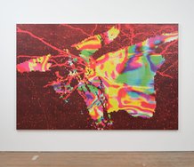
Jane Harris, the British painter, is known internationally for her large canvases of pronged droplet abstractions that look like a synthesis of computer technology and the famous 1936 ‘milkdrop’ photograph by Harold ‘Doc’ Edgerton, but which in fact are made by using templates. A couple of her canvas works were included in a painting survey held at Two Rooms ten years ago, but this current exhibition consists of comparatively intimate, grid-structured, works on paper - involving circular or oval forms - using pencil graphite and watercolour. Because the graphite is used to fill in shape, and so serves as an opaque silvery colour, the juxtaposition with delicate transparent watercolour is somewhat unusual.
This direction developed out of the working drawings Harris was using when making her larger canvases. The precise drawings of this show however, with their meticulous finish, are made for their own sake. They are not preparations for larger works, but self-contained.
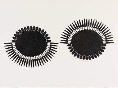
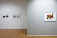
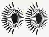
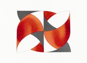
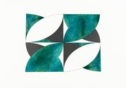
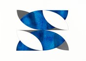
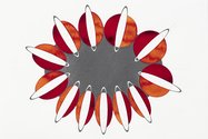
There are four main types of image. One, using only graphite, features pairs of spiky flattened oval frames that like pointy petals revolve around a central circuit, and which when halfway round, switch to the negative version of their shorter inner core. Another, with graphite and watercolour, is like a proscenium arch but with no depth. It contains intersecting parabolic designs to showcase angular vesica-piscus-shaped negative spaces. The curly but sharpened arrangements are elegant and stunningly inventive.
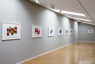
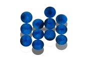
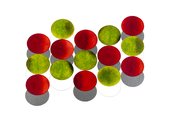
A third type presents stacks of small circles (they could be coins, biscuits, or counters) that as foreshortened discs are laid out on a flat plane (like a table top) in an orderly manner - like vertical columns, but clinging to the picture plane. Harris has a technique where pale glowing colour subtly nestles in the fissures of the Fabriano paper grain supporting each circular shape, while much darker splasherly accentuations occur around certain repeated points of each top-stacked circumference.
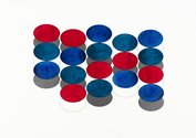
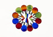
The fourth type is more like a symmetrical corporate Powerpoint diagram, with coloured ovals and circles radiating from a central core and /or transmuting from one to the other - as if of growing sales or the branches of a company. Of course these images (like the others) are quite small and intimate, and visually subtle when examined close up. The colour is transparent and modulated, and the curved razor sharp edges seem to vibrate.
Harris’s use of watercolour and graphite is intriguingly unusual as she raises questions about what we assume to be properties of surface sheen, picture plane and chroma. Her extraordinary meticulousness in technique, its acuity, makes her similar in sensibility - in an Auckland content - to somebody like Georgie Hill, but nonfigurative and not architectural. The large canvases for which she is famous are very different in mood from these intimate explorations. They are simpler, punchier and similarly morphologically intriguing, but not so subtle.
John Hurrell
 Advertising in this column
 Two Rooms presents a program of residencies and projects
This Discussion has 0 comments.
Comment
Participate
Register to Participate.
Sign in
Sign in to an existing account.