John Hurrell – 9 April, 2017
We are presented with a exciting line up of pairs of works from five distinctly different painters, devised to examine methods of vectored mark making - paint application that involves a sense of directional control, or graphic (perhaps brusherly) manipulation. The muscular actions of each artist's arm (or arms) are referenced, their emphasis accentuated by the coupling of stretchers or paper sheets.
Auckland
Tomislav Nikolic, Aida Tomescu, Leigh Martin, Jenny Topfer, Jacqueline Humphries
The Anatomy of Gesture
12 March - 15 April 2017
In this show there is an exciting line up of pairs of works from five distinctly different painters, devised to examine methods of vectored mark making - paint application that involves a sense of directional control, or graphic (perhaps brusherly) manipulation. The muscular actions of each artist’s arm (or arms) are referenced, their emphasis accentuated by the coupling of stretchers or paper sheets.
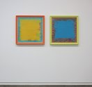
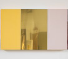
Any body-related gesture in Tomislav Nikolic’s work is really through a priori decisions about the physical architecture of the painting, or the manual squashing of thin paint around the periphery of the dominant frame. Nikolic‘s paintings utilise a structure of concentric frames where six physical - or illusory - planes (narrow and wide; looking away from the wall, facing it, or looking parallel to it) are exploited to constantly surprise the moving inquisitive viewer, through the cunning use of reflective gold or copper leaf, or intensely saturated colour.
Around the edges of the frontal plane, close to the pale but intense frame (and its inner lining of gold leaf), the applied paint of several colours is thin, overlapping and organic with its dribbles. The central rectangle though - with its strong consistent, insistent, hue - draws you close while proffering the very narrow peripheral coloured planes in frontal nooks and crannies, and round the back near the supporting wall.
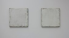
In comparison, Jenny Topfer‘s use of thin, very pale, grey paint, brushed over daubed undercolours of yellow, blue and chocolate that peek out near the edges of the unframed linen stretcher, emphasises a firm dry (slightly crumbly) surface exploiting the translucent nuances of high keyed tones. With the dominant modulated white plane having irregular edges, the agitated but pellucid tones are effectively framed by the dark linen - and different hues subtly act as foils against the borders of the stark field. They allude to Robert Ryman compositionally, but differ by discretely celebrating pastel hues and a restrained diffusion.
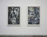
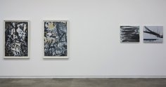
Aida Tomescu‘s dramatic paintings, on the other hand, feature an energetically, restless field of collaged paper, spidery chalk lines and dragged angular gestural paint. Churning but still cohesive, these slashing de Kooningesque paintings lift the colour of the buff paper by embedding it within a black, white and grey palette. The vigorous forms exude a flickering jagged light, akin to flames in shape, but with no chromatic warmth.
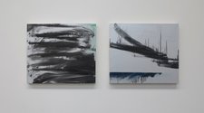
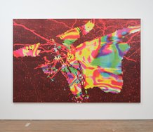
Jacqueline Humphries‘ rectangular paintings are on silvery fields that abruptly lighten as you move past them. Single or double gestural sweeps mingle with dribbly oozy edges that often run in opposite directions perpendicular to the swipes. Humphries keeps things horizontally (occasionally diagonally) calligraphic so that the linear component doesn’t get over complicated, while constantly alluding to a stark unbusied elementary landscape.
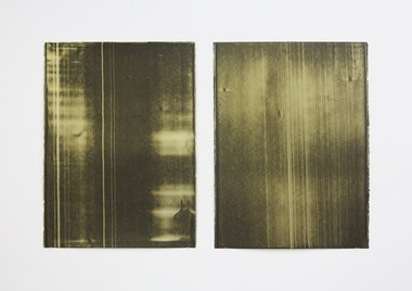
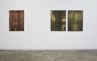
Leigh Martin‘s contribution, three large matte dark green works on heavy paper, are velvety and sumptuous, possessing a gorgeous pulsing light that radiates through their dark vertical striations and mottled pools of liquid luminosity. Mossy and soft to the eye, they speak very much of the artist’s scraping and directional arm movements, hinting also at dense forests or sheets of water - and dappled shadows from mid-morning sunshine. They are surprisingly atmospheric, with a sensuality not normally associated with Martin, though his interest in light is long-standing. The thin, pinned up paper sheets are a lovely contrast to the other works which feature stretchers that project out from the wall.
This intriguing mixture of work celebrates a manual restlessness, a drive that extends from the hand up to the shoulder.
John Hurrell
 Advertising in this column
 Two Rooms presents a program of residencies and projects
This Discussion has 0 comments.
Comment
Participate
Register to Participate.
Sign in
Sign in to an existing account.