John Hurrell – 16 March, 2019
The installation seems to have psycho-analytic overtones pertaining to the mental development of children, specifically relating to Melanie Klein's concept of ‘good' and ‘bad breasts'. This looks at the emotional intensity of the child's interaction with certain objects in terms of repulsion or attraction. In the show there is a clear binary combination of angular, pointed objects and softly curved rotund ones: sharp, spiky and scary versus cuddly, warm and beckoning.
Banks Peninsula installation artist, Pauline Rhodes—legendary for her temporary landscape set-ups that are beautifully photographed, or her longer, spectacular gallery exhibitions in large venues like the then CSA (now CoCA)—currently has an exhibition in Michael Lett on the ground floor. It is three years since her Dark Watch exhibition in St Paul St.
Auckland shows from Rhodes are extremely rare. I know her work because I come from Christchurch, and remember her architecture-focussed presentations at the James Paul Gallery and the Robert McDougall in the early eighties.
Initially Rhodes became famous for her production of rust-stained paper (made by watering ‘sandwiches’ of iron and paper sheets) which she used to cover institution walls, but gradually free-standing constructions ‘marching’ through space took over, featuring-amongst other things—diagonally aligned, leaning fluorescent rods and twisted, coiled or draped intensely coloured saturated fabrics.
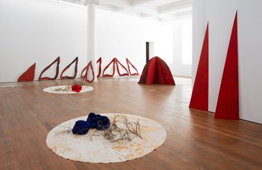
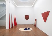
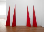
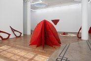
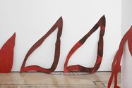
This Lett show showcases rich deep colour (mainly thin red painted over black on shaped plywood) and a few carefully positioned freestanding or leaning domed and triangular forms. Lett’s space has a leadlight-domed skylight in one bay.
The installation seems to have psycho-analytic overtones pertaining to the mental development of children, specifically relating to Melanie Klein‘s concept of ‘good’ and ‘bad breasts’. This looks at the emotional intensity of the child’s interaction with certain objects in terms of repulsion or attraction. In the show there is a clear binary combination of angular, pointed objects and softly curved rotund ones: sharp, spiky and scary versus cuddly, warm and beckoning.
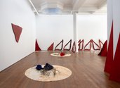
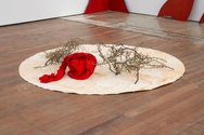
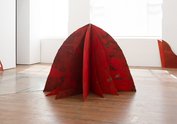
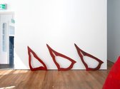
So with the ‘hostile’ elements we have the pieces of thorny matagouri on two rust-stained circles of canvas on the floor, the leaning skinny triangles, the two red heraldic, shieldlike, double-layered, plywood forms on the walls that seem like sinister crab-shell carapaces. With the ‘friendly’ components we have the plywood forms leaning against the windows that with their negative-spaced silhouette look like suspended breasts (reminiscent of Marie Antoinette’s bosom that the French designed into a goblet), and the canvas circles, the blunt-topped ‘mountain’ on the floor, and the domed skylight.
All these are interspersed so that contradictory sensations mingle, and separate only with difficulty. Outlines of inverted hearts have buttock/breastlike bottoms and pointy tips. Bundled lines of twisted streaming fabric can cover for warmth or could strangle. Arrowlike slivers pointing to the ceiling could refer to the skylight or could impale.
Rhodes’ colour sensibility in this show is unusually painterly and sumptuous, having a velvet-like sensuality and lusciousness quite different from the fluorescent colour of orange-red and green she has used in the past. That chroma tended to be optically disembodied, floating away from its linear supports. The hot colour here is firmly anchored through the black underpainting peeking through, and has an unexpected aristocratic feel to it.
Pleasure and Pain is an installation of echoes that resonate with the architecture, a visceral experience where desire for safety (or comfort) and fearful apprehension are woven together to emotionally buffet you to and fro. A manipulated jostling of moods through shape, space, colour and association.
John Hurrell



 Advertising in this column
 Two Rooms presents a program of residencies and projects
This Discussion has 0 comments.
Comment
Participate
Register to Participate.
Sign in
Sign in to an existing account.