John Hurrell – 2 October, 2020
These photographs are baffling. Are they intended as a respite from marketing? A breather (her ‘Gift') from the usual bombardment of commercial ‘noise'? Or are they annoying teasers that taunt you into looking for the discreetly hidden product reference? So if you don't get it you feel insulted. Or are they generous opportunities to make up a contextual story linked to the fleeting image? To indulge in a narrative fantasy with a plot-line as wild as you like?
Meg Porteous
The Gift
28 September - 25 October 2020
In this show from photographer Meg Porteous you can examine the three live streams and thirteen static images (click here) or better still, see her presentation out in the street, standing on footpaths in Beach, Newton or New North Roads—experiencing their scale, varied proportions, dynamism and accompanying traffic noise (and fumes) properly, as they are mixed with ‘legitimate’ advertising. A very different visual sensation.
I happen to live in Kingsland, quite close to one of these LED billboards, and I’ve seen a number of artist projects using this technology already. I confess I love looking at these glowing signs anyhow—night or day—be they art or otherwise. Colour and light make my toes curl. Even if the artist’s intention can be opaque.
What happens when Porteous inserts these product-free images into a promotional space? We are not being asked to reach for our wallets. Instead we are looking at slices of conventional domestic narrative involving young (white?) well-off heterosexual couples.
Looking at Porteous‘ file names (seen if you try to copy off the website) they thematically go like this: sad boy; kiss; shower; toenail; baby; girl; city night; pool; bed stretch; telephoto; pregnancy test, thumbsucker; pool clock. Some have two image variations. Some names can be applied to more than one image.
These photographs are baffling. Are they intended as a respite from marketing? A breather (her ‘Gift’) from the usual bombardment of commercial ‘noise’? Or are they annoying teasers that taunt you into looking for the discreetly hidden product reference? So if you don’t get it you feel insulted. Or are they generous opportunities to make up a contextual story linked to the fleeting image? To indulge in a narrative fantasy with a plot-line as wild as you like?
The images look like magazine illustrations or ads where the captions to be overlaid have been forgotten. They don’t look like contemporary art which usually is fixated on language. But if text were included, the works could be a type of political (identity or class-focussed) tongue-in-cheek advertising, from a first generation conceptual artist like Victor Burgin.
This leads to the seemingly obvious argument that Porteous‘s images reinforce the values embedded in the surrounding ads for real estate, bank promotion, or luxury goods—that they deliberately avoid the ‘real’ world of suffering, oppression and corruption that depressingly dominates our daily news broadcasts. That while dwelling on the ‘ordinary’ and ‘everyday,’ they also are unabashedly escapist and bourgeois in their hermeticism.
It’s a damning position, adopted usually if you believe that all art should be set on transforming an unjust world. It would see Porteous’ images as perpetuating that injustice through their empathetic commercial context, that sitting on a fence for example is impossible.
Now I’m not saying this is right or wrong. What I am saying is that although seemingly intended as ‘gifts’, Porteous‘s images are either naïve or calculatedly provocative (through their lack of text, and middleclass blandness). Why not go for a stroll downtown and see if you agree?
John Hurrell
 Two Rooms presents a program of residencies and projects
 Advertising in this column
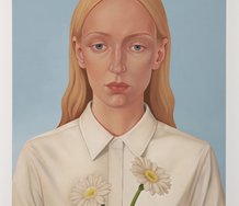
This Discussion has 0 comments.
Comment
Participate
Register to Participate.
Sign in
Sign in to an existing account.