John Hurrell – 29 March, 2009
This is an excellent stock show where three well known, but very individualistic, artists could get in each others way - but they don't. Lots of space keeps them apart so that their different visual and conceptual characteristics are accentuated.
This is an excellent stock show where three well known, but very individualistic, artists could get in each others way - but they don’t. Lots of space keeps them apart so that their different visual and conceptual characteristics are accentuated.
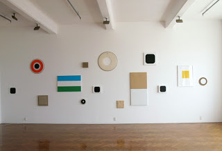
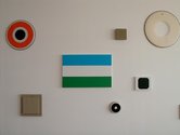
The main Crockford gallery wall has a particularly elegant arrangement of fifteen Dashper paintings. His palette is restrained and understated and often doesn’t involve paint at all, just simple stretchers made of canvas, linen, jute, plywood, hardboard or drum skin, that are sometimes stacked on top of each other so they subtly project out into the room, or paired placed side by side, flat on the wall. Textured surfaces and clearly elucidated shape and thickness dominate here over chroma.
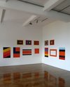
On the other side of the gallery and pushing into a corner between two smaller walls, John Nixon’s paintings indicate a different approach to colour that is often strident or jewel-like with complementary combinations. His earlier works were much closer to what Dashper’s are now, but even more object-like. Nixon currently investigates thin supports, saturated hues, more complex juxtapositions, and often structures that have framing borders that compress - instead of expanding a field that runs off the edges. Unlike Dashper he is not keen on circles. Corners rule.
Of the three Daniel Malone works, two come from a performance in Santiago Chile, where he baked a batch of clay kumara in an indigenous oven similar to a hangi. A modified poster, a DVD, and the vegetable ceramics show Malone’s interest in a theory that kumara came initially from South America, bought here by Polynesian navigators.
Malone’s neon signature, sitting glowing in an open package case, is more ideationally convoluted, quoting from an Auckland tagger who amazingly once put it on the ARTSPACE frontage and for whom ‘Malone’ is not his real name. The pink signature is packed in two halves so you have to imagine how they’d look together. It references Billy Apple as well as tagging, and is a curious example of disparate sensibilities perfectly blended to achieve gorgeous results.
- John Hurrell



 Two Rooms presents a program of residencies and projects
 Advertising in this column
This Discussion has 0 comments.
Comment
Participate
Register to Participate.
Sign in
Sign in to an existing account.