David Cross – 10 March, 2010
Essentially there is a lot going on in these blobby forms, and crucially the ideas are presented with an economy of means that is a mixture of both homage to the key reference points - cited with at all times a tongue firmly planted in cheek.
Wellington
Peter Trevelyan
Mimetic Brotherhood
Early 2010 - early 2012
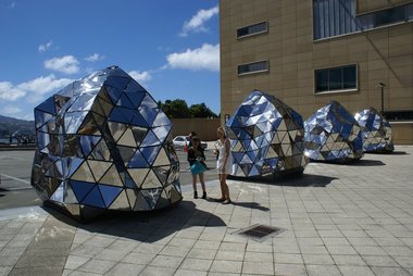
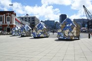
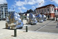
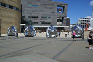
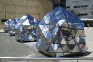
One of the curious aspects inherent in large-scale public sculpture projects are the shifts between the drawings used to pitch the project and the actual realised form. For instance, when you look at the Photoshopped images of Peter Trevelyan’s recently launched Mimetic Brotherhood on the Wellington Sculpture Trust website, there are three almost oblong mirrored sculptures that cogently reflect the buildings around it. These blobby forms also suggest an amalgam of aerodynamic engineering, tempered by a slight flaccidity in keeping with some kind of amorphous sci-fi matter. Yet in the flesh these qualities are literally bent out of shape. Instead of being formed for horizontal speed each of the forms have the inertia of large beanbags that have vertically crashed to earth. Furthermore, the reflective panels do not, as the image suggests, coherently mirror the space around Te Papa at all, but do something far more interesting: they warp the environment into a lexicon of shattered and conflicting pieces.
Of course not quite nailing the original schema, or having to tweak it on the run, might suggest that technical issues have compromised the work in particular ways. After all the immaculate styling of the original image/conception seems hugely ambitious and the kind of project that would stretch the capacity of Weta workshop. Yet for whatever reason, the finished sculpture is much more engaging than its CAD generated formative sketch. Its rougher, a bit more hand crafted, and because of this a lot more elusive in its meanings.
Sitting in the entrance way to a museum that is utterly transfixed by technology, Trevelyan’s forms suggest a laconic DIY sci-fi aesthetic employing a technology more in keeping with the sets of the original Dr Who than the digitised bling of CGI. The ever so slightly dishevelled quality of the forms (their handmadeness) tempers and challenges the Te Papa technology-at-all-costs mantra. It also plays with a range of other contexts from Minimalism, to 70s sci-fi television, and even a nod to a slightly glammed-up Rubik’s triangle. All of these references, combined with a finish that suggests an amateur panel beater with an expressionist bent, has been employed to forcefully customise each form, and pushes the work into strange territory for public art.
The result is a sculpture that somehow aligns repetition and spontaneity, off the shelf components and customised form, the minimal and the gestural, while also activating a raft of issues to do with place and the dynamics of Wellington’s waterfront. Essentially there is a lot going on in these blobby forms, and crucially the ideas are presented with an economy of means that is a mixture of both homage to the key reference points - cited with at all times a tongue firmly planted in cheek.
These traits however have proven to be a double-edged sword in terms of audience response. It’s as if the artist’s gestural customisations have given licence to wannabe sculptors to apply their own embellishments. While the works were conceived to move and contort according to changing weather patterns, the chance encounter of a mindless cretin’s foot with the artwork is more relational interaction than the artist had conceived of. Of course the objects are shiny and vaguely anthropomorphic in a children’s television kind of way. This encourages the base instinct to touch, but the generosity of the work, the way it lures audiences towards it using light as a mechanism of fantasy has resulted in strategic acts of destruction.
It should be some consolation to Trevelyan that the work has pierced the wider community ambivalence about public sculpture and activated a litany of tactical responses. The bill for the upkeep might be significant if the sculptures are to avoid looking like oversized spent beer cans but in this case the extra costs of preservation seems like money well spent.
Images courtesy of the artist.


 Advertising in this column
 Two Rooms presents a program of residencies and projects


This Discussion has 0 comments.
Comment
Participate
Register to Participate.
Sign in
Sign in to an existing account.