John Hurrell – 11 March, 2010
They seem sort of eighties in mood (despite the digital technology), like a variation of Matt Mullican and his use of logos.
Auckland
Andy Tolhurst
Slow Burning
3 March - 1 April 2010
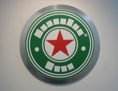
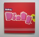
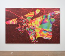
Andy Tolhurst’s computer designed vinyl paintings examine globally famous logos, and reshuffle or alter some of the visual elements to make a new image that is usually much larger than the original. Those original brands include beer bottle-tops and labels, cigarette papers, bubblegum labels, chocolate bars and local dairy chains.
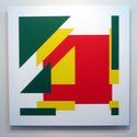
They connect with Pop Art, yet are different. They retain links to their sources of advertising or branding inspiration, retaining the same colours and many of the shapes or images, yet they also have these odd mutated shapes, often squared off. The compact symmetrical ones have a compelling iconic look about them.
Usually you try and puzzle out what has changed and if the differences are an aesthetic improvement. They don’t veer towards abstraction so that the sources become hidden, like say perhaps the much vaguer and more poetic Jim Speers glowing and translucent abstract lightboxes - which often allude to art history as well.
Tolhurst’s paintings are usually high in colour saturation, as a result really of something small and optically punchy made much bigger. They seem sort of eighties in mood (despite the digital technology), like a variation of Matt Mullican and his use of logos. They are not a critique of consumerism and its promotion in any way, nor an endorsement of marketing’s processes. They accept and comment on a ubiquitous mental commercial panorama (remembered or still seen) that accompanies us all wherever we go - and from which we can’t escape.


 Two Rooms presents a program of residencies and projects
 Advertising in this column
This Discussion has 0 comments.
Comment
Participate
Register to Participate.
Sign in
Sign in to an existing account.