John Hurrell – 30 June, 2010
Now Nixon presents two MDF panels side by side to make up the one painting. He is making the viewing experience more complicated. What is interesting is that they don't look like say stereo photographs. They are not barely indistinguishable pairs or twins. Rather they are quite different - but with aspects common to each that you are likely to compare. Viewing commonalities on both left and right: darting backwards and forwards.
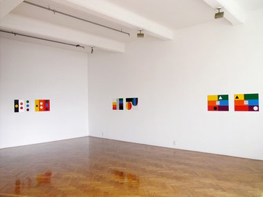
In this show Australian artist John Nixon continues his ongoing project: Experimental Painting Workshop with five works in the front Crockford space. He is well known for his smaller, more compact, intensely singular, block-shaped monochromes, but in recent years Crockford has been showing his more musical polychromes that have a surprising jewel-like sweetness - almost a (dare I say?) prettiness that is a result of their quite intimate scale as much as variety of colour.
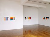
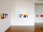
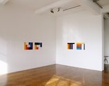
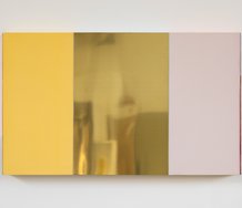
Those previous polychromes have been solo panels, but now Nixon presents two MDF panels side by side to make up the one painting. He is making the viewing experience more complicated. What is interesting is that they don’t look like say stereo photographs. They are not barely indistinguishable pairs or twins. Rather they are quite different - but with aspects common to each that you are likely to compare. Viewing commonalities on both left and right: darting backwards and forwards.
Those commonalities include: cut out, glued on elemental geometric shapes; spectral sequences of chromatic bands; opposing vector directions of those flickering stripes or hovering pulsing shapes; different spatial separation of elements; laying horizontal bars over vertical ones; and repeated juxtapositions using optically unstable silver paint.
Within these structures Nixon uses seven colours and the metallic silver, like musical notes in an octave. The latter varies between white and grey-looking, according to the light source and where you are standing, but usually it forms a close tonal (you could say ‘chordal’) relationship with the white that often looks spatially like a doorway through a simple architectural form.
Trying to grasp a formal relationship between the two units is the essence of the project, rather than absorbing them one at a time in sequential isolation - something which is slightly different, for you may not compare. Of the five works the ones with glued on squares, circles and triangles least successful, because of the distracting, raggedy, roughly painted sides of the MDF shapes, despite their rhythm having an effective lyrical dynamic.
On the other hand the works with no glued on shapes and with solely straight lines seem better made and more interesting illusionistically. Their white/silver interaction is a major feature in the way it suggests a cut oblong hole that unbalances the whole configuration. The asymmetry starts off being an irritation but gradually becomes compelling - by virtue of it suggesting a lop-sided three dimensional architectural model. A true painting experiment, as the title of Nixon’s project states.
John Hurrell
 Two Rooms presents a program of residencies and projects
 Advertising in this column
This Discussion has 0 comments.
Comment
Participate
Register to Participate.
Sign in
Sign in to an existing account.