John Hurrell – 29 June, 2010
Shand gets into trouble because he is hell bent on establishing that Gregory's work has political content - as if it would be calamitous if that were not to be the case. Normally it doesn't matter, for artists like any group of citizens, can be of any political persuasion they please. However it does matter if you are trying to sell said show to a couple of Irish and Mexican art institutions and you want to convince them this exhibition is connected to the turbulent histories of their own particular regional constituencies. Political content (even if terribly vague) is better branding.
Amongst this country’s tertiary art education personalities Nuala Gregory is highly regarded for her role in Elam as a teacher and university administrator. At the Gus Fisher she has taken over the small Gallery Two that used to be a television studio - on the far right when you walk in - and prepared an installation, one that is ‘immersive’ and which involves the deconstruction of the practice of painting. According to the wall label that is.
I greatly value wall labels as a method of introducing viewers to the ideas of an exhibition. However, not to beat about the bush, I believe those claims on this particular wall label to be very confusing. In fact, I think they are quite inaccurate.
Why is this? First of all, the medium that is most used for this show is printmaking in the form of lithography - not painting, though painting is much discussed in the catalogue essay by Peter Shand which examines canvas-based Greenbergian abstraction and the notions of essentialist purity and politics. But the two media can not be conflated, they are very different processes. Painting a stone with tusche which then prepares the surface for ink to go onto paper that is seen under glass, is not painting in the sense that Greenberg understood it with his arguments about modernist abstraction, the canvas stretcher and the picture-plane. Blending the two and claiming one undermines the other is highly dubious.
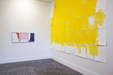
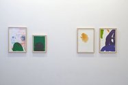
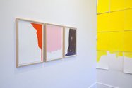
For this show Gregory has worked with printmaker John Pusateri to make a number of extremely delicate abstract images with pale hair-thin lines, delicious micro-tidal washes and dramatic flourishes - created by brushing the liquid tusche onto lithographic stone plates. With some of the resulting sensuous prints (floating yellow and green spongy forms, and less runny but strident Motherwell-influenced blue and pink brushmarks) she has added sheets of glued-on, torn yellow-painted paper collage.
With this lithograph/collage treated paper work there are two forms of presentation: framed under glass and unframed pinned to the wall. The best of the former (of which there are nine in total) are not in the main room but on the wall outside the door in the narrow adjacent foyer: two works exploiting exquisitely intricate marks of flat and organic yellow and green.
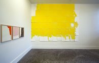
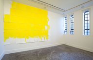
What of the unframed works in Gallery Two? They make up a grid of 6 x 11 sheets of A3 paper that has been printed and collaged on to. This bank of vertical yellow paper pages is snuggled into a corner far away from the room’s four dominant, vertical, narrow windows, and goes up to the ceiling. A top righthand page is absent, and a top lefthand one is unprinted. The righthand vertical and bottom horizontal edges are mainly collaged, with some churning and turbulent yellow lithography put amongst those sheets as well.
The whole point of the gridded composition seems to be its four outer rectangular edges and the various ways they (totally or in part) can be treated: edges of a paper grid (where missing pages will expose the wall); edges of inked colour lying on paper sheets; edges of paper sheets which have no ink or collage at all; edges of torn painted paper glued onto paper sheets.
This large lemony oblong is pressed tightly into the back wall on its left so that a small white protruding box (a temperature or humidity meter) disrupts its lefthand contour. However because it is innermost and tucked in - and not more central in its position - the bank of coloured paper is not ‘immersive’. It has little impact on the viewer’s body because it is too far to the left and does not interact with the most salient feature of the room, the four vertical windows. If the grid were of the same height as them it would not intrude but be integrated as a sympathetic, two planed, architectural element (joined at the corner) that the visitor can enter. Though the show is called Exploded View there is no sense of expansion - though the colour does hover and float. On the other hand it does not implode, neither. It is not compressed or shrinking. It does not push at the viewer or suck them in closer.
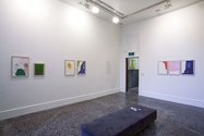
Also in the room are seven framed lithographs. Six are vertical rectangles and one other, a smaller work, is square. Most continue demonstrating Gregory’s interest in edge and the notion of spatial extension through colour, and are placed at irregular intervals on two walls opposite or adjacent to the hanging paper. Two blue ones with thick, brushed on, tumbling forms imply they are separated sections sliced off a much larger blue (but unseen) field. The smaller green square elaborates on this idea, being related to a large green blob in the lower half of its neighbour, while the two yellow and green lithographs outside the door could have been spawned by the pinned up yellow grid with the framed green lithographs on the opposite wall.
These prints are obviously selected from a bigger pool of lithographic images, so the choice of exposed abstraction presumably changes according to the needs of the space. With what Gregory has done in the Gus Fisher one is tempted to say, “So what?” Some exhibitions are ungainly deliberately because the artist has other ‘higher’ priorities, but with this show one senses she wants it to be elegant but hasn’t sufficiently understood the room and how her components affect it.
The natty little hardcover Exploded View catalogue that accompanies Gregory’s show is designed to support it when it is exhibited in Mexico and Ireland next year, and so has some photos of parts of those countries, places where Gregory has lived. It also has two essays by Peter Shand and Greg O’Brien.
Shand’s contribution is particularly interesting as he historically links different complex and paradoxical political attitudes with various permutations of ‘pure’ and ‘non pure’ abstraction. However he gets into trouble because in my view he is hell bent on establishing that Gregory’s work has political content - as if it would be calamitous if that were not to be the case. Normally it doesn’t matter, for artists like any group of citizens, can be of any political persuasion they please. However it does matter if you are trying to sell said show to a couple of Irish and Mexican art institutions and you want to convince them this exhibition is connected to the turbulent histories of their own particular regional constituencies. Political substance (even if terribly vague) is better branding.
Shand points out that twenty years ago Gregory once said that ‘you don’t need to address political or philosophical issues to educate perception’ and says ‘it is clear this is not a claim for an art devoid of social address. Gregory does not repudiate political or philosophical issues, or positions (E.V. p.19).’ However she does not embrace them either and he writes as if she does, building up a discussion that starts with her repudiating (via an earlier catalogue essay he references from Slavka Sverakova) Kandinsky’s idealist / transcendentalist use of colour and ends with Jacques Rancière’s notion of viewer activity in The Emancipated Spectator being used as if it represented her thoughts, not Rancière’s (E.V. p.21-24).
Rancière is a philosopher who is discussing theatre and art that has commonalities with theatre. I believe that Shand is mistaken in thinking that Gregory’s own variety of art practice is pertinent. He considers that her ‘works both reveal and invite the unruly and the unexpected’ (E.V p.24) but that can occur within the details of any strictly ordered and formal presentation. In other words the visual qualities of any artwork can always be mentally reordered by a viewer. Rancière is talking about a narrative that dwells on the social or historical (hence the importance of artists Thomas Hirschhorn and Liam Gillick in the Artforum of three years ago that discussed Rancière) but with Gregory’s practice the kind of ‘spectators who are active spectators, who render their own translation, who appropriate the story for themselves, and who ultimately make their own story out of it (Artforum, March 2007, p.280)’ will not find an equivalent, unless of course they also find it in works that Clement Greenberg (the so-called opposite) championed, like those of Jules Olitski.
Compared with ‘fixed composition’ artists like Olitski, Shand argues that Gregory presents a deliberate incoherence with her presentation of her material, ‘refashioning it in her own way - by drawing back, for example, from the vital energy that it is supposed to transmit in order to make it a pure image and associate this image with a story which she has read or dreamed or experienced or invented.’ (Rancière quoted by Shand in E.V., p.24)
Fantasing about Gregory’s possible intellectual ruminations doesn’t help visitors to her show make sense of it - for it is the spectators who should be ‘emancipated’ from mental inaction, not the artist. However Shand is more valuable when he talks about the variety of contemporary abstraction he believes Gregory’s work to be part of:
Rather than point, line and plane, for example,…(it) tends to deal in intersecting vectors such as time, site, frame. It is a space rather than a place; directed outward rather than inward; formless rather than formal; contaminated rather than pure.(E.V., p.11)
At the Gus Fisher I think this is partially true. Especially in regard to frame, but not to site. Or formlessness but not to time. Space, and not contamination. According to Shand the Gallery Two experience Gregory provides involves a nonpassivity you don’t get with so-called formalist artworks. They ‘emanicpate’ viewers’ imaginations in a way that the older, more conventional abstract artworks can’t.
Greg O’Brien’s text (a sequence of titled paragraphs, like mini-chapters), after Shand, is all frothy bubbles. It makes tenuous connections to other disciplines to examine the procedural aspects of Gregory’s practice - claiming that the work is akin to music and Chinese painting without clarifying in any vividly palpable sense why - only that it is ‘process’. More than with Shand, it is really more about himself as writer-creator than Nuala Gregory the artist-subject. Although I sharply disagree with aspects of Shand’s discussion he is admirably thorough in dwelling on certain issues close to the practice, and makes very sure his own personal interests don’t get in the way.
Considering how hard it is to prepare catalogue writing before an exhibition is actually up, the Gus Fisher staff, writers, design team and artist have done well getting this book out on time. It is a better looking publication than the show itself and an engrossing document in so far that the essays are not esoteric - the language (ie.terminology) is clear - and the discussions are perfect for stimulating conversation. They are unwittingly provocative, as I’ve indicated, by virtue of their sometimes outrageous claims.
However, nimble and focussed writing (as some of it is - thinking of Shand) cannot save art that does not generate a memorable physical and mental experience in its own right. The catalogue reading should come after, not before, the viewing experience, and so because these essays are written with no detailed discussion of the specifics of the hang, they are doomed to fail. They can only help legitimise tasty images isolated within a publication - not pull up a sinking installation that has some lovely details but which is incoherent spatially.
That incoherence might be intended, but it is - as I’ve tried to show - poorly argued for. It is a shame Gregory didn’t have a conventional, less ambitious (read ‘less pretentious’) presentation of the best most organic lithographs, framed and lined up in rows on the gallery walls to create a compelling visitor experience. This exhibition indicates she is out of her depth. Unfortunate.
John Hurrell


 Advertising in this column
 Two Rooms presents a program of residencies and projects
This Discussion has 0 comments.
Comment
Participate
Register to Participate.
Sign in
Sign in to an existing account.