John Hurrell – 23 September, 2010
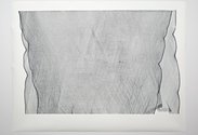
Looking at the screenprint just inside the door, the black lines of the overlapped netting themselves look like woven cotton, each ‘thread' a series of interconnected loops that advance and then double back into each other, like skeins in a jersey. As a drawing it is more complicated than the rest of the show where ‘simple' drawing has complex optical consequences.
Auckland
Monique Jansen
slit, dot, mark: new drawings
12 September - 9 October 2010
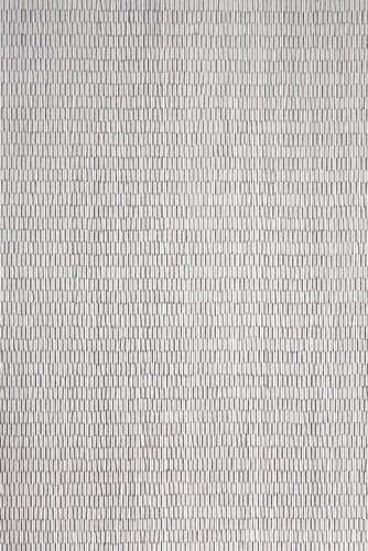
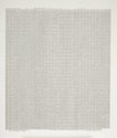
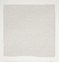
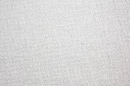
Of the seven finely patterned, industrial looking drawings currently presented by Monique Jansen at Antoinette Godkin, one is made by slits cut into a plastic sheet that is then suspended off the wall, another is a screenprint of rendered overlapping netting, one other is made by nail holes precisely and densely positioned into the MDF wall and the rest are drawn with pencil lines no thicker than a hair.
They are all meshes of sorts, preoccupied with abstract pattern structures and fit somehow between Californian Robert Irwin and Frenchman François Morellet. In our visual culture she is extremely unusual, the only work vaguely related being Ray Thorburn’s modular grid paintings and the Letraset drawings and suspended mesh sculpture of Carl Sydow - both from the early seventies.
Using pencil Jansen creates a form of super-delicate Op Art, where you are not sure what it is exactly you are examining. Just knowing that the lines are from a pencil is in itself a revelation, because most of us have never seen a pencil lead (in a normal wooden pencil or a metallic propeller version) that thin.
The most extraordinary thing though is the colour, because these seem to be lines of conventional grey pencil lead, yet you see washes of colour, and hue in the tiny individual strokes - especially in the works where the drawn gauze looks like muslin or fine fabric. So has Jansen used coloured leads or is she only using grey, and what I see (usually some green, brown and ochres) are actually after-images in my brain, the consequences of retinal adjustment as the eye recovers from saturated or bright hues?
Also the more you look at these grids, the more you realise that they are not as severely industrial as they at first appear. Far from being rigid or precisely geometrical, the horizontal lines of tiny vertical rectangles for example undulate, and start and finish unevenly at the edges. The (occasionally) stemlike vertical columns also are loosely structured: they almost wobble in their vaguely organic alignment.
Looking at the screenprint just inside the door, the black lines of the overlapped netting themselves look like woven cotton, each ‘thread’ a series of interconnected loops that advance and then double back into each other, like skeins in a jersey. As a drawing it is more complicated than the rest of the show where ‘simple’ drawing has complex optical consequences.
Jansen’s other type of grids are not on paper. They are embedded (cut or hammered) into unorthodox materials, not drawn upon them. The very large sheet of translucent plastic draped on the long wall has horizontal cuts when seen lying on the floor, but when hanging its weight makes some slits twist into vertical formations. Unforeseen groups of cuts start to appear in a set out and surprisingly organised internal structure.
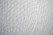
With the moire drawing made of hammered nail holes in the wall, the vaguely hexagonal pattern from a distance - like with the pencil works - has a hint of colour, an odd afterimage with a slight shimmering pulse. Such optical qualities make this highly nuanced show very intriguing. Though it needs time for the visitor to mentally grasp, not to be impatient but to let their eyes adjust, Jansen’s is an unusual approach and in today’s context where the social is (in my view) over emphasised, quite special.
John Hurrell


 Two Rooms presents a program of residencies and projects
 Advertising in this column
This Discussion has 0 comments.
Comment
Participate
Register to Participate.
Sign in
Sign in to an existing account.