John Hurrell – 20 September, 2010
In the small back room that is more private (to make a wildly imaginative leap, it is like a funeral parlour), the Blue and Grey Studies allude (I think) to the colour changes in skin after a body's expiration, the greying over as the blood ceases to circulate oxygen and the temperature drops. Seymour is not being ghoulish here - more a matter-of-fact acknowledgement of a fundamental truth.
Ava Seymour is well known for her exploration of collage, making different varieties of photograph featuring cut paper. Some series have been hugely entertaining (such as images of rubber fetishists relaxing in their vulgar bourgeois sitting rooms) and others have succeeded in making viewers furiously angry (such as the State Housing / Hannah Hoch influenced series that appeared to be viciously cruel in its ‘ugliness’). Over the last decade her work has become more abstract and formally elegant, consistently avoiding the illustrative type of narrative she started off with - firstly by using coloured sections of medical surgery manuals, and then much later, by using paper pages of fashion magazines.
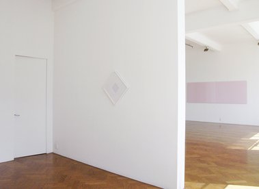
This current show is extremely minimal, with no inventively cut edges, faint lines alluding to diagrams, or wispy hints of shadow. It could be mistaken for an understated Julian Dashper presentation, or else a rarefied feminist statement - the latter because of its vertical ‘cut’ (a splitting linear gap that’s like a white ‘zip’) in the centre of each image, and a possible reference to ‘blush’ makeup foundation. The work is highly ambiguous; about language (or lack of) as much as visual properties.
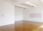
Seymour’s show seems simple enough, placed in two spaces in the Crockford gallery, and two planar areas presented within each digital photograph. The exhibition’s title deliberately withholds helpful information, but there is a pattern provided to assist your thinking. The vaguely named Compositions are all pairs of almost touching, unframed but glassed over, horizontal rectangles. The other sort, the Studies (each incorporating the name of a colour), are framed diamond shaped, tilted squares - again with two juxtaposed pastel hues this time within a bevelled mount.
The monochromatic coloured oblongs are like paint charts, with no internal modulation. Their chroma choices seem to be based on diminishing hue or saturation, how these properties are affected by spatial extension or shape, and how the images of the viewer in the reflecting glass get changed by the degree of distortion in that glass - because that is not consistent.
My interpretation of Seymour’s project is that it is about death. It is seems less concerned with abstraction and more about showing visitors their slowly changing faces and bodies, and as such is a codified contemplation on mortality and time - in the tradition of Edvard Munch and Jasper Johns and their two works Between the Clock and the Bed, painted forty years apart.
In both the Compositions and Studies, Seymour’s pairs of colours are not identical, for one is usually slightly bluer (or colder) than the other. The photographs in the main gallery space are what I’d call ‘Caucasian Pink’, the large Composition 1 on the large wall being richer in hue than the other more anaemic, paler pairings.
In the small back room that is more private (and, to make a wildly imaginative leap, like a funeral parlour), the Blue and Grey Studies allude - I think - to the colour changes in skin after the heart has stopped, the greying over as the blood ceases to circulate oxygen and the temperature drops. Seymour is not being ghoulish here - more a matter-of-fact acknowledgement of a fundamental truth.
To further speculate, I also suspect Seymour’s use of a diamond format for her coloured Studies is precise and calculated, a pointing to the final words of the famous Diamond Sutra of Mahayana Buddhism that stress the impermanence of the world.
Thus shall ye think of all this fleeting world:
A star at dawn, a bubble in a stream;
A flash of lightning in a summer cloud,
A flickering lamp, a phantom, and a dream.
Thus what might seem to be an exercise in miminalist abstraction is, I think, in fact driven by a moral ethos, an austerely coded fable devoid of narrative. It’s a punch line expressed in coded symbols, the pink referring to the face of a new born baby as much as that of a made up woman. A meditation on the brevity of life.
John Hurrell
Recent Comments
Quint Baker
it's all far too minimal, feed me more unflavored yoghurt please!?!?!?!?!


 Two Rooms presents a program of residencies and projects
 Advertising in this column
This Discussion has 1 comment.
Comment
Quint Baker, 5:47 p.m. 26 September, 2010 #
it's all far too minimal, feed me more unflavored yoghurt please!?!?!?!?!
Participate
Register to Participate.
Sign in
Sign in to an existing account.