John Hurrell – 26 September, 2010
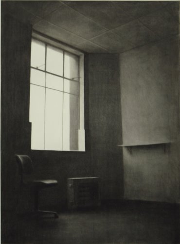
Rae's oil paintings I generally am not enthusiastic about. Her still lifes I find too bourgeois and conventional an idiom for a treatment of contemplated objects. However her charcoal drawings of uninhabited office spaces have a chilly melancholy that makes me sit up. Gone is the ingratiating sheen of fetishised surfaces to be lingered over. These drawings make you nervous. They have a temperature dropping mood you can psychologically enter, as well as the volume of the room.
Auckland
James Casebere, Callum Innes, Helmut Federle, and Jude Rae
Cimmerian Shade
14 September - 9 October 2010
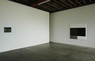
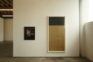
This current group show presents ten mainly new works from four old names at the Jensen Gallery, but displaying subtle shifts and some unexpected common areas. Breaking it down, there are four Casebare photographs, three Innes paintings, two Federles and one Rae. The Rae charcoal drawing fits perfectly with the Casbere’s photographs. Both deal with the nuances of cool morning light within austere architectural interiors.
Rae’s oil paintings I generally am not enthusiastic about. Her still lifes I find too bourgeois and conventional an idiom for a treatment of contemplated objects. However her charcoal drawings of uninhabited office spaces have a chilly melancholy that makes me sit up. Gone is the ingratiating sheen of fetishised surfaces to be lingered over. These drawings make you nervous. They have a temperature dropping mood, based on loss, you can psychologically enter - as well as the volume of the room.
Not only is their pale grey light startlingly ominous, like a shot in a sixties Bergman or more recent Lynch movie, but the lack of ornamentation seems admonishing - as if pleasurable pattern might corrupt. Though she is interested in an uncomplicated examination of light raking across vertical and horizontal planes, there is also a strong sense of tragedy, that these buildings (Victoria Chambers in Dunedin) have seen better days. Yet dilapidation is alluded to, not explicitly described. The light is bleary, but we don’t see dirt or disintegration.
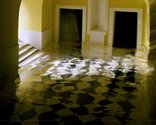
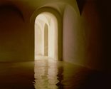
James Casebere’s photographs of flooded cellars or underground sewers use plaster and cardboard models with viscous golden varnish that distorts floor tile patterns and even suggests they might be bending and bursting. However the streaky light on the smoothly undulating upper surfaces of the peaking arches, or ‘water’ covered gridded floors is the main attraction. Gently caressing light seems to be the point of interest, yet in Casebere’s hands the pouring of liquid to inundate ‘old’ spaces seems to be a metaphor for violent historical change, cataclysmic social upheaval. It also might just be the translucent horizontal form and general evocativeness that appeals.
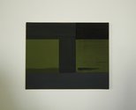
The two painters in this show have a strong sense of a considered divided picture plane - combined with an awareness of surface sheen. Federle’s small paintings have an elegance built around a landscape ‘I-Beam’ format akin to both Colin McCahon forms and Ted Bracey colours, especially with their quickly brushed - but precise - dark khaki-greens overlaid with streaky battleship grey.
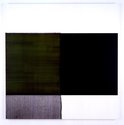
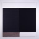
Innes of course, is unlike Federle in that he is famously subtractive and not additive with his paint. And in these works often horizontal paint application underlies the removal of an upper or over layer - with inky velvety edges where vertically stroked turps has eaten the differently hued layers of oil away.
The three works by Innes here feature different vertical subtractive treatments. One is upon a long vertical sheet of heavy brown paper with a horizontal oblong (the remains of the bigger original painted rectangle) at the top. Another has the diluted paint streaming down the lefthand block and running over the white primer on the lower part of the canvas, but not obviously on the area where paint was removed. The third has the vertical cascades running along the bottom edge of the lefthand block and on the block itself, implying mysteriously that the original layer providing those trickles might have been positioned on the upper section of white primer, but that now all evidential hints of residue have gone.
Cimmerian Shade is a fine exhibition that is probably too loaded towards Casebere and insufficient with Rae. Nevertheless all the works repay prolonged attention. Well worth visiting.
John Hurrell
Recent Comments
Ralph Paine
I think it was Marcel Broodthaers who called artists 'labourers of luxury'... Yeah,there's always more to it.
John Hurrell
I guess there are two issues here. First the nature of art reviewing (I'd say 'criticism' but I don't want ...
Ralph Paine
Sure, the office interiors may drop one down into a chilled melancholia, but I don’t see how they achieve this ...
 Advertising in this column
 Two Rooms presents a program of residencies and projects
This Discussion has 5 comments.
Comment
Ralph Paine, 2:11 p.m. 4 October, 2010 #
There is an entry in Brett Whiteley’s notebooks where he describes pencil drawing as being in itself a ‘bourgeois’ practice: too many possibilities for rubbing out and alteration, too controlled.
And there is an art historical attitude which likewise considers the still life to be a thoroughly bourgeois genre – not because of control issues or any fetishization of surface quality (isn’t all painting in some way a fetishization of surface quality?) but rather because of the coincidence in Europe of the rise of the still life and the coming into being of artworks-as-commodities; an attitude complicated by the heightened awareness of time induced by still life paintings themselves (vanitas, Schama’s ‘embarrassment of riches’ thesis, etc.)
In Japan too, the still life genre has been critiqued as being bourgeois, conservative. Here I’m thinking of how Ozu’s films - full as they are of still lifes and domestic interiors - were in the sixties to be condemned by a new wave of directors (a condemnation which has since been reappraised by some of these directors themselves).
But here and now, I’m left wondering how Jude Rae’s still life paintings can be considered bourgeois while at the same time - and simply because they induce an uncanny psychological effect - her charcoal rendered office interiors somehow escape this categorisation.
Perhaps we know we’ve entered a new phase of art when certain words just don’t seem to work the way they used to.
John Hurrell, 3:15 p.m. 4 October, 2010 #
Excellent to get your take on this, Ralph, especially the Ozu reference which I haven't heard of before. (Nor Whiteley for that matter.) You've prodded me into further elucidating what disturbs me about the genre, and the links to Dutch still life painting which seem smug with their moralising, symbolism and hints of prosperity. To me the drawings escape that, perhaps because they are less codifed and more bodily. Not in an ingratiatingly seductive sense but in a chilling undermining way. There is something disturbing and unfriendly about their wintery light.
Ralph Paine, 1 p.m. 5 October, 2010 #
Sure, the office interiors may drop one down into a chilled melancholia, but I don’t see how they achieve this in any less a codified manner than the way the still life paintings seem to put one in touch with a plush zone of overabundance (cold grey vs. rich colour being the most obvious encoded distinction).
So if it is possible to construct a genealogy of code and affect from Jude’s still lifes back to Dutch examples from the 17th century, then surely one may just as readily connect her interiors with a history of universal exchange, with financial cycles and their downturns (‘...the buildings have seen better days’). Rather than critiquing the still life paintings as being bourgeois, instead we might say that both series of works experiment with/explore/induce bourgeois affects and codified states of mind. To dislike one series but like the other would not then be a matter of one being bourgeois and the other not.
There is a wonderful section in Roland Barthes by Roland Barthes titled ‘J’ aime, je n’ aime pas – I like, I don’t like’ where the author itemises long lists of things and activities under each category. This is followed by a commentary: “I like, I don’t like: this is of no importance to anyone; this, apparently has no meaning. And yet all this means: my body is not the same as yours. Hence, in this anarchic foam of tastes and distastes, a kind of listless blur, gradually appears the figure of a bodily enigma, requiring complicity or irritation. Here begins the intimidation of the body, which obliges others to endure me ‘liberally’, to remain silent and polite confronted by pleasures or rejections which they do not share.” Very bourgeois?
John Hurrell, 1:51 p.m. 5 October, 2010 #
I guess there are two issues here. First the nature of art reviewing (I'd say 'criticism' but I don't want it to get confused with 'critical studies' which is different in its wider cultural sweep). To argue for one's taste or 'likes', and using language to persuade, or to coax a viewpoint along, even though ultimately nothing conclusive can be arrived at in the end.
Then there is the bourgeois thing where one is offended by genres of work that are smug in their embracing of wealth, that seem to be created for that very purpose, intrinsically. Of course it might be argued most art fits into that, but I don't agree. I'm talking about a specific purpose and history, a bragging ethos within it as a main priority. (Swinging towards a Bourdieu class 'distinction' thing here as well)
You might argue, hey stop dumping on Still Life. Its preoccupations are elsewhere. Well are they? Is Still Life initially just about the transience of existence via symbolism? There is more to it than that.
Ralph Paine, 9:41 a.m. 6 October, 2010 #
I think it was Marcel Broodthaers who called artists 'labourers of luxury'... Yeah,there's always more to it.
Participate
Register to Participate.
Sign in
Sign in to an existing account.