John Hurrell – 24 November, 2010
In an odd way, the exhibition seems to be a meditation on mass and air. Plinths of obviously hollow metal boxes, diminutive 3D frames that vertically hold small sheets of steel with cut-out letters, floating words describing clusters of birds and their fluffy feathers, odd configurations of discs and bars turning in the breeze: Speers' display revolves around the penetrative properties of space.
Auckland
Jim Speers
Numerology and Territories
11 September - 5 December 2010
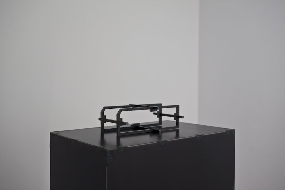
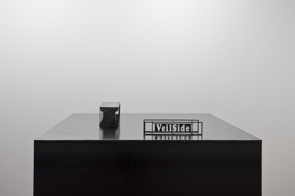
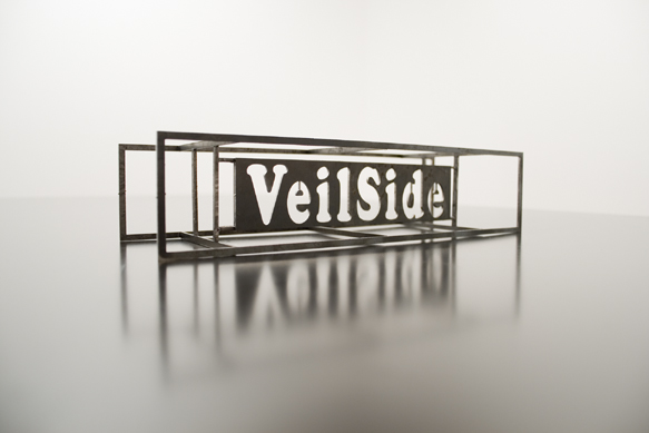
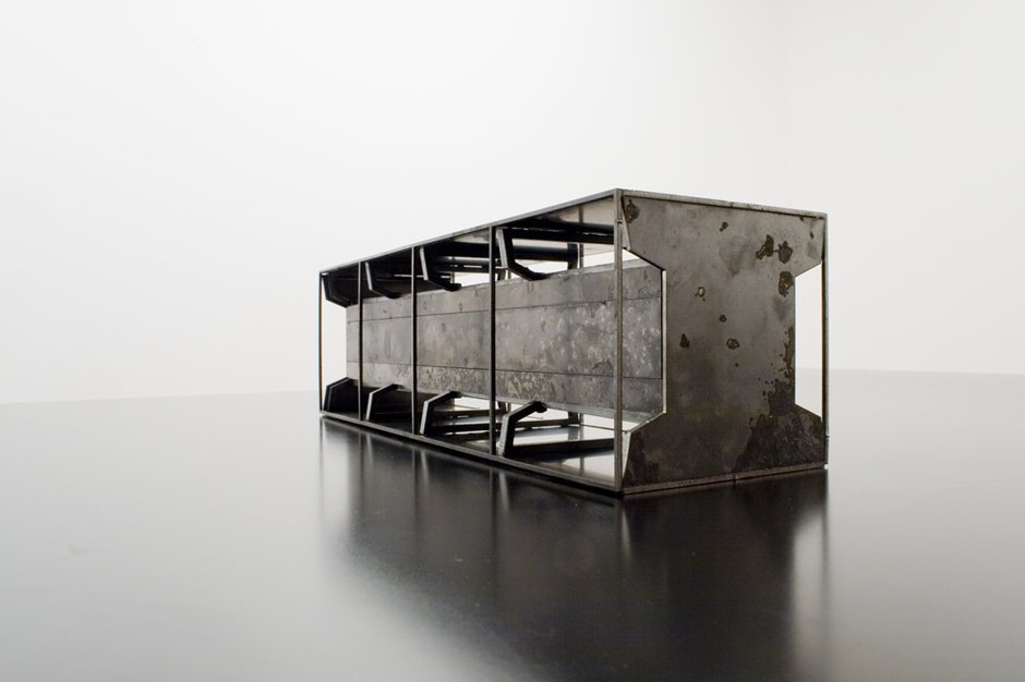
Four laser-cut steel sculptures displayed by Jim Speers at Te Tuhi demonstrate his interest in the intricate connotations of brand-names and the formal properties of fonts or plinths for presentation. They are a natural extension of some of his earlier work with digital video that examined three-dimensional lettering, like Piper Laurie (2001).
This Te Tuhi show amuses because of the outrageous domination in the space of two hollow metal plinths that hold high comparatively small sculptures. In fact the gallery ‘furniture’ of cube and thin vertical slab could be the ‘art’, and seem related (for example) to the large lard or chocolate cubes exhibited by Janine Antoni eroded from her gnawing them - as she did in 1992 - in performance. The simple geometric shapes completely overwhelm the delicate skeletal boxlike objects - akin to kitsets - placed on top.
There are three types of skeletal object - all oddly beautiful. The most minimal is a chassis-like configuration of two parallel horizontal frames held apart by four cross bars. Another is a structure that has the brand name VeilSide cut out in negative shapes, alluding to a customised body manufacturing firm for sportscars. The third looks like a diminutive combination of stables, hay-feeding troughs, and the piston cylinder box of an engine.
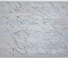
Another sculpture consists of a excerpt from Flaubert’s Madame Bovary, written in steel letters with a seriffed font (Cambria I think?) and attached to the wall. The letters and punctuation project out on pins, hovering in space. Here it is in full:
The rain has stopped; it was beginning to grow light. On the leafless branches of the apple trees birds sat motionless, their little feathers ruffling in the cold morning wind.
The success of the work is more than the mental imagery evoked by Flaubert and his unknown translator, but caused by the compact letters themselves looking like birds huddled on a tree. It’s very sly; a visual treat much understated compared to the ‘plinth’ works.
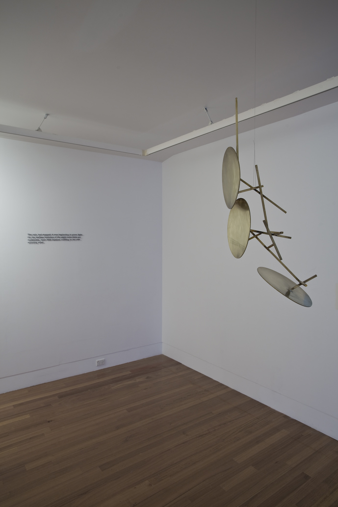
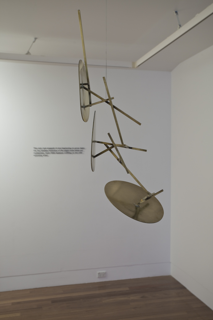
Speers’ other sculpture is hung from the ceiling, a work that looks like a brass John Panting with three wonky cymbal or sun-shapes attached. This solid mobile lacks the precision of the wall text or the planar control of the skeletal boxes - all of which are compositionally decisive and made with rectangular frames to be looked through. This work looks more random. Despite the straight lines it has an organic feel, and doesn’t seem to fit in with the rest of the show, especially as it is suspended. We can position our bodies underneath it.
In an odd way, the exhibition seems to be a meditation on mass and air. Plinths of obviously hollow metal boxes, diminutive 3D frames that vertically hold small sheets of steel with cut-out letters, floating words describing clusters of birds and their fluffy feathers, odd configurations of discs and bars turning in the breeze: Speers’ display revolves around the penetrative properties of space.
His exhibition title speaks of Territories - and the planar ramifications of that are obvious - but what of the very strange mention of Numerologies? That implies a secret coding, an occult mathematical symbolism, particularly of letters like those in religious texts that are claimed to come directly from God.
Speers is thinking about the semantics of branding here, the hidden ‘poetry’ of product names, a rarely revealed aspect that might also be interpreted as a mystic TRUTH covered over by the Side of the Veil - the face of God seemingly alluded to by the makers of the sportscar chassis.
As with the plinths where physical support for the art cannot be ignored as something separate, so it is with the written language when secondary and primary meanings cannot be pulled apart.
In his artist statement Speers writes:
In a commercial setting, you don’t need to read the sign to get it. It works in your peripheral vision. You see its colour…You just download whatever image it is and you’re not even really processing it.
He appears to be making a connection between obvious properties like colour or mass, and detail - certain qualities that become invisible not because they don’t need to be ‘processed’ but because they get superseded by generic meaning (‘commercial setting’) and more overpowering experiential sensation.
Of course you do analyse these works. You can’t help it, particularly the textual ones because they insist on some active interpretation (beyond form) as your eye looks through and around them. You can’t treat quotation like a tray of random shapes. You are impelled to decipher the forms - to read.
It’s a characteristically eccentric show from Speers (remember that Starkwhite floor?) but it is elegant and the letter shapes really intrigue when in your mind the word forms react with their meaning - when you think about language and how it might be put in physical form. A refreshing treat.
John Hurrell
 Advertising in this column
 Two Rooms presents a program of residencies and projects
This Discussion has 0 comments.
Comment
Participate
Register to Participate.
Sign in
Sign in to an existing account.