

David Lillington – 2 February, 2011
Apple's work is in many ways more interesting than Warhol's, in my opinion. Perhaps this feeling has to do with my Britishness, with whatever it is makes me like Turk. Sure, Apple doesn't have the car crashes, suicides, electric chairs, or the weird grand sweep that Warhol's art seems to make, with its mixture of numbness and sensitivity to social realities. And unrealities. But on questions of the nature of art Apple has greater range.
London
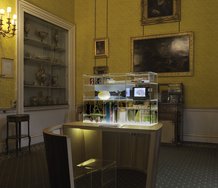
Billy Apple
British and American Works 1960-69
16 September 2010 - 30 October 2010
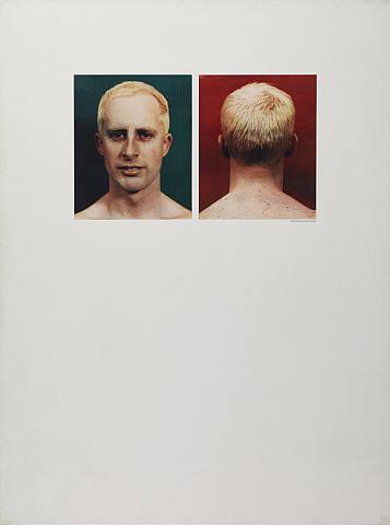
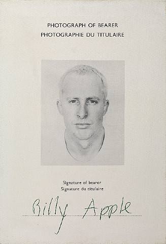
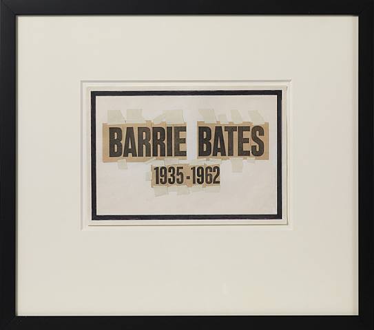
Their various embellishments aside, his self-portraits might be police mug shots or passport photos - that is, photos which are not really portraits but serve another function. Where was he going? And what was his crime? Being someone else perhaps, or just being an artist. This apparently incidental undermining of a genre, in this case portraiture, is typical Billy Apple. These might also be straight portraits, but the feeling that they’re ‘found photos’ and once had an official function, is hard to escape. Apple, born Barrie Bates, is famous for assuming in 1962 the identity ‘Billy Apple’, so these certainly are pictures of a man putting on a new persona - passport photos for a journey to a new self.
But his art is not only about that single defining transition, even if that was and is crucial. His understanding and control of medium is a skill he would have had with or without the name change, with or without the hair dye. The brilliance of the work dealing with his own identity relies on that skill - it is not that he made one clever move and everything else followed: rather, the ability to manipulate medium precedes the idea of transforming himself. And the proof is that this skill manifests itself in his work in many different ways.
Apple lived in Britain from 1959 to 1964, leaving then for New York. I want to look at three things: how this work from the 60s looks to someone from Britain now; secondly, what I’m going to call its ‘valency’; and lastly its physical characteristics. I’m going to start with the British view.
1.
New Zealander Apple was in the 60s a pioneering Pop artist and a forebear of later conceptualists who deal with the identity of the artist, the nature of artworks and the relation of these two things to the market: everything which is on the border between economic ideas and the idea of art and artists. This includes the relation of art to kinds of visual culture which are not ‘art’ - and to many which are. It includes contracts and product branding. Apple’s art is often self-referential, even solipsistic, though not always.
To a British eye Apple pre-dates by decades Gavin Turk, Simon Linke, Carey Young, Michael Landy - and others. He makes some art of the last 20 years look redundant. What does it mean when art of this kind has been ‘done before’? It is not the same as being influenced by Paul Klee or by Jackson Pollock. There is a particular problem: such an artist can lose control of his own allusions, which in this art constitutes much of the palette. It’s a genre with old themes and an artist needs to be careful, and in particular to beware of naïve ideas of originality. Some critical of Apple have pointed out that it wasn’t new when he did it - there was Duchamp, Klein, Manzoni, and some of his contemporaries. But he knew that, and the criticism seems to me false. Awareness is all. Apple’s art hit the spot at a particular moment and as time has gone on its integrity appears intact. It has something original to add to the conceptual canon. His 60s work, shown here, still looks strong, and at the time was as new as anyone’s.
The same applies, to take a later British example, to Gavin Turk, who - like Apple - fares well out of all this. Like Apple he realised from the beginning of his career in 1991 that to deal with the nature of art you had to deal with the identity of the artist. And with where art is shown and with the artist’s working processes, what he actually does with his time.
Turk played with time, pose, face and signature without losing his other, everyday self because like Apple he understood - possibly from music and theatre - that the persona and the person - whatever that is - do not have to coincide, even if they do have to have a relationship with each other. And he understood what had gone before, and armed with that knowledge made work seasoned with British understatement, which seemed appropriate to a subject delicate because well-worn and also the domain hitherto of Continental Europeans. He also understood the timing - it was obvious that a new wave of British art was coming in. The story is not dissimilar to Apple’s, allowing for differences in time and place and consequently style. There was a meshing of personal and artistic identities. Or a separation of them. In any case it was an attempt not so much to define the relationship between the two, but to describe it. It was a meditation on that relationship. This is the subject of both artists’ work.
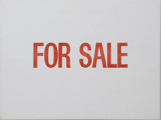
The identity of the artist and ‘identity’ of the artwork as subjects for art have as we know been important at least since Duchamp, and remain so. I emailed Turk to ask if he had any thoughts about Billy Apple. He replied, ‘I did see the show [at Mayor Gallery] and could see many links and crossovers with my own work. There were works I hadn’t seen before or even had knowledge of. That I have more or less made myself. For example the painting, For Sale.’
This seems to tell us at least that there is no question of influence. He had similar ideas, which he executed in a different way. But the affinity between the two artists is notable, and what he says here indicates that Turk agrees.
And it’s also interesting to compare what Apple said after exhibiting his 60s work in a group show in 1992: ‘They looked bloody modern, I tell you now. Unbelievable that they still looked like they were done today…I’d say they’ve more than held their own. In fact they look very, very contemporary.’(1.) He had a point.
2.
Apple’s work is in many ways more interesting than Warhol’s, in my opinion. Perhaps this feeling has to do with my Britishness, with whatever it is makes me like Turk. Sure, Apple doesn’t have the car crashes, suicides, electric chairs, or the weird grand sweep that Warhol’s art seems to make, with its mixture of numbness and sensitivity to social realities. And unrealities. But on questions of the nature of art Apple has greater range. In some ways the art in this show falls somewhere between pure Pop and the art of someone like Gerhard Richter. Compared to Warhol he connects more easily with the concerns of what we now call ‘contemporary art’ (80s, 90s, now). And it’s not because Warhol is dead and he alive. These early Apples look contemporary. Possibly I am inured to Warhol.
What do I mean by ‘the concerns of contemporary art’? I suppose: stripped down metaphors, irony (or the post-ironic), a concern with the legacies of Minimalism and of Surrealism, and these sometimes combined; the nature of art itself and a concern with language, alongside and sometimes combined with a new attempt to return to social observations; a taking on board of all kinds of ideas which might be called Structuralist et cetera - a desire to unravel and reveal the visual languages of culture; all things pertaining to the legacy of abstraction, to photography and to image-making, again sometimes along with an attempt to address the social.
Turk, incidentally, has played extensively with Warhol’s works. Warhol’s car crashes were reprised in a piece in frieze Art Fair (this year devoid of its usual glut of Warhols), a piece which featured, if I remember correctly, a camper-van breakdown. This tragi-comic take on the darkness of Warhol’s death pictures is typically British and has more in common with Apple than with Warhol. It deals with the same questions about art and design, about the where and who-for of art works, and has a comparable humour. Apple’s pop-conceptualism has more reflective facets built into it than Warhol’s. There is more to be interested in, more variety and subtlety, more questioning and less certainty.
To my eye Apple’s work has a very high ‘valency’. Valency is a ‘combining power, an ability to form chemical or lexical bonds’ - the word is used in chemistry and linguistics alike. And here it’s more than mere allusiveness, it’s an ability to connect with the underlying concerns of a huge part of the artistic thinking of the 20th and 21st centuries. But this is why his work at Mayor makes one think not only about Warhol, but also about Gerhard Richter, Marcel Broodthaers, Marcel Duchamp, Jasper Johns, Daniel Buren. Et alia.
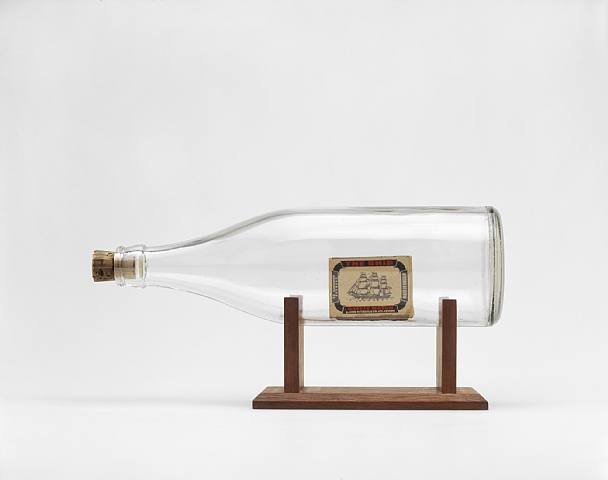
This show sent my thoughts off in a lot of different directions. I was curious about this. Young Contemporaries 1962 (1961), the image of an invite card on canvas, looks astonishingly like a work from the 80s or 90s. The Ship, Brighton Beach, Sussex, England, and Ship in a Bottle put me in mind both of Marcel Broodthaers and of British artist Emma Hart’s video of dice being tossed by waves on a beach (recently in the ‘New Contemporaries’ show in Liverpool).
In these pieces we have the image instead of the thing - the picture of a ship on a matchbox instead of a ship - which would be a model ship already. But the matchbox is made of, and contains, the same material as a model ship, as a real ship. (‘Ship’ matchboxes at this time were made of wood). The elemental image of fire in the bottle and in the sea is evoked.
The idea of analysing the relationship between image and idea has been important since art history began. In the second half of the 19th century it took the turns that were to shape the 20th. Aloïs Riegl wrote in 1899 that Aesthetics was dead, but that her daughter, ‘modern aesthetics’ lived, and ‘eagerly lets art history teach her’. She was bound to art history. And remains so.
And if I may be allowed an aside, I think a reading of this short passage from Riegl’s second version of his Historical Grammar of the Visual Arts (2.) tells us a great deal which is pertinent to the art of Apple, Turk and their ilk. The passage is circular, almost solipsistic. It describes the discipline of art history in 1899 as a ‘ruin’. The narrative goes roughly as follows.
Art history is built by aesthetics in the mid-18th century. Now, in 1899, it is ‘lacking connective corners’ (that is, those between the different disciplines of art: architecture, painting, sculpture and ‘industrial art’). Indeed the connections have ‘dissolved’. To rescue the ruin and rebuild it requires a new architect. Aesthetics is dead, but her ‘heiress’ lives: ‘modern aesthetics, if you will’. Now, this daughter or granddaughter has a guiding principle. This is where the circularity comes in. Her principle is always to look to art history for guidance. So, if you like, the building which the mother built provides the inspiration for the daughter’s re-invention of it. You could say, it’s the contents of the building that inspire her, but it makes no difference.
It was a perceptive and prophetic statement about art history. You could also say, ‘he was talking about the academic discipline of art history, not art itself”, which is true, but nevertheless his narrative explains - or at the very least is equivalent to something which explains - why Billy Apple and Gavin Turk exist. It may be an exaggeration to say that art history and art can only be known through themselves - but is it? And something very like this idea is deep in the heart of such artists.
3.
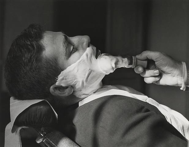
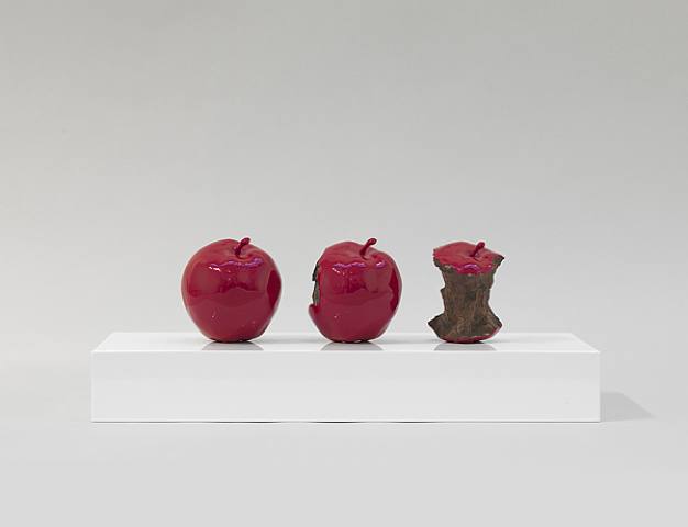
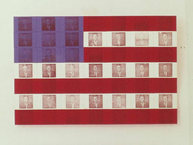
The shaving foam photos Art Declared Found Activity, Lathering/Shaving, Alicante, Spain seem to allude to Duchamp. Apple’s three shiny apples, 2 minutes 33 seconds (Red) look 80s, and made me think of Sherrie Levine. The Presidential Suite: JFK (1964, xerography on fabric) and other similar works put me more in mind of Richter than of Warhol. Some pieces bring to mind Gilbert and George. The Body Works photos (1965) are like 70s video art. Apparently these pieces have never been shown before. True, they also look a bit like pornography. But they connect sculpture and performance and ‘real life’ in a way which artists were still struggling with in the 90s. They seem to me at once serious and comical.
Apple’s bronze melon on a plate is green, pink and bronze-grey and might make one think of Jasper Johns. You might say, well he was influenced by Warhol, Johns, etc. But I don’t think that’s fair. His version of the equation between Pop and Conceptualism is something deep in his own psyche. His art is his own. And, to repeat, there is history and there is a Zeitgeist.
The self-portrait Vertical Progressives is almost Op, and surely in part about printing itself. What does it say about images? It is about the clarity of a photograph as an image and how that can be manipulated, and this correlates with the idea of the market and the techniques it uses. Apple has a fine understanding of both the science and grammar of art. (Incidentally, did people talk about ‘the market’ in the 60s, in the way we do now? Didn’t they speak of ‘commerce’?)
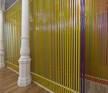
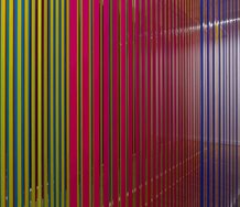
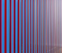
He is an artist of ideas, as Christina Barton’s excellent catalogue essay rightly makes clear: ‘Apple’s questioning of artistic identity is the key to his Conceptualism.’ And she writes of his ‘complex and ongoing negotiation of selfhood.’ But it’s not a contradiction to say that his work is also acutely and astutely physical. It uses a lot of different materials. It is tactile, colourful, often translucent. It shines. These things are not separate from its conceptualism but integral to it. Apple understood advertising and realised that ideas are carried by physical media. His work glows with material intelligence which seems both pitted against and in cahoots with the worlds of art and commerce. There are primaries and faded primaries, the reds, blues and yellows of 1950s magazines, the green of apples, with which he signs his name. Black and white, and the greys of photography. Pink sheens. Neon. There are many different kinds of surface, which is surely significant. Often an idea of age seems built into his work, as if the ads he alludes to were seen from a distance. The fact of his own self-portraits looking like found photos has already been mentioned.
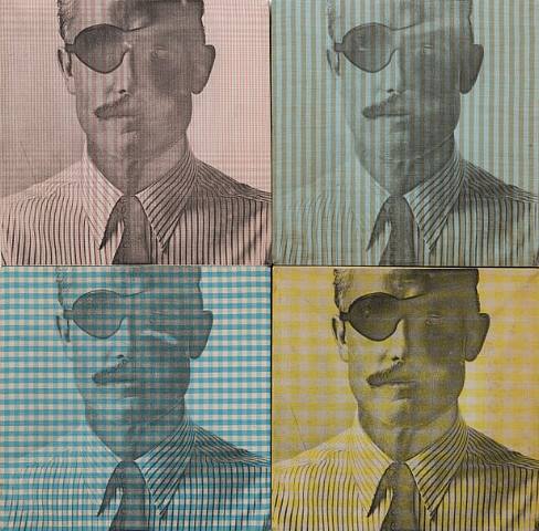
The man in The Hathaway Shirt Man, whose face is printed four times, each time on a different shirt fabric, almost disappears into the background that gives him his raison d’être (he was used to advertise the shirts). He is reminiscent of Randall Jarrell’s Dwight Robbins, President of Benton College in the novel Pictures from an Institution. Robbins is ‘so well adjusted to his environment that sometimes you could not tell which was the environment and which was President Robbins.’(3.)
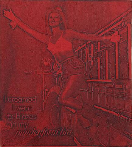
I dreamed I went to blazes in my Maidenform Bra emphasises the absurdity of the original ad. It’s hard to believe this ad ever really existed, but it shows that even 60s advertisers were canny about the Surreal (it’s a dream). Apple’s simple reproductions of it, in pink and in red, and his turning of it into art, push it to its logical conclusion - the model is going to Hell. He inverts its original comedy and adds another layer of irony. It’s like Art and Language without the pomposity. It’s all a very strange embrace of business, half ironic, half real. It’s work with great intelligence and great pitch.
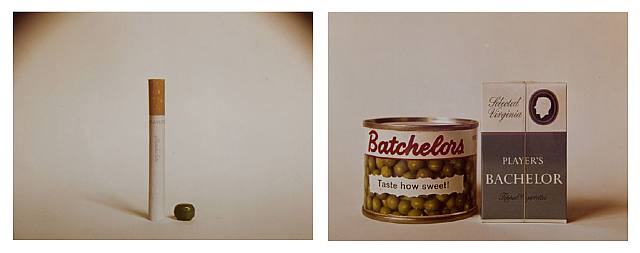
The metaphorical possibilities are many. Again, they are not incidental to the main ideas, but integral. Homonym (1963) and its partner Study for an Epitaph (c.1970) play with words and images in a Lewis Carroll-like way. The latter shows a cigarette and pea. It’s a great image; the ostensible connection is that it’s a Batchelors’ pea and a Bachelor cigarette, but the idea of the possibility of other connections is the point of the piece.
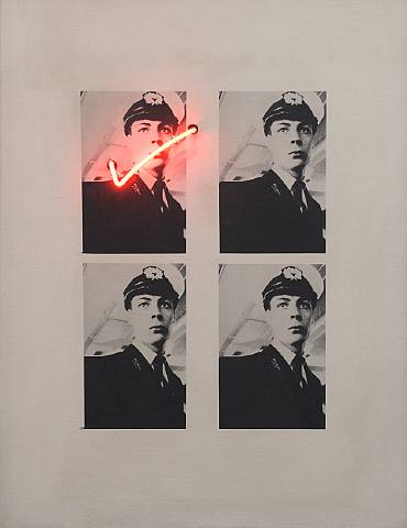
Relation of Aesthetic Choice to Life Activity (Function of the Subject) has four identical portraits of a boat ticket inspector, the top-left portrait ticked with a neon tick, as if to suggest it’s better than the others. But the almost comically long title also seems to ask about the content of the piece it labels, and so by implication the content of any artwork. Why this man? Is it a portrait? And it also seems to extend the question to suggest a bizarre congruence with the man’s life - and by implication all lives: his uniform, angle and pose, appropriate for the portrait of a Royal Air Force captain, suggest a military wish gone wrong (or gone right). As if the desire to wear uniform was the same kind of thing as the artist’s decision about what constitutes beauty. Which maybe it is. And further, as if the difference between a military uniform and a ticket inspector’s were the same as the difference between - what? Different kinds of art? It all suggests a somewhat ‘performative’, while oddly but brilliantly quotidian, view of art.
The main issue in Christina Barton’s essay is Apple’s commodification of himself and the implications of that - as I suppose it must be in any essay on him. It makes sense to interpret Relation of Aesthetic Choice as Apple’s perception that most people ‘commodify’ themselves in some sense, or wish to - and this dressed-up inspector makes a good example, like some character out of Jean-Paul Sartre.
This way of thinking (‘performative’) fits incidentally with Barton’s observation that Apple in his neon works became interested in the energy of neon itself and not just in neon tubes as objects or medium. Even more incidentally, but while I’m on things existential, I don’t know if Apple’s choice of name has anything to do with the fruit of the tree of knowledge of good and evil, but presumably it occurred to him.
To conclude - a Conceptualist he may be, but this is still an artist, making physical and articulate objects, and he insisted on the highest standards when he had his things made (as he invariably did). Concepts have to speak through something. Much of what I took away with me from this show was physical; the eggshell finishes of the xerographed canvases, the high gloss of his apples, the combination of ceramic and bronze, of neon and canvas, and, more metaphorical, the meeting of water and fire.
Apple’s branding of himself makes the artist ‘a consumable like any other,’ as Barton puts it. Some have criticised him for being a one-trick dog, with his pop-conceptual solipsism, his art-about-art-and-the-market. Well, he has great clarity of thought. But to simplify him is not right. This is not a simple artist.
David Lillington
1. Quoted by Patrick Smith, New Zealand Listener, 13 April 1992.
2. First complete English version published in 2004 by Zone Books, New York. Translation by Jacqueline E Jung. The passage I mean is the first two pages of the introduction to the Second Version: Lecture Notes of 1899, pp 287-88.
3. Quoted by Mark Ford in The London Review of Books, 21 October 2010. The novel was published in 1954.
Recent Comments
John Hurrell
This long interview in Frieze, prepared by Anthony Byrt, is an excellent companion to David Lillington's article. http://www.frieze.com/issue/article/brand-new/
 Two Rooms presents a program of residencies and projects
 Advertising in this column

This Discussion has 1 comment.
Comment
John Hurrell, 8:36 a.m. 3 December, 2012 #
This long interview in Frieze, prepared by Anthony Byrt, is an excellent companion to David Lillington's article.
http://www.frieze.com/issue/article/brand-new/
Participate
Register to Participate.
Sign in
Sign in to an existing account.