John Hurrell – 19 April, 2011
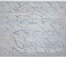
Walters' ink on paper work One/Two/Three No.2, 1988 again compares angles and pointy tips, excited by Killeen's initial idea and looking at mathematical proportions and how angles in the three columns change.
Auckland
Gordon Walters and Richard Killeen
Walters and Killeen
30 March, 2011 - 23 April, 2011
This John Leech exhibition of Walters and Killeen paintings and prints comes hot on the tail of Sue Crockford’s From the Walters Estate show. Some of Walters’ works here are very similar, but of course the presence of Richard Killeen introduces a different flavour. Walters and Killeen were close friends - mutual admirers of each other’s work with a common interest in hard-edged visual dynamics - so bringing the two practices together makes good sense.
It’s a sensitively hung presentation in the single rectangular gallery, particularly with the wall adjacent to the door which emphasises the reds and blacks of the Killeen and Walters screenprints, and the opposite wall which shows both artists experimenting with angular prickly forms. Even though there are six Killeen works to nine Walters, because there is a largish Killeen canvas painting (Destruction of the Circle, 1990, 115 x 1520 mm) it seems very balanced.
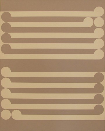
The chronological span of the Walters works is 1953-85, and Killeen, 1974-96: the most recent work being in the John Leech window, a new version of Dew, the cut out Killeen made shortly after Walters’ death. Originally it had 16 elements but this one has 21, all the parts variations of a supine body / teardrop motif.
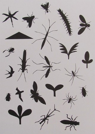
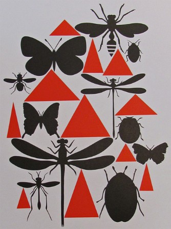
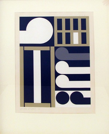
Personally I have always loved Killeen’s seventies grid paintings and the early cut outs that grew out of them via the ‘encased’ figurative imagery, such as the cut outs with silhouetted insect and geometric forms. It is nice to see the screenprints that reference them.
There are two modestly sized works I find especially intriguing, variations from these artists I am not normally familiar with.
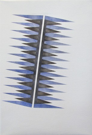
One is Untitled, 1974, the tilted Killeen comb image that references Pacific patterns and Bridget Riley. It is a bit like a set of shearing blades with one set of sharp, steeply angled teeth lying over another. The shorter darker grey teeth are not as acute or as menacing in their pointed angles as the longer pale blue ones, and the forms look stencilled because of their uneven paint modulation. However the overlapping parts of the two combs are darker, while the thin tilted ‘unpainted’ line in their centre glows in contrast. The tips on the outer edges seem tremulously aggressive while the cutting bladelike edges look as if they slide up and down like a guillotine or set of secateurs.
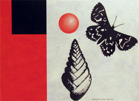
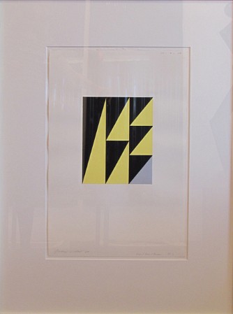
Walters’ ink on paper work One/Two/Three No.2, 1988 again compares angles and pointy tips, excited by Killeen’s initial idea and looking at mathematical proportions and how angles in the three columns change - moving left to right - from one skinny, downward facing, black, right-angled triangle to three stacked up, squatter ones. In the bottom right hand corner he has replaced the pale yellow, upward facing isosceles triangle with a grey version. This subtractive action introduces a tension where the unstable piled up yellow triangles now appear to slide down from right to left. The various diagonal black angles - aligned from top right to bottom left - have more emphasis now, creating a pulsing stabbing dynamic along the bottom edge of the grid.
I like this Walters work because - as with the koru paintings - he is exploring a sort of visual logic. There is an overt rationale that cannot be separated from the aesthetic, the work’s appearance.
This is a wonderful mini-survey of these two artists, with very successful juxtapositions. An unexpected treat.
John Hurrell
 Two Rooms presents a program of residencies and projects
 Advertising in this column
This Discussion has 0 comments.
Comment
Participate
Register to Participate.
Sign in
Sign in to an existing account.