

John Hurrell – 17 May, 2011
Henry with these (and earlier) works is combining contrived invisibility with cultivated exhibitionism. Intro- and extra-version seamlessly blended. Taking a form of camouflage that merges with the local architectural context, and mixing it with an attention-seeking raucous shriek.
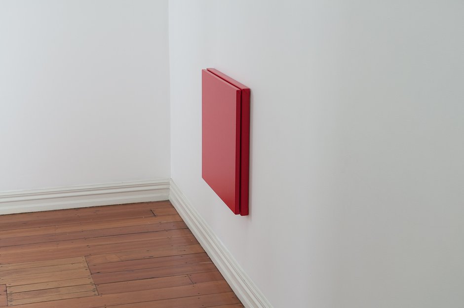
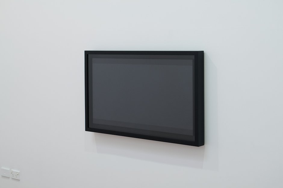
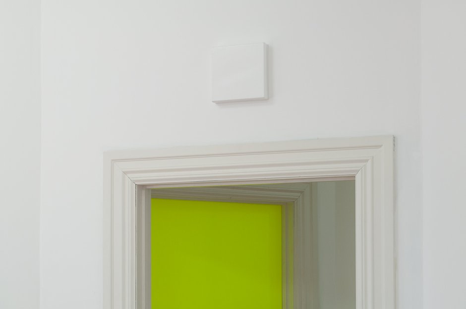
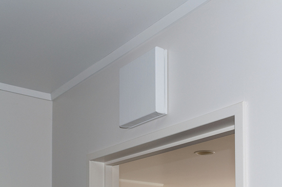
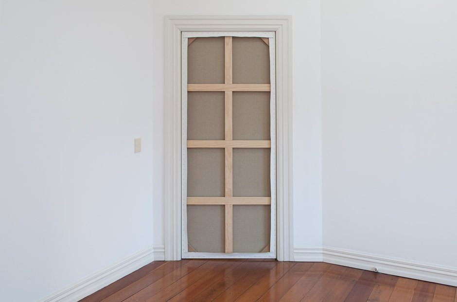
Matt Henry has had a few shows now at Starkwhite, presenting his distinctive variety of austere minimalist sculpture and painting that plays on its similarity to appliances or architectural fittings in the office or home. The impeccably finished works of earlier exhibitions could get mistaken for solid state heaters, flat screens or stereo speakers, and in this new presentation, they likewise might be confused with fire hose cases, fuse-boxes, screens, and office dividers. That sort of ambiguous mayhem is their function - that is what they are meant to do. Be art that pretends (in a quick glance) to be domestically or commercially useful and technologically advanced.
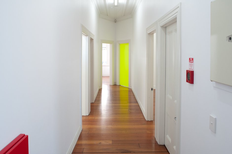
Last year he had a very elegant display in the big downstairs space, where each item was fastidiously (and innovatively) positioned. The current show is spread throughout the upstairs Starkwhite gallery rooms, each space having its own unpredictable but discreet Henry addition - as if augmenting some mysterious policy set out by Osh requiring certain box-shaped fittings.
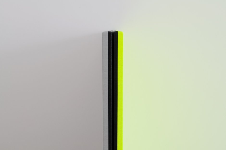
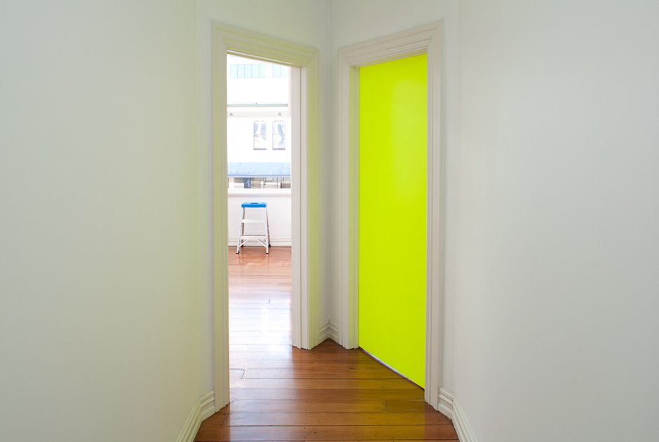
Then there is the colour. Henry loves sizzlingly hot fluorescent colour that is juxtaposed with black and grey. He likes those eye-ball scorching hues that insist on maximum attention, that make you want to dunk your squinting head in a bucket of water.
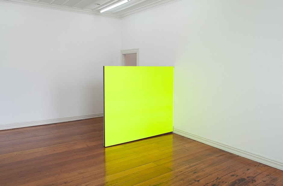
Henry with these (and earlier) works is combining contrived invisibility with cultivated exhibitionism. Intro- and extra-version seamlessly blended. Taking a form of camouflage that merges with the local architectural context, and mixing it with an attention-seeking raucous shriek. These colours, especially the transparent yellows in the current show - though encased within anonymous grey box trays or framing doorways - reflect off the adjacent walls, impose themselves onto those surfaces, and dominate them.
One of the other paintings, like the others by itself in a side room, avoids garish colour, being limited entirely to blacks and greys, yet it seems to be related. As an object it plays with a fake shadow (with parallel dark strips on the front panel’s top and bottom) and the effects of imagined local lighting, exerting another form of control over the ambience of the room.
If this installation has a weakness it is the method Henry has created to allow access to one room one of his yellow paintings has blocked the doorway of. He wants you to see the back of the work, its cedar-wood stretcher (its physical ‘paintingness’) and so you have to get in through a K’ Rd window.
To get to that upstairs window you need to clamber out of the window of the room next door and walk across the veranda roof, using a stepladder he has bought (see slide #8) and wooden steps he has built. It is extremely awkward, especially bizarre seeing that the focus of the show is in making the artificial natural, in disguising the contrived so it feels contextually embedded and inevitable. You wander through this sophisticated, highly aesthetic, exhibition and suddenly you find yourself outside overlooking the noisy traffic and climbing up a ladder as if a child checking out a tree den. The mood is disrupted.
Despite this problem Matt Henry’s ambiguous paintings are always refreshing, and with their astounding technical slickness and clever allusions, invariably funny and thoughtful. An important show to visit.
John Hurrell
 Advertising in this column
 Two Rooms presents a program of residencies and projects
This Discussion has 0 comments.
Comment
Participate
Register to Participate.
Sign in
Sign in to an existing account.