John Hurrell – 9 July, 2011
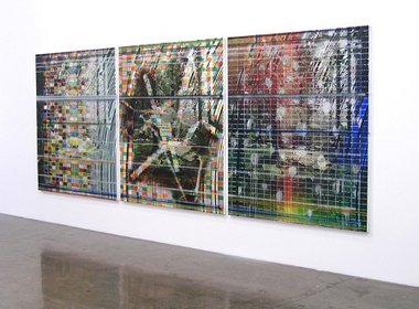
The artist challenges you to find the commonality that unites all three sections of Parks (the triptych), whilst also incorporating improvised gestural elements that stylistically separate them. They pull together and float apart, cohere and disintegrate, straining for and just attaining coherence.
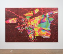
James Cousins is known for his complexly layered paintings that utilize densely zigzagging masked lines, with vaguely recognisable images appearing on top or partially peeking through underneath. This twitching angular (irregular) grid of thin acrylic, painted over in blurry oil and perhaps sprayed, has a frenetic shimmering effect: an odd sandwiching or melding of clashing imagery. It’s a bit like a lenticular sign, but not involving viewer movement and with the two aspects simultaneously observed.
Cousins has four paintings on show here, including a diptych and a particularly complicated triptych.
The triptych (Parks [Parks iv,iii,ii]) has a grid of small coloured rectangles on top of the angular grid. The three canvas components all have the same identical spikey masked relief, are all linked by three sets of onflowing sprayed horizontal lines, and also have the second layered rectangular grid.
The artist challenges you to find the commonality that unites all three sections, whilst also incorporating improvised gestural elements that stylistically separate them. They pull together and float apart, cohere and disintegrate. The uniting mechanisms are tenuously subtle, so there is this straining quality reaching for and just attaining coherence - one that is also aware of its vulnerable compositional limits.
His other three paintings are less visually busy, but nevertheless show Cousins’s obsession with surface, taunting the viewer to ponder over sequencing of layers: what is painted on, over and under - what has been stripped away in removed masking and what remains; what hovers physically in the middle of the painting process; what has been added last of all.
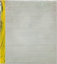
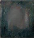
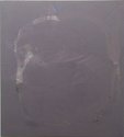
Sounds somewhat clinical and dryly abstract doesn’t it, but the smaller images are oddly emotional and often have a lopsided compositional tension - a sort of sliding plane. Calling has overtones of an incinerated or heavily rusted image, and Dune: Roy Lichtenstein fighting it out with Robert Ryman - intricate graphic detail beating off obliteration from an encroaching oily layer. In dramatic contrast, the blurry green lefthand panel of the Caught/Catch diptych has a decidedly Baconesque ambience, as if a moving head.
These are fascinating canvases dealing with different methods of paint application, all competing for control of the outer surface (marks and relief texture) and its attendant (but independent) pictorial depth. An excellent exhibition.
John Hurrell
 Two Rooms presents a program of residencies and projects
 Advertising in this column
This Discussion has 0 comments.
Comment
Participate
Register to Participate.
Sign in
Sign in to an existing account.