John Hurrell – 7 December, 2011
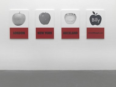
The four paintings follow the history of the apple as Apple's exhibitable image (a nominal self portrait) that in increments transforms the act of renaming into a legally registered marketing logo.
There you see them, four paintings in a row - a bunch of black and white photographs printed onto canvas, four sorts of apple, and below, the relevant referencing locations: all separated roughly into 4 decades. Originally shown two years ago as part of the two part Billy Apple survey at Witte de With in Rotterdam, this ‘quartet’ is currently being presented at Starkwhite on the forty-ninth anniversary of his birth. Celebrating not the birth of Barrie Bates, note, but the rejection - a time of transmutation, the creation of a new identity and artwork.
It’s a matrix, a sort of structuralist diagram showing the birth and growth of Billy Apple, an elementary rectangular grid with its horizontal and vertical movements. In 1962 when Bates was replaced by Apple, that walking/talking artwork/brand was eventually superseded first by an unregistered trademark - Billy AppleTM, 2007 (not found here, though a white and black version on paper is in the office) - and then again by a registered trademark, Billy Apple® in 2008.
The four paintings follow the history of the apple as Apple’s exhibitable image (a nominal self portrait) that in increments transforms the act of renaming into a legally registered marketing logo. Typical Apple works with their use of the Golden Ratio dividing each seemingly intact canvas into two separate parts, they show firstly on the left the unpainted bronze sculpture; then an apple as an idea, the fruit as a mentally considered trope waiting to be developed as a sign for an individual art practice; then the 1983 golden apple weighing 103.6 ounces (for sale at $85,000); then his logo and website.
So as a coding for an artistic self we see a photograph of the fruit, which when devoured curiously provides bodily sustenance by changing the eaten into the eater. Being above ‘New York’ it stands for the artist and the experimental gallery he set up there. It is flanked on one side by the bronze sculpture, the self referencing result of the artist’s practice and embodied idea, and on the other by the highly visible commercial transaction with gold (the publicity itself building up the brand).
At the other end of the row is the dematerialised Apple®, an image representing a legal declaration that has marketing, economic and economic ramifications for a company that might not necessarily require Billy Apple’s corporeal participation. Other people could be the CEO if the artist so decided - or if he himself were cloned as a genetic extension of his body, something he has been exploring in his practice.
What is interesting is the title: A History of the Brand. Not The History. It is one possibility out of several. Horizontally some of these images could be shuffled about. The fact that the four apples are black and white is mindful of the alternative possibilities for presenting documentation. B/w pointedly shows a certain kind of aesthetic restraint through not having colour, a link to a particular variety of publication. It self-consciously declares itself to be a mode of representation, thwarting transparency and spotlighting its own documenting activity, as do the stretchers of the paintings declare the presence of that medium with its historical context.
The composition of this ‘History’ seems to be formal rather than elucidating a narrative about the Apple art brand. The darker toned apples alternate with the lighter ones, whereas for a ‘Billy Apple story’ the fruit probably should appear on the far left, embodying a horticultural item before it’s converted into an art moniker. As for the registered brand, its significance is untapped - yet to be commercially developed in the global cyberspace stated by the url - but looking ahead.
John Hurrell

 Advertising in this column
 Two Rooms presents a program of residencies and projects


This Discussion has 0 comments.
Comment
Participate
Register to Participate.
Sign in
Sign in to an existing account.