John Hurrell – 30 April, 2012
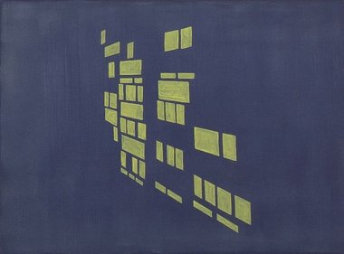
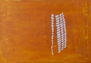
McIntyre's images express delight at the transient patterns of light (or lack of) found around or on tall modernist buildings in the city, usually bouncing off gridded panes of window glass or balconies. He uses these clusters of rectangles, rhomboids or lines to suggest the abruptly angled planar structures supporting them.
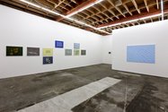
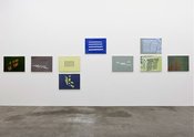
Artists looking closely at the physical properties of our environment and their impact on our senses (as perceived qualities) have become rarer in recent years. It is as if any interest in the mechanics of the viewer-artist’s body/brain were out of vogue for not contemplating the social, even though there is an argument that many aspects of perception are culturally inculcated. This Simon McIntyre show presents painting that examines the effects (or absence) of light, sometimes shining out of windows directly, or in the form of ubiquitous reflections and shadows found on glass, water or concrete - and how those configurations affect our eye and brain.
His images express delight at its transient patterns found around or on tall modernist buildings in the city, usually bouncing off gridded panes of window glass or balconies. McIntyre uses these clusters of rectangles, rhomboids or lines to suggest the abruptly angled planar structures supporting them.
Interestingly enough these shape-based images are derived from photographs, so they are in a sense, selected quotations from nature, though they look as if they could have been composed and constructed by the artist, one element cumulatively added at a time, bit by bit. In reality they tend to be blocks or groups of patterned shapes - complete entities unto themselves - extending along walls, around corners or over the ground - and with the spatial relationships in between carefully attended to.
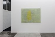
McIntyre has made these images tenderly with thin mottled paint that avoids any suggestion of the industrial. The bright configurations and sombre backgrounds are organic with their use of granular pools of watery acrylic. There is no severely clinical finish with crisp edges - for the underlying fields often have parallel horizontal lines created by the soft bristles of large house painting brushes. The result is a background foil for the compressed and dense formations placed on top.
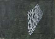
Some of the configurations are mysterious. They look like shadows, perhaps from curled cones of plastic netting, or solarised photographs of stone towers or walls. The line itself looks blobby, a little like a high contrast photocopy.
It is the tension between thin paint application and imposed spatial formations that give these sensitively tactile works their appeal. They celebrate manual restraint in their crafting of illusory form, while insisting on a thinking eye that analyses the two sandwiched layers of painted space. This leads the way towards competing evocative associations in both figure and ground.
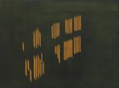
This artist’s paintings also intrigue because with their dark background tones they look like film noir movie stills: shots of a city at night - say by the waterfront. In fact some of the more gestural clusters of vertical lines seem abstract, so much so as to appear like polished versions of Len Lye scratch films, his turning and twisting sets of marks hovering in black space.
McIntyre’s approach is a little like Simon Morris’ in its love of thin colour and paint’s behaviour when applied with certain brushes. However his images are not process driven or preoccupied with time, and more about perspectival depth in pictorial space; how we move through the world observing patterns of light and darkness within the city that gives us work and shelter.
John Hurrell
Recent Comments
Roger Boyce
re. "-avoid the vitriol." 1.)Aieeee Rama cobra-snake (is for the less superannuated) a line from Andy's Gang (a 1950s kid ...
John Hurrell
Gentlemen, let's tone down the personal stuff and stick to the issues being looked at. On this site a certain ...
Owen Pratt
What does an egg sound like?
 Advertising in this column
 Two Rooms presents a program of residencies and projects
This Discussion has 23 comments.
Comment
Owen Pratt, 10:35 a.m. 30 April, 2012 #
so is McIntyre looking and painting or working from photographs?
I like the way the works are recontextualised by being shown at Melville's gallery, it makes me interpret these works as urban dreamtime.
John Hurrell, 10:54 a.m. 30 April, 2012 #
I think, Owen, he looks, discovers, photographs and then paints. Sometimes he uses the same configuration on differently proportioned canvases, creating a different spatial context around the edges.
Andrew Paul Wood, 3:59 p.m. 30 April, 2012 #
Puts me in mind of Michael Morley
John Hurrell, 4:25 p.m. 30 April, 2012 #
Which works of Michael's are you thinking of, Andrew?
Andrew Paul Wood, 1:08 a.m. 1 May, 2012 #
The turntable and architectural paintings especially - though of course these works are in the abstract and those were more "bad painting" figurative.
John Hurrell, 10:17 p.m. 1 May, 2012 #
Well the difference is not just subject matter, Andrew, it is paint surface quality - esp as Michael uses oil and the two Simons use watered down acrylic. Shiny/greasy/streaky versus flat/matt/dull.
Andrew Paul Wood, 1:29 a.m. 2 May, 2012 #
Compositionally, however, we are dealing with similarly crudely delineated orthogonals and grids rendered in a similarly grubby palette.
Roy Good, 9:25 p.m. 10 May, 2012 #
Hi Andrew, to me McIntyre's new work deploys a technique of extrapolating natural graphic images into formal abstractions pioneered by Elsworth Kelly in the 40's & 50's - his drawing & recording of urban Paris lead to his later more minimal work.
John Hurrell, 9:45 p.m. 10 May, 2012 #
Kelly wasn't interested in photography much as a tool was he, Roy? Mainly linear drawing of plants, windows, Parisian bridges etc. With McIntyre the mediation of photography seems crucial as a tool in his exploration of plane and shape.
Owen Pratt, 9:39 a.m. 11 May, 2012 #
John. How do you know Simon uses photography? Is it an interpretation of the paintings or from text or talking to the artist. If it is the former, which is where this observation carries most weight, do you think it transcends being a mechanical device for the construction an image, like say a camera lucida or a manual version of photoshop?
Is this a strategy to make the image redundant and force the issue of paint quality; which has been described here in less than glowing terms? Does this work occupy the space allocated to end game painting, or does it offer something more optimistic and progressive?
John Hurrell, 10:01 a.m. 11 May, 2012 #
It is stated in the written contextual material provided by the gallery. And Tim M talks about it. My impression is it is an aid. Like a working drawing.
I think the paint quality is terrific.Andrew is peculiar about it but he has never seen the work which is certainly not undermined by a camera being part of the process.
Andrew Paul Wood, 4:58 p.m. 11 May, 2012 #
John - I don't see "grubby" as particularly pejorative in the context of art any more than "abject" is. An anti-aesthetic is still an aesthetic.
Owen Pratt, 5:56 p.m. 11 May, 2012 #
Andrew, where do you think Simon's work sits in the pantheon of art, if you see his paint as an 'anti-aesthetic', and he employs reproductive technology to distance himself from the reality of his subject?
Andrew Paul Wood, 7:55 p.m. 13 May, 2012 #
It's fairly standard PoMo - perhaps a comparison could be made with recent Saskia Leek works
John Hurrell, 4:27 a.m. 2 May, 2012 #
"Grubby", eh? Not a good choice of words.
Andrew Paul Wood, 7:13 p.m. 2 May, 2012 #
"When I use a word," Humpty Dumpty said in rather a scornful tone. "It means just what I choose it to mean - neither more or less."
"The question is," said Alice, "whether you can make words mean so many different things."
"The question is," said Humpty Dumpty, "which is to be master - that's all."
Owen Pratt, 8:44 a.m. 3 May, 2012 #
The word is half his that speaks and half his that hears it. — Montaigne, Essays III.xiii.
John Hurrell, 10:09 p.m. 11 May, 2012 #
It's a strange question Owen. Isn't a pencil drawing reproductive technology and doesn't all art distance itself from the 'reality' of its subject?
Owen Pratt, 9:08 a.m. 14 May, 2012 #
I agree that a pencil is a reproductive tool, John but take issue that this distances the artist, or viewer from reality. I like to think that an artist is at least attempting to get under the surface of realty by skilfully employing their media and bringing the viewer of the art to a closer understanding of this objective reality.
Roger Boyce, 2:15 p.m. 14 May, 2012 #
AIIiieee Rama-Pratt, cobra-snake. What's this "objective reality" you allude to? And "-under the surface of reality-" neo-Platonism (or should I say Emersonian transcendentalism)??? May I suggest Susan Sontag's Against Interpretation...with out sounding like an egg?
Bunkum.
It's hard enough making a visually effective thing without attempting the route while bearing up under a half-assed backpack filled with perennial philosophies (see Aldous Huxley for fully illustrated trail-map).
By the way - the window-derived abstractions are less like Kelly and Morley than (say) Alex Katz's reductionist abstractions of nose-bleed high, illuminated, nighttime, office windows along Hudson Street (NYC). Alex used a paint application that's akin to the works under discussion....as well.
Coda: All's well that ends well.
Owen Pratt, 6:45 p.m. 14 May, 2012 #
What does an egg sound like?
John Hurrell, 8:02 a.m. 15 May, 2012 #
Gentlemen, let's tone down the personal stuff and stick to the issues being looked at. On this site a certain amount of abrasive banter is to be expected (I don't want it to be like Sunday school) but avoid the vitriol.
Roger Boyce, 10:48 a.m. 15 May, 2012 #
re. "-avoid the vitriol."
1.)Aieeee Rama cobra-snake (is for the less superannuated) a line from Andy's Gang (a 1950s kid show) wherein the 'jungle boy' warns Rama of a nearby cobra. My use of the term referred to an idea rather than a person.The conflation of Pratt and Rama infers kinship rather than animosity.
2.)The Kiwi-ism 'egg' referred to myself.
3.)"Bunkum - refers to neo-platonic ideas that perennially infect the artworld as does soft-headed neo-Emersonian transcendentalism.
4.) "-half-assed backpack-" refers to ideas not persons. Perennial Philosophy refers to Huxley's book which chock full of such universalist ideas.
5.) "nose-bleed" refers to altitude....in this case upper-story windows.
6.) "All's well that ends well." is a coda employed to sooth citizens of these gentle isles who, at times, take robust, irreverent critique as personal attack.
Mea Culpa
Coda II
One day, a young boy and his little brother were playing in the living room with their new pet puppy, while the mother was in the kitchen preparing lunch for them. Suddenly, she heard a loud crash from the living room. Rushing into the room, there she saw a lamp on the floor broken into a hundred pieces. Turning to the young boy, the oldest, she asked, “What happened? Did you break the lamp?” Immediately the young boy replied, “Not me, it was him! It’s his fault” pointing a finger at his little brother. The mother turned to the littlest boy asking “Did you do that?” “No, it was him. He made me do it!” the little boy said pointing to the puppy. Now the mother was faced with a dilemma as to whose fault it was, and who should be punished. So she decided to punish both of them and send them to their rooms for the rest of the day.
- Anon
Participate
Register to Participate.
Sign in
Sign in to an existing account.