John Hurrell – 5 June, 2012
The floating quality of the gleaming marker line worries me: its refusal to sink into the background of trickling and deliciously smeared paint. It is a repudiation of all the great qualities so apparent in the earlier painting, an espousal of an illustrative and narrative sensibility where nuanced manual manipulation is rejected and coded literal signifiers like rainwater and written (but not drawn) alphabet-like glyphs embraced.
Nice title here, a witty way of comparing two large paintings twenty years apart - from 1992 and this year. There are seven other much smaller works (also two lithographs the same ten years apart), but the emphasis is on Twilight of the Idols and Kepler’s Dream. With them comes an informative Laurence Simmons essay that is great for conversation, but which is in my view devoid of pertinent observations about the material properties of the work.
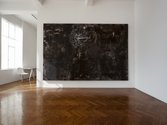
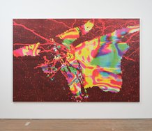
The earlier painting, Twilight of the Idols, named by Reynolds after Friedrich Nietzsche’s last book (written just prior to his Turin breakdown) is a stunning deep umber work - with hints of early Winters-influenced Shane Cotton. Turbulent, moody and dense with detail, it is packed with inventive drawing placed over churning paintwork that occasionally renders staves and musical clefts. The linear marks in oil stick and pencil vary in colour intensity and thickness according to manual pressure. The resulting sensitively rendered drawings of a chrysanthemum (referencing Mondrian and McCahon) and Leonardoesque whirlpool dominate, their elegantly made lines being tonally absorbed into the fluid paintwork, and also optically emerging from it. These elements, while disparate in origin, still end up presenting Reynolds as a focussed united Self, like say Bob Dylan and the appropriations within his songs. (Simmons claims Reynolds in this work presents many voices. I’m not persuaded. He obliterates difference.)
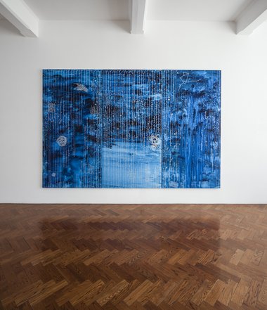
Kepler’s Dream (referencing the 17th century astronomer Johannes Kepler and NASA spacecraft/telescopes) is typical of the large works Reynolds has been making in recent years - and quite different from Twilight. Using thin Prussian blue and rainwater and vertical strings of ciphers that could be digital codes, he presents sign systems, not renderings. Enigmatic enamel glyphs are drawn in a metallic silver line that never varies in thickness or tone. It hovers over the thin blue paint and never sinks into it, a floating reflective veil of dashes, hooks and dots, like a bead curtain onto which are fastened quotations from the Book of Kells, some starry constellations, knots and rectangular geometric forms.
The floating quality of the gleaming marker line worries me: its refusal to sink into the background of trickling and deliciously smeared paint. It is a repudiation of all the great qualities so apparent in the earlier painting, an espousal of an illustrative and narrative sensibility where nuanced manual manipulation is rejected and coded signifiers like rainwater, and written (but not drawn) alphabet-like glyphs embraced. Storytelling symbolism has replaced optical tactility, overmediated codification blocking off painterly sensuality.
In the same show are a number of sculptures, where small paintings are stacked up under large bell jars, glass containers popularised in the nineties by performance artist/sculptor Andrew Drummond. Reynolds’ variation has a handle on its top so it can be lifted like a deep lid for protecting cheese.
One work Astronomia Nova has a canvas with curved silver lines that seems to allude to the edge of the universe. With it are two bronze vessels that have an Anslem Kiefer feel. Another Somnium, named after Kepler’s last manuscript, contains a stack of twelve small canvases, while Diptych (Kepler & Nietzsche) has two canvases and two black wine glasses that visually hide their liquid contents from the taster, extolling the virtues of intellectual courage and risk, and the vulnerable possibility of failure.
John Hurrell
Recent Comments
Tim Nees
Why thank you John. Literal, yes, fine. JR has always been a very sensual/sensory bodily painter and I don't see ...
John Hurrell
Crikey Tim, that's a very literal interpretation of his use of silver marker. A clever angle. Remember though he has ...
Tim Nees
Interesting to feel what may be a breath of optimism in the later work. Perhaps that explains the silver marker ...



 Advertising in this column
 Two Rooms presents a program of residencies and projects
This Discussion has 5 comments.
Comment
Andrew Paul Wood, 7:19 p.m. 5 June, 2012 #
I like that he's brought the painterliness back int his work. I loathed most of the doodly and superficial text stuff that he'd he'd been doing for the last decade or so.
I notice he's still tending to give his works somewhat pretentious titles as if to give them some sort of intellectual lustre that they really don't need. Twilight of the Idols seems to me a bit like Peter James Smith doing the well-known vertical code from the Matrix movies - Professor SMith meets Mr Smith perchance. Really nice painting.
John Hurrell, 9:09 p.m. 5 June, 2012 #
Well yes and no. It is painterliness without the integrated drawing worked in. The silver lines float in front.
Tim Nees, 5:59 p.m. 11 June, 2012 #
Interesting to feel what may be a breath of optimism in the later work. Perhaps that explains the silver marker - it's not sinking in, its lifting off, escaping. I may have thought there is more reason to feel dark in this day and age, although the early nineties were pretty dire as well, a ground down-ness we worked through. Nevertheless, 2 very involving paintings, and the painterliness, JR's skill at depth of field, still has the ability to capture us whether he's pulling in or lifting off.
John Hurrell, 6:36 p.m. 11 June, 2012 #
Crikey Tim, that's a very literal interpretation of his use of silver marker. A clever angle. Remember though he has been using it for some time now, starting with the small stackable canvases of texts from about 6 years ago. Actually longer I think. I remember a massive wall drawing he did in the old AAG -taking up the whole room.
Tim Nees, 7:01 p.m. 11 June, 2012 #
Why thank you John. Literal, yes, fine. JR has always been a very sensual/sensory bodily painter and I don't see anything wrong with that. I never saw the wall work you mention but I'm sure it was impressive. I see his use of silver as an extension of the tension that has always been present in his work (worked and unworked, beautiful and not beautiful, sink and float) between the surface and the support. And, usually in the more painterly pieces which APW harks back to, the rising or sinking of many surfaces. Silver's mercurially slipping around on top.
Participate
Register to Participate.
Sign in
Sign in to an existing account.