John Hurrell – 4 September, 2012
The balls look like colliding atoms, astral spheres, or propelled cannonballs that confuse because the tones of their sombre green, red or grey colours often lock into the picture plane behind unfocussed globes instead of floating in front of it - as they would if more saturated. Their abruptly varied sizes, like the unpredictable degrees of unfocussed edge, create ambiguities in interpreting spatial depth.
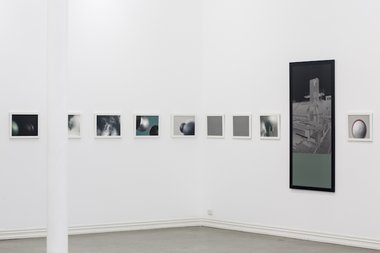
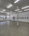
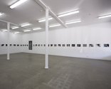
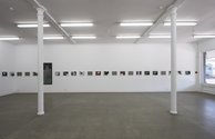
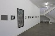
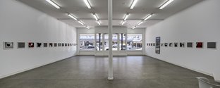
Gavin Hipkins is much admired for his knack of combining cerebral themes (like the unhomely) with a pleasurable sensuality, an inventive retinality and flair for compositional nuance. And like a couple of his earlier exhibitions using banners and photographs, this downstairs Starkwhite show is an orchestrated installation of photographic images running as a frieze along two long walls.
17 of the 41 images seem at first glance to be billiard balls but it doesn’t take too long to see that there are several sizes and that they are not perfect but made of roughly shaped, painted polystyrene. These have been photographed with different focal lengths and coloured backgrounds, carefully playing off blurry edge against sharp curve, level planar support versus airborne - often with a wit that suggests unexpected objects like eyeballs.
Interspersed with these images of spheres are 10 grey-brown monochromes (the same sized landscape rectangle), deliberately ‘blank’ intervals that create a contrast to the sequence of manipulated balls - and a dozen photos of wispy clouds are also scattered among them.
Plus there are two much larger vertical images, one of the Berlin Olympics diving board and the other of some native ferns, with a third of their height occupied by a grey monochrome: one at the top, the other at the bottom. These act as a foil to the carefully organised horizontal tensions running along the wall.
The balls look like colliding atoms, astral spheres, or propelled cannonballs that confuse because the tones of their sombre green, red or grey colours often lock into the picture plane behind unfocussed globes instead of floating in front of it - as they would if more saturated. Their abruptly varied sizes, like the unpredictable degrees of unfocussed edge, create ambiguities in interpreting spatial depth, while the two large vertical images introduce references to history and landscape, mingling with the ‘atomic’ spheres in the manner of the adjacent thin gaseous clouds nearby. The photos link up to make a strange horizontal frame with an empty centre, an imaginary sculptural armature that lines the perimeters of the gallery.
Upstairs is another exhibition by Hipkins, this time with the jeweller Karl Fritsch, in one of the small rooms near the staircase. The two artists are a well-considered combination, Hipkins seeming so considered and thought-out, Fritsch so impulsive and spontaneous.
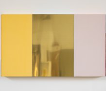
Their four wall works are collaborations where Hipkins has gone through his extensive archive and picked out figurative images for the ringmaker to work on. The photographs are dark and sombre, tonally restricted with little contrast, so they require careful looking to see what properties attracted Hipkins to them in the first place.
Then there is Fritsch’s response. He has had Hipkins’ images, in most cases, mounted onto aluminium sheets. Some of these such as one of a hippie girl holding a bone hash pipe, he has gouged into and scraped away the surface of the paper image exposing the metal beneath.
On another of a stone German eagle he has poured a soupy puddle of resin into which is embedded chunks of green chrysoprase and seedlike specks of black quartz. Into the photo of the hashish smoker he has inserted some lolly-coloured ersatz gemstones, and over a third image of a sculptured cubist head, there is a scattered cluster of fake diamonds. They seem fired into the photo like buckshot. The fourth work, an image of a raw and weathered piece of scallop-patterned iron sculpture, has a knobbly part of a branch - painted in aluminium - protruding out like an animal’s rump.
These shows use photography to expand the notion of sculpture pushing out from the wall - a frieze that becomes a kind of wraparound girder - while upstairs, gemstones explore what drawing with specks of reflected light in front of photographs might be. One exploits tropes for culture/history and nature mixed with spatial extension, the other light bursting out of the picture plane surface. Both shows are excellent but the upstairs collaboration is particularly innovative. A real treat.
John Hurrell


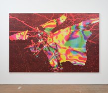
![Gavin Hipkins, Second Pavilion, 2012 [detail]; Karl Fritsch and Gavin Hipkins: Der Tiefenglanz (Zirkonia), 2012 [detail]](/media/thumbs/uploads/2012_09/cid_3427535487_270959_png_380x125_q85.jpg)
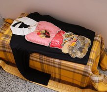
![Gavin Hipkins and Karl Fritsch, Der Tiefenglanz II. Installation view. Der Tiefenglanz (Cubist Bust), 2012 [left image] Der Tiefenglanz (Zirkonia), 2012 [right image]](/media/thumbs/uploads/2012_09/_MG_6362_jpg_380x125_q85.jpg)


 Advertising in this column
 Two Rooms presents a program of residencies and projects
This Discussion has 0 comments.
Comment
Participate
Register to Participate.
Sign in
Sign in to an existing account.