John Hurrell – 15 November, 2012
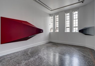
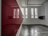
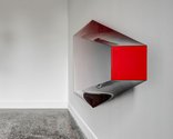
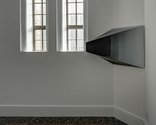
On entering the room, your first instincts are to approach the lefthand corner, to stand between the two undulating and very reflective sculptures and study the impact of the white walls around them as they cloud the outside planes. The curved surfaces are tonally modulated so that dark grey merges into the large red form and white into the smaller grey one. The cross-sectioned squares are a hot red and piercing white respectively.
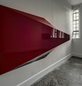
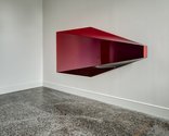
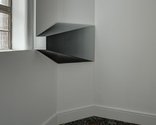
They look like distorted horns, two red and grey anamorphic pyramids that have been pushed over to one side - their tips cut off to leave squares in cross-section. Impeccably finished in their sprayed-on coats of hi-gloss lacquer, these strangely oblique, stretched out forms - flush on two adjacent walls in the smallest Gus Fisher gallery, and with windows in between - are the crucial ingredients of Sarah Munro’s unusual site specific installation.
On entering the room, your first instincts are to approach the lefthand corner, to stand between the two undulating and very reflective sculptures and study the impact of the white walls around them as they cloud the outside planes. The curved surfaces are tonally modulated so that shadowy dark grey merges into the large red form and snowy white into the smaller grey one. The cross-sectioned squares are a hot red and piercing white respectively.
The big crimson form slowly swings out away from the wall, while the grey sculpture - because it is fixed to a tilted plane that subtly angles out from the vector-line of the windows - swings back towards the wall. The angular streamlined shapes, that look a little like giant pen nibs, seem to reference art history and great speed, the end squares seeming to be new paintings that have tailing slip streams sprinting behind - referring to themselves as a innovative breed of painting.
Munro’s works are like crystals that have morphed out of racing cars, strange intrusive forms that have incongruously sprouted out of the Gus Fisher walls. They work best when you stand in a position near the windows that allows the mirrored architecture to dominate, smothering the crisp surfaces so that the gloss lets their masses lose their shape. That way the saturated colours are downplayed. We see dematerialisation via reflection.
John Hurrell
 Two Rooms presents a program of residencies and projects
 Advertising in this column
This Discussion has 0 comments.
Comment
Participate
Register to Participate.
Sign in
Sign in to an existing account.