John Hurrell – 4 March, 2014
It's an amazing notion, the idea of the stretcher ‘doing the painting', making its internal marks. It is not only extraordinarily clever to work behind the front of an image, but the traces in these objects have a spooky quality. There is something slightly disturbing about their smudgy emanations. It could almost be a send up of worshipful art believers and their little ‘Shrouds of Turin'. Cheeky. Almost blasphemous.
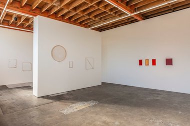
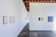
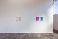
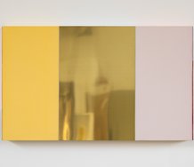
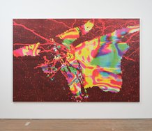
In this varied assortment of differently produced ‘system’ paintings, Johl Dwyer mixes on the gallery walls his trademark plaster-stretcherwood oil works (filling the stretcher from behind so that the wood oils are sucked out to leave smoky stains in the hardened chalk) with other innovative methods. These include: mixing dye into the plaster; applying thin saturated colour or thicker resin over the front and sometimes sanding back; putting ‘framing’ metallic leaf around the thin planes on the side so they reflect the colours of the wall; coating the front and sides with hi-gloss enamel so they look like whiteware or a car bonnet; or soaking assembled wooden stretchers in water and letting them ‘paint’ by placing them on watercolour paper.
The plain plaster works still seem to be the most successful, especially the large round ones (they’re less twee than the small vertical rectangles) and the new variety of seeping diagonal struts, or shaped stretchers where added corners project inwards. It’s an amazing notion, the idea of the stretcher ‘doing the painting’, making its internal marks. It is not only extraordinarily clever to work behind the front of an image, but the traces in these objects have a vaguely spooky quality. There is something slightly disturbing about their smudgy emanations. It could almost be a built-in send up of worshipful art believers and their little ‘Shrouds of Turin’. Cheeky. Almost blasphemous.
Then there is the other approach of drawing a shape to ‘contain’ the painting, where precalculated edge, the peripheral contour, produces a linear enhancement quite different from say Ellsworth Kelly where the intense shaped monochrome makes an in/out optical flicker. Here the internal dynamics of the stains in plaster and the outer borders, work intimately with the supporting white wall, not competing. There is no pulse and the painting is an extension of that wall.
Dwyer is ‘drawing’ in a way that has parallels with the way that Pip Culbert creates her de-centred fabric ‘seams’ work that she pins to the wall. Not only does he draw out oil from the grain of the normally unacknowledged stretcher wood, showcasing the borders, but the resulting ‘shadows’ are like shadows in the usual sense - they exploit a physical correlation, an echoing perimeter, a companionable but ghostly match.
In comparison, the coloured works with the pressed on raggety gold or silver leaf frames suffer from being too cute, apart from a few with a vague Clyfford Still fir tree ambiance. The colour is punchy for sure, but it is undermined by the small scale, and though the sanded back leaf does leave interesting residues in the frame grooves, the torn borders surrounding the front plane are too distracting.
Nevertheless this is an excellent show for seeing how the extraordinarily inventive Dwyer tries out different procedures for image making. Though some approaches have more ‘legs’ than others (a few don’t take off as procedures), he’s a remarkable talent - and though I sort of just have, he’s never to be underestimated.
John Hurrell





 Two Rooms presents a program of residencies and projects
 Advertising in this column
This Discussion has 0 comments.
Comment
Participate
Register to Participate.
Sign in
Sign in to an existing account.