John Hurrell – 3 March, 2014
With the two larger rectangular works, the combinations of 2 x 3 squares, with overlapping (not butted together) strips are complicated, particularly in the vertical and horizontal slivers between the dominant blocks of colour. There sections of mostly hidden coloured bars play peekaboo in the skinny interstices, for the most recently attached strips of colour are closest to the viewer and the covering glass.
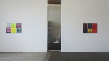
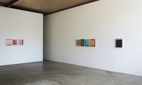
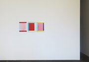
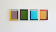
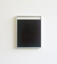
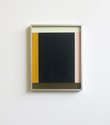
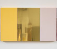
The six works here from this world famous colourist feature cut strips of hand painted paper, meticulously arranged, stuck down, and framed with aluminium under glass. Two are single panels where a central sheet is ‘framed’ by strips at its edges, two are rectangular panels with compositions of 2 horizontal rows of 3 squares, another is 3 separate panels of lush colour arranged in a row, and the last is 4 positioned side by side. These works on paper are quite different from the larger more intensely coloured projecting works on metal and plywood Knoebel is well known for.
Knoebel is experienced at juxtaposing unusual colour combinations and tonal contrasts, calculating their effects just perfectly. The thinness of the paint, the direction of the dragged brush, the finely tuned saturation, the concise placement and the thickness and weight of the paper; they all play a role.
With the two larger rectangular works, the combinations of 2 x 3 squares, with overlapping (not butted together) strips are complicated, particularly in the vertical and horizontal slivers between the dominant blocks of colour. There sections of mostly hidden coloured bars play peekaboo in the skinny interstices, for the most recently attached strips of colour are closest to the viewer and the covering glass. And if you look closely at the brushed on application of thin acrylic, you’ll see Knoebel has varied manual approaches, for sometimes he switches direction. The gain changes emphasis.
The three types of composition here you have to visually investigate in three different ways. With the large rectangles and their six divisions, you compare the crisscrossing bands of colour and their backgrounds, and the intricate borders that separate the units. With the two sequential works, you examine the tensions between the butted together borders, and across them over the gap on the wall. Some opposite bands have the same hue, others the same tone, or the matching chromas are adjacent, touching at right-angles. Your eye jumps along the series, to and froing between comparable glassed over oblongs, seeking palpable relationships.
Finally with the single panel works you examine the relationships only inside the metal frames, pondering each hovering block of colour and tilting implied by the tonal pressures top and bottom, or twisting from the strips on the sides - and the suggestion the plane might vertically slide towards where it is least tonally anchored.
Be it thin or dense - either way Knoebel sure knows how to make paint colour sing through contextual placement, and shape become spatially ambiguous. Position and surroundings (the Bauhaus values of Itten and Albers) are the key.
John Hurrell
 Two Rooms presents a program of residencies and projects
 Advertising in this column
This Discussion has 0 comments.
Comment
Participate
Register to Participate.
Sign in
Sign in to an existing account.