John Hurrell – 14 July, 2014
“A use, a using, a going into or through, or into and through, a metronome - or it is one. And as it moves….” Here we experience language and its subtle intonation through careful listening: tiny vocal stresses and accelerations, small calculated shifts in emotional temperature, the sharpening or softening of a spoken syllable amid stretched out and repeated syntax, with contradictory and undermining phrases slyly introduced. Created in this case, expressly for (and only for) a determined space.
This is Ruth Buchanan‘s third show at Hopkinson Mossman, and it is slightly different from her previous exhibitions. This is because firstly, the adjacent smaller gallery is now occupied by a sympathetic work by another artist (Ayşe Erkmen) and secondly, there are no curtains or vitrines, items which were almost becoming a trademark. It has a slightly different feel, even though the sound work, Looking as,or is, Metronome, as a prose poem reminiscent of Gertrude Stein and Lawrence Weiner, has some auditory phrases originally used in No Solitary Beat (2013) and uses a syntactical structure similar to Intractable (the ‘no fingerlicking’ poster from 2010-11).
The most salient feature is that she has taken the interest in grids apparent in The History of The Room (2013) and expanded it with three large freestanding screens. Those three screens, as a walk through installation, refer to collection storage mechanisms and the mesh racks on rails on which an institution’s acquired paintings are suspended. They are numbered in sequence (Screen: 1, Screen: 2, Screen: 3) and six artworks are hung on them in reverse numerical series (three framed watercolours stating the title of the nearby sound work; two framed ‘blank’ screenprints; one framed photograph that seems to be taken out of the artist’s studio window). The works on the racks appear to be a comment on institutional collection processes, their ontological transition (via their journey from studio to museum, the subsequent art historical legitimisation and its added conceptual layering), as well as about contextualising components of an artist’s corpus by looking ‘through’ them to ponder other works - like overlapping screens.
Buchanan’s aural work, Looking as, or is, Metronome, 2014, is a five and a half minute long loop that presents a series of carefully enunciated phrases that with a clipped, ‘erudite’ female voice self-reflexively explore cadence, using transmitted sound as sculpture: the spoken words - and the interior of the particular room where they are encountered - as sculpture.
“A use, a using, a going into or through, or into and through, a metronome - or it is one. And as it moves….” Here we experience language and its subtle intonation through careful listening: tiny vocal stresses and accelerations, small calculated shifts in emotional temperature, the sharpening or softening of a spoken syllable amid stretched out and repeated syntax, with contradictory and undermining phrases slyly introduced. Created in this case, expressly for (and only for) a determined space.
Furthermore, Buchanan’s mode of writing (if in published format) is the sort of approach that writing teacher Gary Lutz calls ‘page-hugging’ where you slowly savour each sentence (as opposed to ‘page-turning’ where you are following a narrative). It is akin to the methods of prose stylists like Beckett and Stein, and is closer to non time-based disciplines like painting, particularly when not read aloud. The language covered page has repetitive formal properties where it could almost be an abstract canvas.
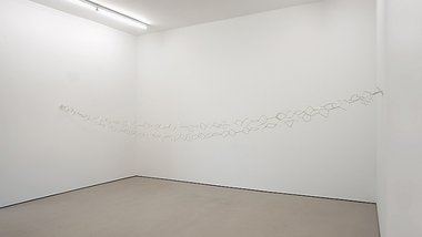
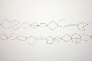
In the small gallery next door, Ayşe Erkmen has suspended between opposite walls another variety of loop, a chain of interlocking linear logos, all silver plated, and consisting of simple motifs such as wheels, scrolls, or stars. In Inform (2014) these very basic shapes could represent letters of the alphabet - there are about twenty, and the sequence of shapes seems to flow like that of a sentence, with certain forms being repeated - as in words. In fact when you study the chain with its two sides, the two drooping strands are identical, for one line has its linked components in the reversed order of the other. One is the flipped ‘shadow’ of the other.
This interest in cycles and self-contained systems is also reflected some of Erkmen’s other works, particularly Plan B (2011), where she installed in a Venice gallery a complicated system of pumps, pipes and filters that brought filthy water up from the adjacent canal, purified it and then returned it, or Easy Jet (2011), where taut bands of orange seat belt material were wrapped around, stretched between and horizontally woven through four thick pillars in a gallery space.
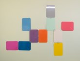
Erkmen also has a work on a wall in the Hopkinson Mossman office. Spring 2014 (2014) consists of ten powdercoated metal plates that are all connected by hinges either placed on the mid-point of one side of each rectangle or one corner. Theoretically all ten panels should fold up to form a tightly packed stack. The opened-out arrangement reveals that half the plates are hot in colour temperature, and half are cold. Seven are vertically aligned, with three horizontal. Five are hinged at the corners, four at the sides.
Spring 2014 looks like a large paint colour chart comically cut up and rearranged so that negative shapes are aesthetically exploited too. Each individual ‘fold out’ flap (some of which with their lopped off corners have a vaguely hexagonal appearance) can be enjoyed in its own right, as if a page in an educational child’s game, a diversion taken out to be explored from within somebody’s (a Brobdingnagian’s) back pocket. The title is also a pun on the yearly season (its colours) and the closing/opening nature of the configuration, a ‘springing’ forth - like the opening of a flower.
This is a cleverly organised show with the juxtaposition of these two artists. Their ‘loop’ and ‘page’ works provide fascinating parallels that can be methodically delved into, explored and mentally expanded.
John Hurrell
 Two Rooms presents a program of residencies and projects
 Advertising in this column
This Discussion has 0 comments.
Comment
Participate
Register to Participate.
Sign in
Sign in to an existing account.