

John Hurrell – 24 March, 2015
As a temporary architectural element within Te Tuhi's meticulously organised space, it is affected by diffuse natural light coming in the window and smudgy shade on the right from the building's unlit interior. When sunlight directly encroaches, the window struts generate diagonal shadows that fortuitously mimic the dramatic sweeping red/white slash that optically dominates.
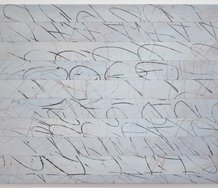
Auckland artist, Jessica Pearless, in this show presents a hard-edged painting on Te Tuhi’s Drawing Wall, her simple but dynamic design executed on that plane by a professional signwriter so that the edges and corners of the four interlocking shapes are fastidiously crisp and razor sharp. We see two right-angled triangles on the left contrasting with two horizontal rectangles on the right, the two variations within each shape being represented by two sorts of tonal value, an unstable ‘sliding’ juxtaposition alongside a much more balanced ‘stacking’.
There are two types of red and two types of white used here; one of each for each of the two shapes. One red (top triangle) is a hot orangey jaffa colour; the other (bottom oblong) a purplish sort of brown that contains metallic bronze pigment. Looking at the whites, one (bottom triangle) is your standard piercing stark white; the other (top oblong) a pale grey that is closer to white than mid-grey.
The position of the pale shapes (outside the darker forms in the middle) and their long edges seems crucial to the painting’s vibrating tension and equilibrium. They accentuate the two pale corners located at diagonally opposite positions on the elegantly bisected wall. While the harsh red triangle above the bright white dominates with its pristine hypotenuse, even colour application and jagged acute corners, its foil - the bronze bar - is dominated internally by soft vertical streaks below the subtly gentle slab of grey.
This fascinating, meticulous, formal construction - with its taut borders and converging corners - has great physical presence, a scale that resonates with the body and mind of the ‘tuned in’ standing observer. As a temporary architectural element within Te Tuhi’s meticulously organised space, it is affected by diffuse natural light coming in the window and smudgy shade on the right from the building’s unlit interior. When sunlight directly encroaches, the window struts generate diagonal shadows that fortuitously mimic the dramatic sweeping red/white slash that optically dominates. The wall becomes even more active - in this impressively exhilarating contribution from Pearless.
John Hurrell
 Advertising in this column
 Two Rooms presents a program of residencies and projects

This Discussion has 0 comments.
Comment
Participate
Register to Participate.
Sign in
Sign in to an existing account.