John Hurrell – 12 June, 2015
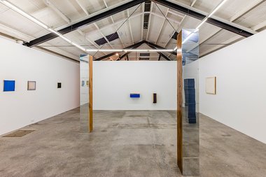
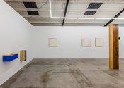
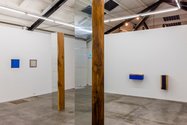
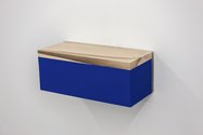
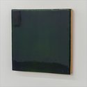
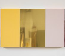
Dwyer's Judd-like projecting wall boxes and freestanding classical obelisks seem to have evolved out of his earlier experiments with gold and silver leaf on the outside of the stretcher frame - and using dark blue centres. From some angles, the tall columns emphasise stacked modular units, as if waving to Carl Andre, with their shiny aluminium sides alluding to the metallic paint. The wall reliefs salute Judd, in spite of being solid and heavy with their stained timber, and being solo.
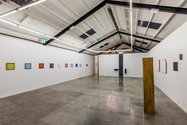
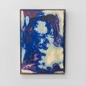
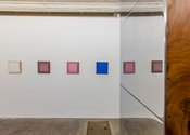
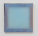
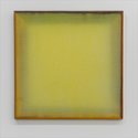
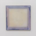
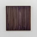
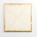
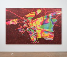
In this exhibition of paintings, freestanding sculpture, and projecting wall reliefs, Johl Dwyer continues his research into different supports and surfaces, inventively discovering ways where one can affect the other. Invariably he has included some large versions of the plaster paintings he is known for, those intriguing works where oils from the supporting stretcher bars stain with smudgy streaks the plaster that provides the front surface; we see ghostly shadows of the hidden armatures.
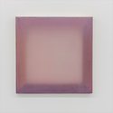
Dwyer has more recently extended this idea by pouring resin into the four-sided stretcher so that instead of osmotically transferred traces, we see the actual wooden batons in the tinted translucent murk. He has also mixed plaster with resin so that the two different processes (and substances) are combined directly, or else layered the plaster so it is placed behind or in front of the resin: two varieties of ‘presence‘ - direct and indirect - variously blended.
Then there is the front surface, and what material the resin or plaster (or mixture) is resting upon, while setting when horizontally flat. The textural consequences of that and what sticks. What colour is embedded through this process and does sanding or scraping occur afterward? Or is plaster added to the front surface and gouged back, or then glossed or painted over?
Dwyer’s Judd-like projecting wall boxes and freestanding classical obelisks seem to have evolved out of his earlier experiments with gold and silver leaf on the outside of the stretcher frame - and using dark blue centres. From some angles, the tall columns emphasise stacked modular units, as if waving to Carl Andre (but vertical like Brancusi), with their shiny aluminium sides alluding to the metallic paint. The wall reliefs salute Judd, in spite of being solid and heavy with their stained timber (not hollow and light), and being solo - not in groups.
It is interesting to see Dwyer make this sculpture because with its heavy wood and imposing height, it is such a contrast to the more ethereal and delicate paintings. Oddly, in both investigations, light plays an important role. The paintings are mostly softly atmospheric with their diffuse and foggy light, while a few are glossy with harsh dark reflections. The vertical sculpture on the other hand, with its aluminium side, uses light to try and dissolve that evanescent plane - to make it invisible. The paintings in comparison tend to accentuate their front (albeit hazy and enterable) surface.
John Hurrell




 Advertising in this column
 Two Rooms presents a program of residencies and projects
This Discussion has 0 comments.
Comment
Participate
Register to Participate.
Sign in
Sign in to an existing account.