
John Hurrell – 8 August, 2015
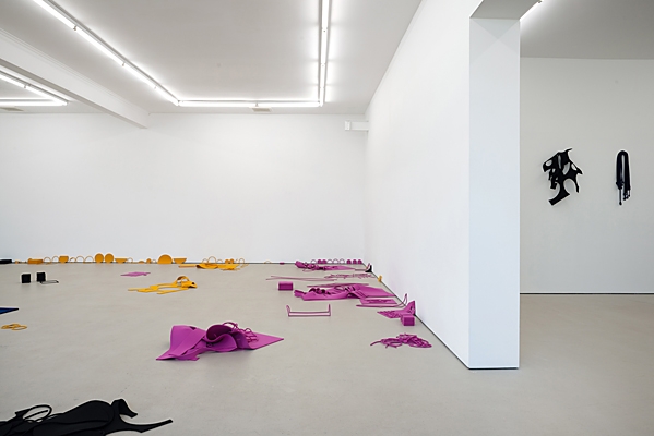
The artist has also tightly controlled the mixing of the coloured forms, so that the room hasn't turned into clusters of overcomplicated configurations that would destroy the impact of a linked up, single coloured, shape as it extends along the floor. The four hues are not jumbled together like confetti, but carefully kept separate like the plastic pieces (on walls) of early Tony Cragg, brilliantly containing and measuring their localised impact.
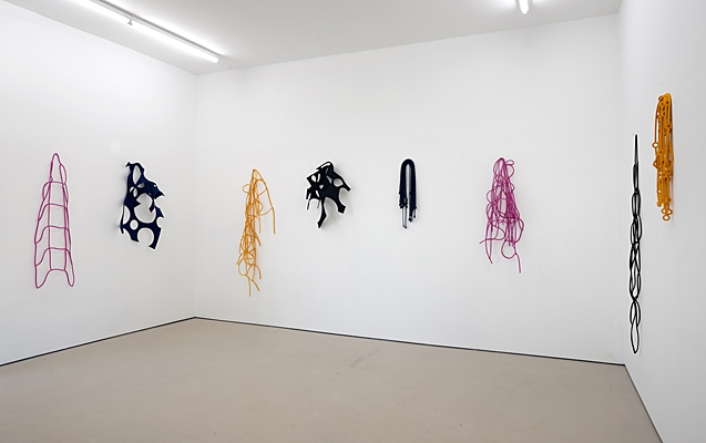
With his recent presentation at Artspace of a series of participatory installations involving invited (spoken to) community groups, and another show at Sutton Gallery in Melbourne, Peter Robinson now displays a related body of work in both Hopkinson Mossman spaces, demonstrating the use of coloured die-cut felt to compose drawings and relief sculpture on both walls and floor.
In these, chance and careful manipulation are combined, while for Robinson, the colour is uncharacteristically exuberant, eschewing the usual ‘Māori’ red-black-white combination he is known for. With its poppy use of magenta, yellow ochre, black and dark blue, it seems to allude more to contemporary fashion and women’s outer garments.
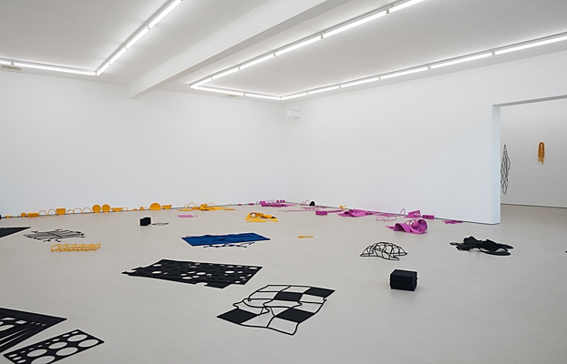
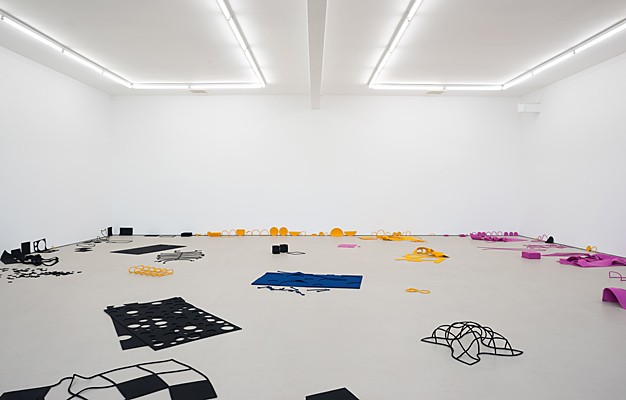
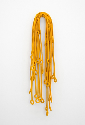
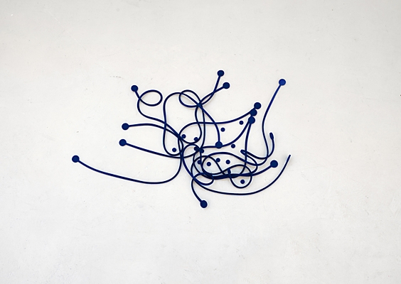
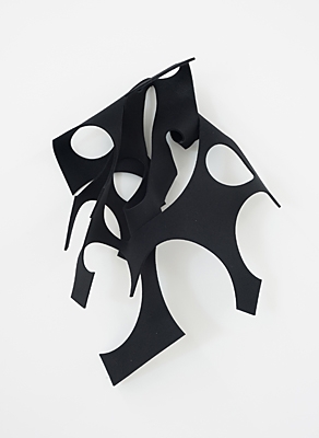
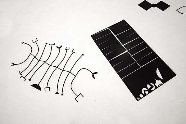
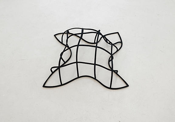
The first gallery space (the small room) you come to has eight felt items hanging on nails. Some are suspended grids, made of squares cleanly cut out, or else squares made by thin strips being threaded through other thin strips that have circular eyelets at their ends. Others are drooping lines with eyelets or else rectangles (offcuts, the ‘derivations’) with assorted, differently sized, circles cut out, some removed portions extending over (and slicing into) the fabric’s outer edge.
Robinson’s choice of felt is surprisingly thin, given the thicker grey varieties referenced (via art history) with Morris or Beuys, and its ability to form relief sculpture projecting up from the floor - when flopped over, scrunched up or prodded. Rich in associations, some of the configurations extending upwards are simple stacks of squares, or folded grids, or cut rectangles positioned over uncut ones of the same colour. On a two dimensional plane some of the segments, sectors, right-angles and other small pieces have been scattered as a group to look like dispersed letters spewing forth as a form of inarticulate speech, like a grunt, gurgle or moan, or alternatively, the unfolding of an alphabet-based Kabbalistic cosmology.
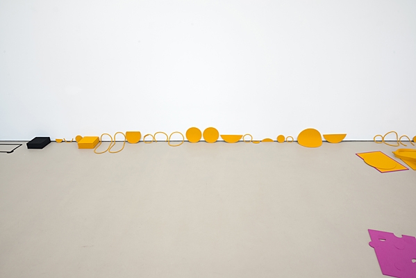
Another area of interest in the large room is Robinson’s treatment of the ‘crease’ or ‘hinge’ where the walls meet the floor. Cut out circular forms (with hollow centres or else ‘solid’ shapes) - often in isolation and not overlapping, and not found in the smaller room - feature lined up in rows. These circles have segments cut off so that Robinson can press them tightly against the planar edge, causing the straight-edged chords to be butted hard against the wall (the shapes lying on the floor) or the floor (the shapes leaning against the wall).
The artist has also tightly controlled the mixing of the coloured forms, so that the room hasn’t turned into clusters of overcomplicated configurations that would destroy the impact of a linked up, single coloured, shape as it extends along the floor. The four hues are not jumbled together like confetti, but carefully kept separate like the plastic pieces of early Tony Cragg, brilliantly containing and measuring their localised impact.
The funny thing is that for Robinson, the colour in this installation - the four types, but especially the magenta and ochre - for all his control, is in his context unusually optimistic, as well as unnervingly sweet. It is so pretty as to almost be tasteless. Of course there are no doughnuts being salaciously penetrated by sausages, or puddles of chunder, or mounds of poo. This installation is wild but not scatological, and not as gesturally wild as his Acktion Paintings (which were loose, abandoned, and painterly). This colour is clean, pure and architectural in function. It is shrill and spatial.
John Hurrell
 Advertising in this column
 Two Rooms presents a program of residencies and projects

This Discussion has 0 comments.
Comment
Participate
Register to Participate.
Sign in
Sign in to an existing account.