John Hurrell – 16 October, 2015
The subsequent variations in application method, surface quality and spatial treatment - inflected by three auxiliary works in the front foyer - make this (when analysed) an exhilarating suite to think about. Their mark configurations and colour densities alter as you change your distance from their surfaces, and slowly notice the different processes and chosen options.
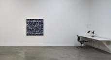
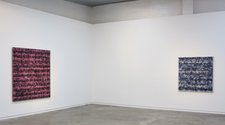
The five Thornley canvases currently presented in the Jensen Gallery come from several series and separated dates, so the subsequent variations in application method, surface quality and spatial treatment - inflected by three auxiliary works in the front foyer - make this (when analysed) an exhilarating suite to think about. Their mark configurations and colour densities alter as you change your distance from their surfaces, and slowly notice the different processes and chosen options.
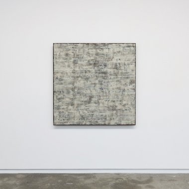
In the middle of the large wall, First Sight No. 15 (2011) is the work with least obvious depth or transparency to peer through, as it looks as if the brush has been dragged horizontally through pale umber coloured clay. Square in shape, it has a sticky cloggy consistency that still lets the underpainting come through, even though the chalky bands are quite dense. Yet it dominated by a thin vertical line that seems to have been roughly masked off and quickly removed, only a quarter of the way out from the lefthand edge. With its shimmering pale ‘mud’ and wavy rhythms, this is the most recent painting.
The oldest work, With Division #24 (2001-2002) is a vertical rectangle filled with soft transparent pinks and yellows that hint at a pale body with veins peeking through and odd skin blemishes. It also has overtones of aerial landscape. Traversed by spasmodic pink roller marks these butt much closer together in the bottom third, introducing a form of airy weight.
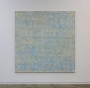
Similar in its very soft mottling, White Lines No. 9 (2006-2007) has a pale blue field that suggests dusty Tuscan frescos and restrained scrubbed surfaces. Even against white walls it looks bleached and chromatically withheld; conspicuously understated. It has a dappled, watery constituency.
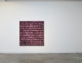
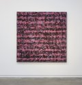
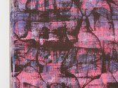
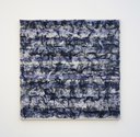
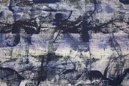
Untitled no.6 (2010) is the most aggressive painting in the room with its strident use of piercingly deep pink, tonally and rhythmically backed by delicate black arabesques, and thin mauves. The black lines seem to have been stamped on with some flexible, curved, very thin, edge - and then rubbed. Untitled No. 18 (2010) is a dark blue version, with thin speckled purplish greys. It is the most immediately striking painting in the show with its horizontal ducking and diving, swooping cadences.
These last two works have considerably more tonal and saturated impact than the other three, being much rawer and more assertive in the space. Though smaller than the others, they dominate. All of the show needs time to absorb, because these paintings revel in natural light illumination, and require patience to grasp the layered bands of mottled pigment application and figure out the sequencing and deliberate pattern irregularities. (Also the photographs here are not particularly accurate.) Complex but rewarding.
John Hurrell

 Advertising in this column
 Two Rooms presents a program of residencies and projects
This Discussion has 0 comments.
Comment
Participate
Register to Participate.
Sign in
Sign in to an existing account.