John Hurrell – 2 March, 2016
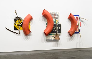
This is a very striking, gutsy Don Driver, one of his best ever. The menacing scythes and spade seem to have cut through huge curved chunks of greasy intestine that double up as pieces of a giant bagel. It looks so creepy, being so thin. Behind the 'bowel/doughnut' bits are specimens of assorted signage, including an incongruous Tip Top ice cream placard and a warning for road users that the railway crossing lights are turned off. Take care or you'll be eviscerated.
Christchurch
Post-earthquake - with about fifteen new Collection shows
Some exhibitions: 19 December 2015 - 3 April 2016
It is obviously fantastic to have this great civic gallery up and running again after five years’ absence; it is such an enriching facility. Even though I happened to be there on the ground floor during the recent big Valentine’s Day tremor and saw the Bill Culbert Bebop work - with its suspended tables, chairs and fluorescent tubes - swinging furiously (but staying up) above the marble staircase (and wonder now if the Martin Creed neon text will ever have credibility), we need to assume that eventually the city will be perceived as (and indeed be) a safe place to live.
There is a diverse range of exciting new contemporary art shows on display and from them I’ve picked ten works I found particularly enthralling. I’ve ignored much of the thematic context placed around them by the curators when selecting for group projects, and focussed instead on the distinctive aspects of each artwork, the qualities - that for me - make them memorable.
Don Driver, Energy Triad, 1991, is a very striking, gutsy Don Driver, one of his best ever. The menacing scythes and spade seem to have cut through huge curved chunks of greasy intestine that double up as pieces of a giant bagel. It looks so creepy, being so thin. Behind the ‘bowel/doughnut’ bits are specimens of assorted signage, including an incongruous Tip Top ice cream placard and a warning for road users that the railway crossing lights are turned off. Take care or you’ll be eviscerated.
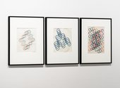
Carl Sydow, Untitled (Meander Drawings), 1971, are plans for Sydow’s sculptures, planes of clear Perspex with carefully positioned holes, used for holding up threaded loops of coloured garden hose. The drawings of course, being flat, graphically attenuate the rhythms of the unravelled, undulating, snaking line, compressing them so they overlap, while the supporting structure remains drawn in faint pencil.
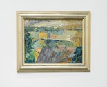
Don Peebles, Sydney Harbour, 1953 is a lovely little oil painting, painted by a young Don Peebles in the early fifties. It shows his lifelong preoccupation with Cezanne. What is interesting here is Peebles’ own interest in receding planes via the individual brushmarks. Whereas Cezanne would use hot and cold contrast for spatial and chromatic effect, with the actual marks parallel to the picture plane and flickers of white canvas, Peebles - being concerned with the planes of nearby rooftops - gives each roof-daub perspectival tilt, and overall, a sense of rarefied tautness.
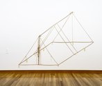
The late (great) Pip Culbert, here represented by Pup Tent, 1999, presents an eviscerated army tent with its panels removed leaving the supporting seams. The latter have been shifted and shortened to create a variety of orthogonal drawing featuring parallel lines and equilateral triangles. Peculiar little rope tags (where pegs went) and crimpled entrance liners bring life to this surreal diagram that exalts in its process of subtraction.
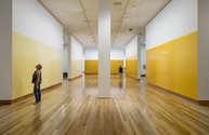
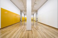
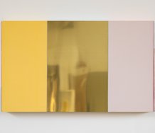
Simon Morris, Yellow Ochre Room, 2016 is the best thing in the building, a honey-walled glowing box where the artist has taken eight wall lengths separated by entrance gaps, added them together and divided them into a sequence of nineteen 12’ x 12’ sections. The darkest wall square is where Morris began, for he created each section one at a time, collecting the surplus paint that had run down the wall and on to the floor (to be collected in a tray), mixing it with an equal amount of medium, and continuing the process. One circumnavigates the perimeter, exploring the gradual tonal changes, noticing how the colour intensity decreased, the glossy planes diminishing in consistency and depth. Thin darkened vertical lines form where occasionally the caramel coloured squares overlap.
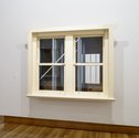
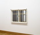
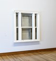
Fiona Connor’s what you bring with you to work, 2010, is a sculpture of three bedroom windows, based on the actual bedroom windows of three CAG gallery attendants. Two of them are on the opposite sides of a gallery wall, so you can look through it. The three windows are very varied. One has anti-burglar bars, as if on the outside of a prison, while the others have thick, somewhat ornate wooden sills. Peering into them you can see inside the hollow MDF walls and observe aluminium struts, sheets of plywood, hidden panels.
By referencing staff living conditions and sleeping quarters Connor alludes to the staff’s imaginative world of sleep and nocturnal fantasy. And safety, especially when the community is so apprehensive about earthquakes. She brings community anxieties into the exhibition display - in a subtle form.
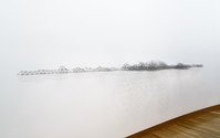
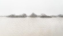
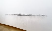
Peter Trevelyan’s survey #4, 2013-4, creates what seems to be a coastline, an undulating landscape in the gallery made of clusters of propeller pencil leads, organised in pyramidal formations. The low hillocks and knobby peninsula extend out into the void, floating over the gallery space and making that the sea. The fragile material speaks not only of vulnerability, and also of representation and drawing. Its regular graphite lines are marks in space but not drawn, cantilevered and locked in place by shrewd - and unspeakably intricate - engineering.
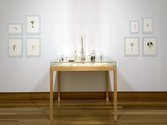
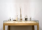
Zina Swanson’s collection of sixteen miniature objects in different sized bell jars, Some people’s plants never know, 2007 is displayed on a table that is presented alongside Untitled, 2007, a suite of eight imaginative botanical watercolours (with plant substances) on the wall. The jars contain tiny pine cones, bumble bees, ladders, birds’ nests, eggs, pins, keys, and bamboo roots. Swanson and Trevelyan both have related works next door in CoCA’s Precarious Equilibrium.
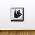
Andrew Drummond’s Rotated Sample 3, 2008, is a multiply exposed photograph of a polished chunk of coal, flipped over and around. With its dark shiny faucets, reflections and jewel-like angles, its exaggerated scale makes it look like an obsidian cubist sculpture with several extended arms. Compact and expanding, it seems alive and not mere mineral.
Glen Hayward’s Yertle, 2011, references the Dr Seuss story about the King of the Turtles who liked to view his kingdom from a teetering stack of subordinates. Hayward’s stack is a vertical line of 28 carved replicas of some plastic paint buckets that he found in storage. Each bucket contained a mix of colour specially prepared for the walls of some exhibition at Christchurch Art Gallery. Four of the duplicated tins bear the names of shows, one being The Naked and The Nude, and three others, Ron Mueck.
Ron Mueck was a hugely popular exhibition from the UK that closed a month before the February 2011 earthquake. Cantabrians and outsiders really responded with long queues. The challenge for CAG, and CoCA its neighbour, is to excite the locals sufficiently that the good word again travels nationally, and further. This suite of shows is a very good start, and it all comes with a cheap ($15) softcover publication that lists all the works with pictures. Terrific!
John Hurrell

 Advertising in this column
 Two Rooms presents a program of residencies and projects
This Discussion has 0 comments.
Comment
Participate
Register to Participate.
Sign in
Sign in to an existing account.