Peter Dornauf – 24 June, 2017
Clarke's patterns deny all absolutist claims or any structures of knowledge associated with fancy Hegelian underpinnings. Like Miranda Parkes' crumpled abstractions, Clarke puts a little juice back into the system, a little homage and a doffed cap while at the same time withholding serious reverence. There is eye candy here and there is irony - at work simultaneously.
The abstractionists of the twentieth century all began with inflated dreams and noble optimistic hopes, fed as they were off a strong diet of Hegelian philosophy mixed with lashings of sanguine theosophical religious visionary yearnings. Their choice of pictorial space was flatness but their preference for spiritual dimension was mysterious depth and / or esoteric unfathomable heights. As the century advanced, the air, for various reasons, was incrementally sucked out of such pumped romantic metaphysical dimensions.
Pop Art popped the pretensions, and after that, abstraction had to content itself with more modest and fussy aesthetic claims, with the exception however, of people like Gretchen Albrecht and Max Gimblett who were still mining the old methodologies.
The radical theologians were also doing their bit at deflation, frantic to appear up-to-date and have done with any embarrassing and overblown religious assertions. The rhetoric was completely secularized. The sublime was neutered, and the transcendental tamed and put out to pasture. What was there left for a card carrying abstractionist to do?
Postmodernism had the answer. One could play a number of games: either the diversion involved in imaginative, inventive mark making, a preoccupation with the vagaries of materiality, or an engagement with parody and playful irony.
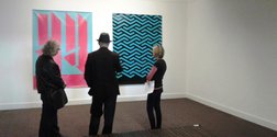
Geoff Clarke (Wintec Media Arts tutor) has plumped for the latter in his current show, Vernacular, at the Wallace Gallery, Morrinsville. He has appropriated and recycled historical abstract forms but shorn them of all their visionary hopes and theological trappings. If you search for sincerity here, you’ll find none. He may draw on hard-edged abstraction, minimalism or applied art design motifs, but in the work of reconstitution and reconstruction he fabricates hybrid forms that sit somewhere on the boundary between aesthetics high and low, balanced inside a narrow band width between ‘commercial’ and ‘serious’ fine art.
In the language employed by Wittgenstein, there are “family resemblances” operating here, but the mixing and matching that takes place creates doubly-coded readings that undercut any nodding acquaintance with grandiosity that might have come from the parent form it feeds off. As Clarke describes it, the work has “come back as the living dead, contextually displaced but still resonating…” Those faint echoes and energies once alive, that carried universal themes and utopic messages, have gone through the ringer and come out washed and cleansed of any mysterious and idealistic overtones; re-baptized in the blood of irony, paradox and gentle mockery.
One of the abstract images Clarke has created began first as a kind of vernacular form itself, a found image of humble and functional origins, a structure that becomes the foundation on which the artist builds his playful and pluralized canvases. These canvases are of a synthetic kind and it is on these that Clarke constructs his work, employing a variety of mechanically distancing techniques, because he states, he does not believe “in any notion of authenticity outside of the strategic limits of the rules and stylistic and formal limitations of flat vector abstraction and the limitations of the technical production methods” he might happen to use. Those practices include digital printing, CNG cut panels, screen printing, hard edge vinyl stencil masked painting techniques and industrial spray painting methods.
What we end up with in these large abstract notations is a stage on which a kind of Op art visual dynamic messes and mingles with hard-edged abstraction to create a new dehydrated breed. Two apparently contradictory forces are brought together in a funky amalgam, a crossbred concoction that takes aim at all the high-flown vocabulary and ostentatious claims of purely abstract assemblages.
The title of the work, Sky Blue and Pentobarbital Blue, signals the satiric intent of the artist, where the object of the barb is all the utopian ideologies that belonged historically to the narrative of abstraction from its early inception. The drug referred to in the title is used to put suffering animals out of their misery.
Modernism died of course and was laid to rest, euthanized in a sense by the history of the twentieth century itself with all its collapsed ideals and projects. It had to be put down like a sick animal. We all ran out of belief. But although there is mockery in the artist’s work, there is also a lingering affection for a rhetoric and agenda that unfortunately never lived up to the hype.
Pollock, Rothko and co were appropriated by the design world in lino prints and fabric patterns and Clarke does an appropriation of an appropriation in the above mentioned work, taking a maths textbook cover from the period and turning it into a kind of Op art creation of his own. Remnants of an ideal are reconstituted and we are invited to look back, a fond nostalgia mixed with a wry cynical smile.
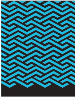
The work Vernacular does some more of the same thing with hard-edged abstraction the target. That whole school of painting associated with the Russian avant-garde - complete with its neo-mystical claptrap - or Mondrian and his “metaphysical arrangement of space” is reduced to zigzag repetitive patterns that call on wallpaper design or Warholian repetition. It quotes people like Frank Stella or Donald Judd but without the implied Platonic idealism that accompanied them.
Clarke’s patterns deny all absolutist claims or any structures of knowledge associated with fancy Hegelian underpinnings. Like Miranda Parkes’ crumpled abstractions, Clarke puts a little juice back into the system, a little homage and a doffed cap while at the same time withholding serious reverence. There is eye candy here and there is irony - at work simultaneously.
High Score goes one better with the artist presenting what at first glance appears to be simply an interesting play of abstract forms, echoing perhaps the work of Jean Dewasne from the 1950s. But the high score here, concealed inside the formal configurations - number 95 - refers to the number of people a specific serial killer killed over a five year period. A more chilling and dramatic way of deconstructing the grand promises of utopian advance, using a ‘hyper-real’ spectacle of evil, would be hard to find. Clarke spares no one in his insistent critique of the modernist typography that carried idealist and universalist themes, all the while enjoying the aesthetic ride.
People like Habermas might argue that rather than failing, modernism was simply an unfinished project, taking a little time to work itself out. Be that as it may, for some the failure of modernism was a splendid failure, and artists like Clarke have fun mucking about amongst all the pretty ruins.
Peter Dornauf


 Advertising in this column
 Two Rooms presents a program of residencies and projects

This Discussion has 1 comment.
Comment
Owen Pratt, 10:53 a.m. 8 July, 2017 #
Necrophillia?
Participate
Register to Participate.
Sign in
Sign in to an existing account.