John Hurrell – 29 November, 2018
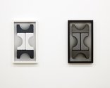
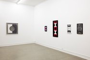
This time the variously-sized wall photographs are alluding to sculpture as well as painting, to artists like Brancusi who explored the totemic and the vertical, as well as (in the earlier show) planar painting minimalists like Kelly or early Marden—but rejecting an industrial surface, and celebrating paint as viscous substance with caked-on, icing-like layers. More complicated than before, with squared-off arching forms, the new circular negative spaces seem to allude to the camera lens itself.
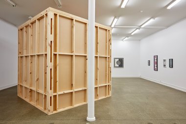
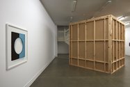
An exhibition with two parts—framed photographs of vertically stacked, painted children’s blocks on the wall, and a revolving carousel of slides projected on a screen tucked into a large boxlike room deftly constructed in the space—this show continues to explore themes seen in Gavin Hipkins’ previous solo exhibition at Starkwhite three years ago.
This time the variously-sized wall photographs are alluding to sculpture as well as painting, to artists like Brancusi who explored the totemic and the vertical, as well as (in the earlier show) planar painting minimalists like Kelly or early Marden—but rejecting an industrial surface and celebrating paint as viscous substance with caked-on, icing-like layers.
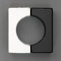
More complicated than before with squared-off arching forms, the new circular negative spaces seem to allude to the camera lens itself. As unique photographs that depict painted and extended surfaces, they remain very much photography on paper with a smooth surface.
Because of Hipkins’ big interest in filmmaking the reflective wit continues. The columns could also be strips of film, lines of celluloid—stacked up repeating frames of U-shapes (alternating between empty half circles and vertical ‘I’ stalks). Or perhaps quasi-modernist Māori carving. The background colours vary.
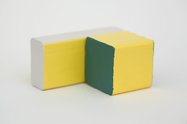
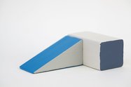
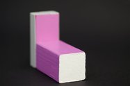
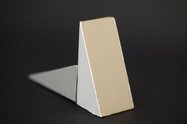
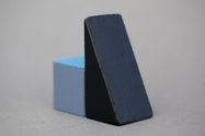
The eighty slides in the carousel feature pairs of blocks, ramps and other geometric forms in a set that merges the floor with the background wall, exploring nuances of colour on the simple wooden toys, planar edges where the applied paint ‘misbehaves’, and where the horizontally allows Hipkins to play with focus so the forms shift in and out of crisp acuity. They are engrossing, and I think, upstage the ten vertical wall works (of mostly three or five elements) that are—due to their skinny proportionality—slightly gawky and spindly.
The projected paired blocks, wedges, oblongs, cylinders, semi-circles and slabs in contrast are compact. They have mass. Their density makes them look part architecture and part furniture. They don’t hover within the frame like the vertical symmetrical wall images, but rest integrated with the surrounding field, becoming part of an asymmetric horizontal landscape.
These shots of small sculptures are clearly different in character to the frontal wall works, being obliquely angled, self-contained and not extending beyond the edges of the image. Their backgrounds come in cream, pale grey, dark grey, milk chocolate, greeny grey, browny grey, pale blue and black.
When enlarged the painted forms’ texture becomes rough, the imperfect edges bumpy. We can detect wisps of shadow, and the time period of illumination (four seconds) is brief. That these images are not frontal makes them less formulaic than the wall works. This—and their more varied colour range and deeper space—gives them a vibrant immediacy (an exuberant gorgeousness) that the more chromatically subtle and spatially shallow wall works lack.
John Hurrell


 Two Rooms presents a program of residencies and projects
 Advertising in this column
This Discussion has 0 comments.
Comment
Participate
Register to Participate.
Sign in
Sign in to an existing account.