Peter Dornauf – 20 October, 2019
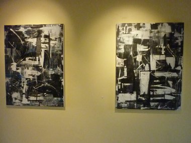
What is particularly satisfying is the opposing presence of hard-edged forms against more meandering shapes that bulge and billow out—either from or against them. Amongst the seeming chaos, there is control and a search for balance, and the two contrary elements find a gratifying harmony in the most accomplished works. Grey is never dull here and it comes, not as an erotic charge, but something closer to sensual pleasure.
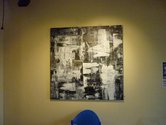
Forget Fifty Shades of Grey and its ersatz eroticism for the daytime television demographic. The real varieties of the ashen tone are to be found at Frankton Gallery, Hamilton, in its largest room. Shades of Grey is a series of abstract paintings by Garland Sharp that limit the palette to whites, off whites and a multitude of tonal variations in grey that are scrapped across the canvas by knife and spatula to create fields of interweaving and abutted geometric and biomorphic forms.
These layered works also have carved into the surface a number of scratch marks that add to the dynamic of push and pull of the painterly stratum. The best have a finish that demonstrates that the artist knew when to stop. And very occasionally he has added the smallest hint of colour; a touch here and there of purple or blue, to help lift the monochromatic dominance, providing relief, counterpoint and mystery to these large canvases.
What is particularly satisfying is the opposing presence of hard-edged forms against more meandering shapes that bulge and billow out—either from or against them. Amongst the seeming chaos, there is control and a search for balance, and the two contrary elements find a gratifying harmony in the most accomplished works. Grey is never dull here and it comes, not as an erotic charge, but something closer to sensual pleasure.
–––––––––––––––––
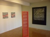
Next door in an adjoining room is Spin Cycle, a three artist show. One of them is Brylee Courtney, an artist restricted to a minimalist palette and abstract notations. However, her works are less wildly frenetic than Sharp’s. They are, in fact, strictly and formally disciplined.
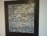
The largest and best work, The Black Arena, is made up of a series of subtly modulated marks lined in rows, 52 of them, across and down the canvas — short cream and grey thin lines, played off against a flat black background. The effect is quietly impressive. Repetition is offset by a wonderful modulated variation in colour, albeit, limited to shades of grey.
There is something here of Malevich and his famous Black Square, but more is happening, much more. As the eye moves back and forth along these exquisite gridded patterns, their delicacy and subtle rhythms make for hypnotic viewing. It is almost like reading some long-lost ancient script, written in a language long forgotten. But we can discern the surface easily enough. The patterns are like gleaming fish scales or burnished coats of armour, making a quiet sumptuous feast.
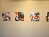
Nearby we also see some bold geometric paintings on small aluminium squares, by Liam Bourton. These are painted in waterborne enamel, sharp-edged forms in triangulated configurations limited to two colours—red and black. They recall, apart from their interrupted forms, something taken from the geometrics of Maori relief carvings or weaving patterns.
Here, tradition comes hard up against the modern and the fusion conveys an electric frisson. They echo, in part, the work of Waikato Māori artist Zena Elliot, but Bourton has chosen to hone in on the singularity of the forms themselves, giving us not only the close-up, but also the fragmented look at the same time.
The exposed aluminium ground in some of the works adds another dynamic, hinting at Stella and LeWitt and lending the pieces space to breathe and declare themselves.
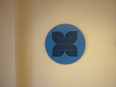
Geoffrey Clarke is the third artist. He has been working in sculptural relief wall hangings for a while, and Gatechrasher is a new addition to a whole series he has been preoccupied with over the last year or two. He had a similar work selected for the current National Contemporary Art Award, but here the motif presents a more ethnic feel, placed as it is inside a blue ground.
The attention to geometry still persists, and the reference to popular commercial imagery finds its way in there too, but Clarke has alluded here directly to an indigenous leitmotif, albeit in his own unique and idiosyncratic way. The sharp grooved inset, not visible in the photograph, provides a three-dimensionality which adds to the power of the piece. This is a real gate crasher to his oeuvre.
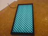
Clarke’s Hydro 2 also is a complete departure in some ways, a lightbox that presents repetitive abstract patterns, motifs like those on his larger canvases from several years back. Its reference to water plays with retro design shapes, even calling on the New York school of modernism, as in Frank Stella. Both are encoded. The vernacular reference to New Zealand and our hydro dam systems is all part of the component elements, while the sharp minimalist iridescence of blue-on-black provides a visual effervescence.
This presentation has a satisfying cohesion, as it moves in and out of various versions of abstraction and minimalism, with each artist positioned at various points along the spin cycle.
Peter Dornauf
 Advertising in this column
 Two Rooms presents a program of residencies and projects

This Discussion has 0 comments.
Comment
Participate
Register to Participate.
Sign in
Sign in to an existing account.