John Hurrell – 19 January, 2023
Beside Miller's low tonal values and Walters' narrow bands of glowing illumination, contained between the carefully positioned vertical shapes, the painted edges vary when scrutinised close up: especially their properties of nuanced consistency and severity—such as where each individually coloured Walters rectangle asserts the particularity of its own perimeter. The two artists differ hugely in the finish of their paint applications, for Walters doesn't look industrial in Miller's company—though he might without it. He is impeccable, but not super-duper uber-ultra impeccable.
Auckland
Gerold Miller & Gordon Walters
Miller to Walters
8 December 2022 - 31 January 2023
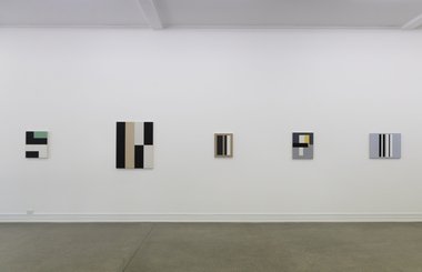
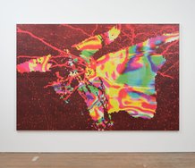
In the large Starkwhite downstairs gallery, three large, mainly dark Gerold Miller (b.1961) paintings are lined up on one long wall to face five smaller, chromatically muted, also rectangular Gordon Walters (b.1919 - d.1995) paintings on the opposite side. The Millers are not highly colour saturated as one might expect. Their temperatures are not hot, unlike those seen in a previous, comparatively recent, Starkwhite Miller exhibition.
The Walters canvases are all Untitled. The Miller panels are labelled through numbered series and individual identification numbers.
Bodily in the gallery, we experience two competing horizontal white planes (that support the panelled and stretched fabric works) locked into the architecture in parallel, and partially interrupted by the stairwell at one end, and the occasional vertical column.
Walters’ Christchurch studio-made stretched matte canvases, with their pristine traversing or perpendicular dark bands—made with brushed on acrylic—vividly contrast with Miller’s ultra-glossy, car lacquer sprayed, contracted out, Berlin factory-made panels that sometimes have large circular holes cut into their aluminium sheeted surfaces in order to use the bright reflective surface of the background wall. And cast soft round internal shadows.
Dynamic tensions from illusory spatial manipulation thus compete, with real space encompassed by dark valued planes projecting out from the wall; different pressure points compete: in or out; up or down.
Sometimes in the case of Miller, real spatial intervention and illusory morphic intervention are combined. Or (across the floor, with Walters) juxtaposed painted rectangular forms are compared with implied overlapping ones. You start to measure with your eyes—each painted length and width—and how they compare with each other. You ponder deep space and shadow versus the effects of reflected (illuminating) light on surface, and how they impact on the contraction and expansion of form. You consider the ramifications of dividing a vertical rectangle; particularly bifurcation, and whether that section of plane is extended laterally. If so how far? Could that oblong be transparent? Or is it reflected light only?
Beside Miller’s low tonal values and Walters’ narrow bands of glowing illumination, contained between the carefully positioned vertical shapes, the painted edges vary when scrutinised close up: especially their properties of nuanced consistency and severity—such as where each individually coloured Walters rectangle asserts the particularity of its own perimeter. The two artists differ hugely in the finish of their paint applications, for Walters doesn’t look industrial in Miller’s company—though he might without it. He is impeccable, but not super-duper uber-ultra impeccable. His hand (albeit perfectionist) is sometimes detectable.
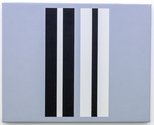
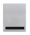
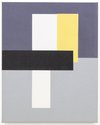
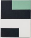
With the five Walters works, where one is much bigger than the other four, each dramatically tonal painting (with its clearly delineated separate parts) has internal comparisons, unique proportions of repeated (usually vertical) elements—analysable relationships between discrete identical rectangles (occasionally shuffled around and realigned) positioned within its borders.
On the other side, two of the three glossy Miller works have a very different approach. Their panels have rounded corners that echo the edges of the overlapping different-sized fluoro-coloured circles and adjacent round holes (enclosing fuzzy shadows) found within. The one on the right with an orange shape at its base, instead of being structured around vertical straight forms (as in Walters) is split by a dominant diagonal that provides a sliding tension while still keeping the two hovering ‘beach balls’ stable.
This tenuous stability speaks to one Walters work in particular, positioned second from the right, that with a dangling vertical rectangle looks even more lopsided, revelling in the tension. Imminent freefall or slithering drift: we are witnessing a conversation across the floor about intestinal viscerality and shape and space (physical or implied) as foil. Apparently a mutual hostility to stasis. Seemingly a rarely noticed hatred of equilibrium.
John Hurrell




 Two Rooms presents a program of residencies and projects
 Advertising in this column
This Discussion has 0 comments.
Comment
Participate
Register to Participate.
Sign in
Sign in to an existing account.