John Hurrell – 27 May, 2023
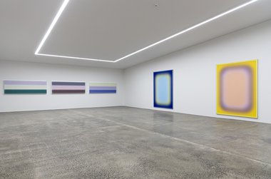
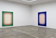
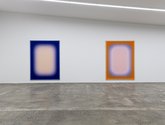
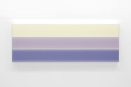
This merging is done through the use of fine voile, digitally printed coloured layers that allow light to penetrate the sheer surfaces of the painting and bounce off the gallery wall back towards the viewer. The coaxial hazy oblongs of colour have a comparatively stable blurred rectangle hovering in their centre. From in front, you can't see where the stretcher bars meet the walls, but from the side you can observe vertical slivers of reflected colour. Frontally, four to six fluffy frames of colour can be detected in each.
With an amusing title from Let’s Call the Whole Thing Off that blends Ella, Louis and Leonardo, this second Starkwhite show from the Australian sonic artist and painter Jonny Niesche launches the opening of Starkwhite’s spectacular new venue in Newton Road. The Gershwin ditty is about trans-Atlantic pronunciation (the differences between English and North American); Niesche’s title though is about transitional chromatic merging.
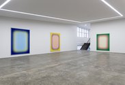
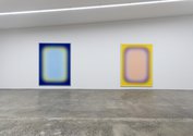
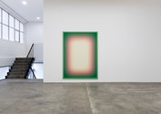
This merging is done through the use of fine voile, digitally printed coloured layers that allow light to penetrate the sheer surfaces of the painting and bounce off the gallery wall back towards the viewer. The coaxial hazy oblongs of colour have a comparatively stable blurred rectangle hovering in their centre. From in front, you can’t see where the stretcher bars meet the walls, but from the side you can observe vertical slivers of reflected colour. Frontally four to six fluffy ‘frames’ of colour can be detected in each.
There are five of these large vertical stretchers, each bordered by a frontally-coloured inside frame. They are big paintings that beckon you to optically ‘walk into’ the implied feather-edged rippled space. The scale is important.
Exploiting concentricity, Niesche makes us puzzle over where one coloured ‘frame’ is precisely ensconced on the fabric, where it fades away, and where the next one (within it) begins. Close up, the gauzy material has a shimmering moiré effect.
In a recent Ocula interview Niesche talks about the importance of beauty, it being something intended, not contingent—and indeed the effect is calculatedly pleasant. Spatially inviting and sensual. The colours (like yellow, pink, orange, green and purple) seem sweet and fruit flavoured. Primary and secondary in hue.
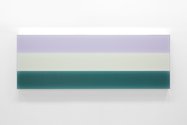
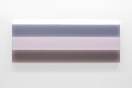
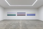
On the main end wall are three, triple panel stacked, horizontal works—ostensibly of unmodulated colour that is pale and tending to be tertiary. The works also have mirror frames so that when positioned close together they incorporate reflected images sideways. From a distance, the ‘planar’ colour of their fine viole panels is paler at the edges, and darker in their centre.
This is because of the separation of the taut sheets of voile, and the shrewd positioning of MDF. Due to the thinness of the gauze, the colour is less intense at the sides (less overlap) and more ‘saturated’ (more overlap) when seen frontally. Put together and lined up in a horizontal row, the nine panels create a flickering effect.
It’s a bodily presentation that implies distances and spaces beyond the architectural confines of the sharp and elegant gallery. That corporeal aspect of the show, on its own, has great appeal, but the colours and soft textures (the ocular/tactile) also reinforce seduction: the pleasures of imagining and experiencing.
John Hurrell




 Advertising in this column
 Two Rooms presents a program of residencies and projects
This Discussion has 0 comments.
Comment
Participate
Register to Participate.
Sign in
Sign in to an existing account.