John Hurrell – 27 August, 2023
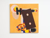
'Birth of Venus' seems to be a joke about the planet, not Botticelli, with a dynamic of irregular tensions of the four corners, circles in the centre, and the main dark circular motif disrupted by horizontal and vertical pipe forms of differing thicknesses. In contrast the larger 'Life on Mars' has fat finger and planet forms, the former squeezing the latter, with assorted cocks, leaning towers, and chimneys, all flat and compositionally structured like a tablecloth, or slighterly higher to show folded table legs.
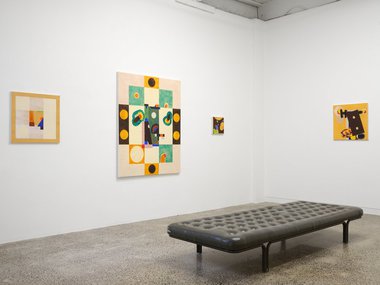
In the Ivan Anthony exhibition space furthest away from the street-entrance, Denys Watkins presents seven variously-sized paintings. Of these geometry-loaded canvases, curiously many—besides being compositionally striking with clear flat simple shapes, and symmetry—are also subtly viscerally unsettling.
This is because of their affinity to aerial views from high up—looking down from a studio ceiling examining objects on the floor, or outside hovering over architecture. It is as if Watkins were like Kazimir Malevich, who became terribly excited when he discovered aerial photography (via works by photographers like Moholy-Nagy, Rodchenko and Kertész [using towers, balloons and later aeroplanes], and possibly from the previous century, Nadar, Coburn, and Lindahl) and—noticing the disappearance of the horizon and elongation of shadows from buildings and trees—experienced a spatial revelation about feeling and non-objectivity.
Some of the painted flat geometric forms overlap, others float in isolation. A few are aligned vertically; or occasionally diagonally. Now and then small colourful units are repeated in groups, to be scattered like chaff in the wind.
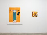
Another salient quality in this show is Watkins‘ interest in symmetry and pattern, for some of his larger compositions are like spread-out tablecloths—but where the systematic outer edges of the rectangle are foils for the more unpredictably positioned (and scaled) inner elements. Life on Mars and the smaller Birth of Venus are good examples of this.
Birth of Venus seems to be a joke about the planet, not Botticelli, with a dynamic of irregular tensions of the four corners, circles in the centre, and the main dark circular motif disrupted by horizontal and vertical pipe forms of differing thicknesses. In contrast the larger Life on Mars has fat finger and planet forms, the former squeezing the latter, with assorted cocks, leaning towers, and chimneys, all flat and compositionally structured like a tablecloth, or slightly raised to reveal folded table legs.
Of the smaller square works, Passport to an Empire plays off smoky grey black blobs, a charcoal horizontal bar, and buff circles within a tilted chocolate rectangle that teeters over descending watery and saturated oranges, and woven latticed ovals. Quiet Village again specialises in deeply sensuous chocolate and pale orange washes but with wide slabs of blue and vertical ‘hyphens’ of green, while The Pond and Nightflies has linear walls peering down on a pond of wiggling green parallel-lined wrapping paper, and lots of hovering oscillating glowing rings.
The Watkins works I have just discussed are more compact than the other canvases in the show that have less compression, fewer regular rhythms and a lot more airy (sometimes filmy) space. More minimal with less ingredients, their compositional layout is more pronounced, placement being emphatic.
All along, looking down, these works provide the viewer with a vaguely hovering, outer-body experience: head versus stomach. Oddly intestinal, they paradoxically make you aware of your own churning visceral vulnerability; while also analytic, cognitive and cerebral.
John Hurrell




 Advertising in this column
 Two Rooms presents a program of residencies and projects
This Discussion has 0 comments.
Comment
Participate
Register to Participate.
Sign in
Sign in to an existing account.