John Hurrell – 17 October, 2024
The narrow hazy or densely dark bands that cling to the sides, behind the planes—the shadows—are emphasised, due to no planar surface texture being apparent. Appropriately these photographs are called ‘games’, for there are implied rules of logic based on observing the non-digital world, that are then quickly repudiated.
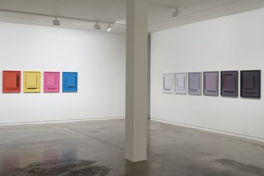
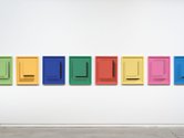
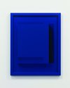
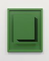
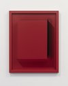
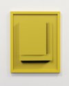
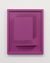
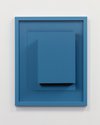
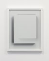
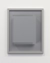
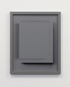
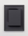
In this downstairs Two Rooms show, Waugh presents three projects, one of which I find particularly interesting due to the fact I come from a painting (not photography) background: twenty-four framed and glassed-over colored abstract photographs that play with the conventions of illusionism using overlapping rectangles (parallel to the picture plane), with discreet and not so discreet shadows delineating their straight edges.
From a distance they look three-dimensional, yet they have a strangely delicate ethereal quality even though their colour is often highly saturated, if not hot. This creates a sense of paradox.
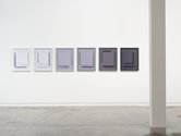
Eighteen of these deliberately puzzling coloured works are presented in a tight row on one long wall, and six multi-grey variations are displayed on a short one. Mysterious in their manner of production, the cleverly contrived shadows of different degrees of darkness (or fuzziness) are presented on opposite sides of each photo’s two central rectangles, implying the use of several shrewdly positioned lights.
The resulting layered shadowy ‘double-exposures’ are displayed as a kind of tease, and various other illuminating contradictions accentuated. The narrow hazy or densely dark bands that cling to the sides, behind the planes, are emphasized, due to no planar surface texture being apparent. Appropriately these photographs are called ‘games’, for there are implied rules of logic based on observing the non-digital world, which are then quickly repudiated.
While some might consider this type of photography cold and emotionally icy, it is sly in its knowing use of paradox: for most of the hues are high in emotional temperature. And thus while extremely bodily, they are also quietly amusing. Although they are sort of ‘clever-dicky’ and too show-offy, their sensuality, combined with the glaring observational contradictions, nevertheless soon ‘hooks’ you.
In his very fine essay that accompanies this show Marcus Moore explains why these monochromatic works are entitled Cascades . I was initially baffled by the name, thinking the artist was applying the term to the works as hung on a wall with the viewer looking at them from across the room.
In fact, it is as if they are positioned flat on the floor, and you are looking down on the stacked ‘hovering’ planes from a standing position. The various lights positioned around them create the opposing bordering shadows, and from above the resulting bright glare can be perceived as ‘tumbling’ downward, shadows seemingly advancing down the sides.
The images of the rectangular planar blocks creating the shadows are then removed, and a unified background color substituted to generate a mysterious ethereal ambience devoid of material tactility - and leaving only umbra-generating edges. Moore succinctly goes through the stages of the process in his particularly lucid text.
In the long run, this is a chromatically punchy show that really (to put it ‘colourfully’) gets your retinal rods and cones a-poppin’: first the long wall and second the short one. Then—just when you start to calm down—the cerebellum unexpectedly starts to go awol, deliriously heaving when pondering the shadows (the photographed ones and then the real gallery-specific ones linked to the upper square cross-sectioned frames), and why the photographed ones might possibly be positioned where they are. And why you might find such seemingly incongruous placements interesting.
Okay, so that was a discussion of the individually framed photographic elements, but what about their installation as a totality? It is so peculiar. Why has Waugh positioned the Cascades in tightly packed rows on only two walls: one looking at chroma, the other tonal value? Surely they would be better spread out? Or even mixed together? Curiously the artist has in the catalogue labeled each photograph with an individual name. However, the gallery visitor experiences them collectively, as two separate rows on two different walls. Not as discrete rectangular items. They are too densely organised for that.
Maybe the two rows Waugh sees as types of musical score and so to him as ‘composer’, the sequencing of colour and shadow orientation is important? However I think the show would be better with only the Cascades by itself—and not the accompanying Test Chart and Photo Box-Lid works. Cascades could have been better spaced apart (if he wanted to accentuate their individuality) to exploit the white Two Rooms walls that would let each image breathe properly in isolation.
Personally I find the darkroom proofing prints on the other wall dreary with its fetishistic glorification of process. They undermine Cascades’ pristine ambience. I like the Cascades because they, in a sense, clearly use photography to converse with painting, sculpture and installation. They have a wonderful wit, and their fascination lasts. And along with other advanced photographers like Michael Mahne Lamb, Waugh is clearly prodding his audience to think about contemporary photography in a fresh new way.
John Hurrell



 Advertising in this column
 Two Rooms presents a program of residencies and projects
This Discussion has 0 comments.
Comment
Participate
Register to Participate.
Sign in
Sign in to an existing account.