John Hurrell – 25 October, 2024
It can be argued that these agitated surfaces are more adventurous than the neon texts, which have plenty of antecedents in twentieth century art history from Kosuth's conceptualism in the mid-sixties on. Their sprayed paper surfaces have a subtle understated sensuality and do not reveal interpretative meaning easily, overtly embracing subjectivity as viewers try to discern physiognomies within the flickering rectangles, searching for possible eyes, mouths, noses, chins and foreheads.
In Tim Melville’s gallery, Paul Hartigan’s exhibition title, I LIGHT, seems to refer to the imaginative terms, ‘Highlight’ or ‘EyeLight’—which could also mean MeLight? A healthy, very seasoned artist’s ego (‘I’ as radiating illumination, clearly claiming identification) is openly declared by emphasising the visual properties and lexical meanings of coloured letters or parts of spelt-out words. Exuberant colour and playful language for a long time have been part of what is usually Hartigan’s (extremely varied) well known Pop Art brand.
In this display, because he is now bedridden—due to the appalling debilitating impact of Motor Neuron Disease—we discover two types of work, two separate approaches that he has developed out of his restricted daily routines, and encouraged through the use of invaluable assistants:
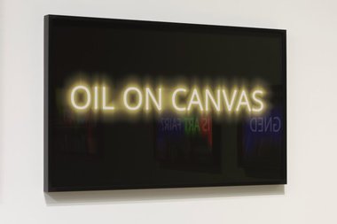
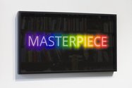
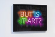
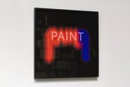
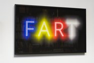
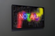
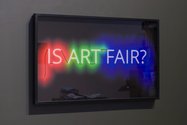
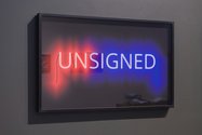
The first are the Neon Light Drawings, black-mounted framed textual phrases, behind glass and in front of paper, showcasing glowing neon letters or single, radiantly coloured, neon words. In his label descriptions Hartigan discusses these images as if neon were a medium to be used on paper like ink, paint or collage, emphasising the materiality of glowing glass tubes and contained gas when placed over paper. It is a subtle and witty approach, implying liquid fluidity.
My affective responses to these images are complicated. Some of them I really like (Paint, Oil on canvas, This is not art, Is art fair?, Unsigned); a few I almost like (Masterpiece); and others I find irritating because I consider them trivial (Not art, Unsigned, Fart). They press the wrong button. Well, for me anyway.
With Paint and Oil on canvas though, it is difficult to articulate where their cerebral or emotional appeal comes from. I greatly enjoy reading the simple descriptive phrases or stated names that use text to serve as vague substitutes for imagined, precisely rendered, crafted images. Not only are the glowing colour and letter forms that emit it a source of pleasure, but so is the activity of pondering language, when possible terms are sifted through and mostly discarded. Reading itself is exalted: a worthy action that invariably leads to shuffled possibilities—through unanticipated mental imagery.
From the complicated responses mentioned above, can various enthusiasms, indifferences, or hostilities be justified when evaluating such exhibits? How does meaning lock into the sequencing of letter shape and/or colour? Are there historical, sociological or associative references, or tonal or chromatic contrasts? Varied degrees of linear blurriness seem apparent within the highly reflective glass.
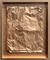
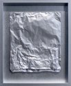
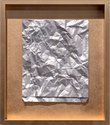
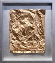
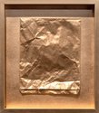
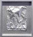
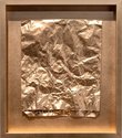
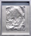
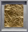
The other type of work Hartigan presents are his painted ‘bas reliefs’. They consist of spray-painted paper bags, coated by his assistants using metallic colours such as copper, silver, and gold. Simply framed and mounted with no glass, they abound in creases, indentions, and wrinkles, as is typical of paper bags.
Unlike the neon works, these reject orthodox ‘rainbow’ colour. Because of their undulating ‘cubistic’ planes, the angle of light direction is crucial, especially as it is intended that the viewer notices abstracted faces looming within the restless, shiny, flaring surfaces.
These crumpled paper bags originally contained purchased takeaway lunches and other items, when picked up and delivered by visiting friends, so after further manipulation, the putative fragmented ‘faces’ they allegedly present could be expressionistic jagged self-portraits of Hartigan himself as food consumer, or portraits of his helpers, or even admired Olympic or gladitorial heroes. They are discreetly volatile paintings/sculptures that ‘draw out’ changing angular images as the viewer moves around to scrutinise the textures and glittery evanescent sheens.
It can be argued that these agitated faceted surfaces are more adventurous than the neon texts, which have plenty of antecedents in twentieth century art history from Kosuth’s conceptualism in the mid-sixties on. The reason is that battered metallic bags are tough. Their sprayed paper surfaces have a subtle understated sensuality and do not reveal interpretative meaning easily, if at all, overtly embracing subjectivity as viewers try to discern physiognomies within the flickering rectangles, searching for possible eyes, mouths, noses, chins and foreheads. This search for connectable facial parts is despite their being initially hidden behind a resolute cloud of blank impenetrability and murky vagueness.
As a group the Metallica series can be seen as a sardonic comment on all human and cultural transience, and planetary impermanence too. Here, yesterday, today and tomorrow—with minimal kerfuffle. Despite all our efforts and great persistence in attempting to determine meaning: it’s all gone or about to go. Seeping away, floating adrift beyond the edges.
John Hurrell
 Advertising in this column
 Two Rooms presents a program of residencies and projects
This Discussion has 0 comments.
Comment
Participate
Register to Participate.
Sign in
Sign in to an existing account.