John Hurrell – 17 April, 2025
Leonard's use of shiny metallic paints amongst ‘normal' chromatic colour seems to introduces an ironic twist to her palette. Is she laughing at notions of vulgarity or is she in earnest? To me the blending looks awkward and is not a smooth integration where like cohabits with like. In fact I find it excessive and strangely tacky.
Virginia Leonard
The Wedding Breakfast: An Ode to Olly
26 March - 19 April 2025
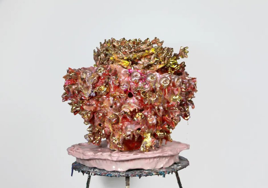
The explanatory blurb accompanying the striking ceramics show this work is in states that these large richly encrusted glazed pots are intended as a metaphor for the artist’s body, the painful medical problems that over the years have tormented it, and are titled to acknowledge the devotion of her attentive partner, Olly.
Bear in mind artworks do not always co-operate with the intentions of their makers, despite their naming or tactility, but can even be wilful disruptors vehemently independent. However, whatever the resulting trajectories of meaning here for the artist or viewer-so accept them if you wish—these are clearly fascinating, evocative sculptures (hinting via their outer surfaces of shellfish colonies or tightly entwined flowery jungle vines), very intensely coloured and rich in dense prickly textures and glossy curved surfaces, showing off decorative rhythms. And hues that are positively surreal. There is a dreamlike fantastical element.
Impossible to ignore, they are ‘in your face’, ‘full on’, & so not subtle—providing a memorable (pleasurable) bombarded-bodily experience. Influenced occasionally it seems by sculptors like Hesse or Bourgeois, but obviously not soft, flexible or linear.
Nuanced layered chroma is a salient factor as well, using thin modulated (usually hot) colour, as is the precise positioning of the vaselike containers on supporting plinths, be they short, vertical or horizontal white columns.
Leonard’s use of shiny metallic paints amongst ‘normal’ chromatic colour seems to introduce an ironic twist to her palette. Is she laughing at notions of vulgarity or is she in earnest? To me the blending looks awkward and is not a smooth integration where like cohabits with like. In fact I find it excessive and strangely tacky.
But is Leonard herself tacky? Or is the adjective describing a certain look only a mere device?
The novelist Martin Amis once commented on the late Joan Didion’s view that a writer’s style is a reflection of who they are. A self-portrait. He loudly scoffed.
I’m not scoffing, but I do wonder about where Leonard is pitching these.
A twitching eyebrow, shall we say?
John Hurrell
 Advertising in this column
 Two Rooms presents a program of residencies and projects
This Discussion has 0 comments.
Comment
Participate
Register to Participate.
Sign in
Sign in to an existing account.