David Cross – 23 December, 2009
While 'How It Is' is very much an encounter with self and a brilliant manifestation of intimacy rubbing against the grain of the objects scale, the other audience members frame the work in very particular ways.
Of all the things you can say about the Unilever series of temporary commissions in the Turbine Hall at Tate Modern, subtlety has never been a strong suite. From Olafur Eliason’s ‘Ben Hur’ style manipulation of natural elements to Carsten Holler’s theme park slides, the ten commissions have nearly always been severely monumental and overtly spectacular. To a large extent this is understandable given the sheer magnitude of the space that seems to require a heroic counterpunch from the artist simply to keep the architecture from usurping the sculpture.
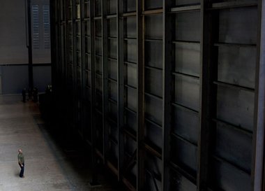
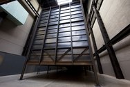
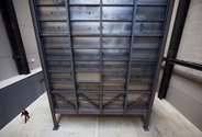
At first sight Miroslaw Balka’s latest instalment How It Is suggested more of the same. Sitting snugly in the Turbine Hall, a huge brutal industrially fabricated steel box mounted on legs was anchored to the space. Walking towards it there was the sense that this was a post-minimal object very much in keeping with the former power stations modern architecture and as such was a critical attempt to form an inter-play with the building. Yet a surprising denouement awaits the audience member as they reach the far end of the structure. On arriving at the far wall it is apparent that the box is only three sided and an enormous ramp leads up inside the structure. Crucially you cannot see what is in the box, as a perfect envelope of darkness engulfs the interior. If you want to know what is inside the structure there is no choice but to take your chances and enter the void.
Walking up the ramp towards the unknown is an existential challenge designed to test the psychological mettle of the participant. While certainly bracing as a kind of quest/ordeal, it is hard not to think you are entering the mother ship of Close Encounters of the Third Kind and that annoying keyboard descant was very much wafting through my head with each step. Once inside the structure the extremity of blackness is overwhelming and each footstep feels modest and hesitant. The trepidation is accentuated by the fact that there are people in front of you but you have no idea where. The floor underneath feels solid, no sounds emanate from the act of moving and this is also unnerving. It’s as if the structure is capable of completely absorbing your bodily presence, reducing it to a silent and blind entity in space.
Unexpectedly and blithely I walk head first into the wall and realise the limits of the structure. At this point the work takes on an extraordinary quality as you crash into the threshold and subsequently turn around and look back towards the light. Amazingly the whole interior space is revealed by this illumination, especially the myriads of slow shuffling people moving towards you arms flailing willing themselves to reach the end. Heading back towards the light all of the tension is released and you are able to enjoy the paroxysms of others on what is only a short walk to reach the ramp and exit the structure.
While How It Is is very much an encounter with self and a brilliant manifestation of intimacy rubbing against the grain of the objects scale, the other audience members frame the work in very particular ways. At the time I was there a group of Down’s Syndrome children were enjoying the work by running at full speed into the darkness. The sense of utter danger was phenomenal and their inability to foresee the possible consequences was seat-of-the-pants profound. No amount of screaming from the teachers had any effect and this out of control quality pushed the work into a very disturbing space whereby pure unadulterated freedom nestled against that awful sense of foreboding.
As is the case with such a simple scenario there are a huge number of possible readings of the work. Paula Herkenhoof writing in the catalogue highlights darkness as a language of silence or the ‘ill-heard’, as a cut in reality, as the vibrant signifier of the unsayable - and such readings are without doubt compelling and speak of a grand ambition in the work. Yet ultimately all the allegory and metaphor that is no doubt thoughtfully imbued takes a back seat to something simpler: the all too infrequent experience of an art work carefully, yet emphatically, shifting our experience of what we know and how we clumsily come to know it.
David Cross
 Two Rooms presents a program of residencies and projects
 Advertising in this column




This Discussion has 0 comments.
Comment
Participate
Register to Participate.
Sign in
Sign in to an existing account.