John Hurrell – 13 March, 2010
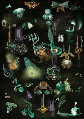
The works that reference Durer and Fuseli are particularly rich in their layered complexity, as is another that contains amongst other things, darting squid-girls that glow like jellyfish zigzagging through an undersea murk.
Auckland
Andrew McLeod
24 February - 20 March 2010
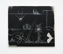
Andrew McLeod is a regular exhibitor at Ivan Anthony and this show is typical - in its varied range of work types. There are large and small digital prints, also the ubiquitous small white stretchers with unravelling orthographic black box shapes, and then there are the big canvases. Plus various smaller painting experiments.
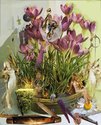
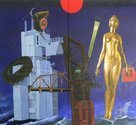
The prints show McLeod at his most inventive and eclectic - today Richard Killeen, tomorrow Peter Madden. The works that reference Durer and Fuseli are particularly rich in their layered complexity, as is another that contains amongst other things, darting squid-girls that glow like jellyfish zigzagging through an undersea murk. The quoting methodology succeeds in the prints but not the paintings because the prints manipulate the space with much more finesse. They make the paintings look oafish.
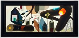
Painting is obviously not McLeod’s forte. The deliberately incestuous ultramarine and gold Auckland series are coarsely rendered and look like the digitally animated imagery of Cao Fei interpreted by Julian Hooper and Liz Maw. McLeod is not an artist methodically exploring the parameters of painting as a discipline; he is not interested in its materiality or organisation like say Simon Morris, James Cousins or Simon Ingram. There is one Abstract Triptych of black box shapes framed in three wide intricately inlaid frames that has a curiously memorable dynamic with its angular shapes, but few other successes.
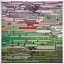
Yet for all his faults, there is one work from this ‘non-painter’ that I find remarkable: a large painting called Pink and Green Abstraction with Dragon.
This last work has an intricate rendered surface of horizontal trellislike bars arranged like a wall of stacked up batons with angular ends that look based on Chinese architecture. In the middle of what from a distance seems to be a coloured wooden Venetian blind made by Gordon Walters - but which actually is far more complicated - is a pewterish/bronzy Chinese dragon that is like a jelly-mould. Below it (again in dead centre) is an enigmatic tropical pot plant: a peculiar symbol alluding to the dragon.
The delicate pale green and rosy light flickering through the slats is gorgeous. This is a radiant stunning work, which in the context of his other grosser efforts like the Auckland series, shows his activities with oil to be exasperatingly directionless. McLeod’s practice seems so scattershot and unfocused.
So there we have it: the occasional inspired cracker of a painting, surrounded by unresolved experiments that I think should not leave his studio. Usually the best McLeods are the digital prints that pulse with intriguing pockets of spatial depth and resonate with the acuity of photographic - not painterly - detail. They draw your eye in so it doesn’t want to leave - such is their capture of your imagination.

 Two Rooms presents a program of residencies and projects
 Advertising in this column
This Discussion has 0 comments.
Comment
Participate
Register to Participate.
Sign in
Sign in to an existing account.