David Cross – 15 July, 2011
And then there is the issue of massive art saturation. How does an artist find a way to cut-through the cornucopia of exhibited work without simply falling into the trap of making ‘look at me' art? This is the Venetian curse, the look-at-me syndrome where artists feel they need to ramp up to eleven the spectacle rating so that the work can shout just that little bit louder than everyone else.
Venice
ILLUMInations
Directed by Bice Curiger
4 June - 27 November 2011
Venice is difficult, very difficult. To make good work there requires a profound understanding of how the city functions, how audiences navigate it and how you can fit in without looking too much like everyone else. It is a perversely complicated game of similarity (fitting in) and difference (standing out) played out in a united nations of nascent inequality. The big end of town at the Giardini is guaranteed huge audiences and has pavilions that while slightly faded have been purpose built for contemporary art. For everyone, else including New Zealand, it’s a big, complicated hustle: find a building somewhere as central as possible (the great Venetian conundrum) that is roughly accessible, has the requisite space and ambience for the work being shown and then work overtime trying to tempt audiences to venture beyond the Arsenale and Giardini where everything is laid out for easy contemplation.
Even for those clutching the map and determined to get to ‘the provincial’ offerings, it is never easy to find what you are looking for. There are only so many times you are prepared to back-track down alleys to avoid the rabbit-warren of cul-de-sacs in the hope of finding something edgy in what you tell yourself might be some life-changing experience at a new Eastern European pavilion. That so many treks are rewarded with lame, context-bereft work that has blithely ignored the unwritten Venetian rules of engagement, makes it just that little bit harder each time.
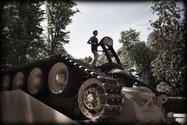
And then there is the issue of massive art saturation. How does an artist find a way to cut-through the cornucopia of exhibited work without simply falling into the trap of making ‘look at me’ art? This is the Venetian curse, the look-at-me syndrome where artists feel they need to ramp up to eleven the spectacle rating so that the work can shout just that little bit louder than everyone else. This biennale’s ‘signature’ work was Track and Field by US-based artists Allora and Calzadilla the jogging machine powered by a tank with a live runner doing stints at regular intervals. It got a lot of media, was mentioned in just about every major review, and was mind numbingly stupid.
The punters also flooded in droves to the same artist’s ATM machine located inside a large pipe organ. Every time someone put his or her card in and withdrew money, the organ would play a different music/noise sequence. The audience that I saw were whooping with delight in a ‘press the button, get a funny sound and marvel at the wackiness’ kind of way. That such work and other big spectacle gigs like Christian Boltanski’s remarkable photographic production line are rewarded with the requisite art media coverage simply perpetuates a cycle that keeps more considered and compelling work in the shade. That’s Venice, big boats, big posing, and a lingering preference for superficially big art.
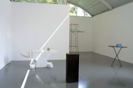
With this insanity-inducing tightrope to walk, it is surprising that there is as much compelling work as there is in the latest chapter. The 2011 model is not a straight backlash against ‘look at me’ art so much as a maturity in certain national pavilions that suggests a number of countries have decided to plough a different course. Hany Armanious in the Australian pavilion is a case in point. After Shaun Gladwell’s overcooked meditation on Mad Max last time, Armanious has produced a much more refined body of work that is by his standards quite frugal. The stripped down aesthetic of The Golden Thread is beautifully pitched with an assortment of found and fabricated objects elegantly positioned throughout the space. Using the repeated device of domestic and office furniture as plinths/supports/armatures, the artist juxtaposes a sweep of his own crafted interventions to tweak both the functional aspect and the second hand banality of these objects. A vase sticky taped to the base, a blue brick that is covered in the same woodchip as the ironing board it rests atop, a small number of coloured pins tacked into a beige office divider, these combine sculptures are dangerously subtle. The risk of the objects receding into an anodyne procession of readymades is tempered by Armanious’ remarkable capacity/facility for transforming with the lightest possible touch, bland inert junk into strangely charismatic and frankly beautiful sculpture.
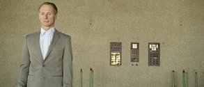
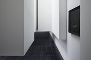
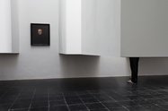
The other showing at the Giardini that was especially compelling was Markus Schinwald at the Austrian pavilion. I should note that the following description of this work in all likelihood will sound barking so a small plea to defer a base response at least for a few sentences. Consisting of three seemingly mutually exclusive strands of work: a series of 19th portrait paintings each one defaced by the artist with a Gothic nastiness; a labyrinth of internal architectural walls raised off the ground to reveal audience members legs walking through the spaces, and, a number of video works featuring older people performing simple dance movements, this mishmash of media and contexts should by every conceivable criteria for good art have belly-flopped. That it didn’t and it really didn’t is testament to an extraordinarily adventurous artist throwing caution to the wind and finding a way that defied logic to draw together seemingly incongruous languages and histories into a complex treatise on the body and its frailties. The work amazingly knitted together vastly different technologies, the grotesque and the everyday as well as the virtual and live body with a stunning economy of means. Schinwald is definitely an artist to watch.
A lot of hype was centred on Mike Nelson’s I, Imposter in the British pavilion. His work over the past decade has been consistently interesting with its gonzo-architectural modification predicated on destructive alterations to gallery and non-gallery spaces. His piece for Psycho Buildings at the Hayward in 2008 was extraordinary and as a result, I had high expectations. They were not quite met. Yes, the building of a Turkish workshop that he made for the Istanbul Biennale in 2003 and recreated piece by piece in Venice is impressive in ambition. And yes it is hard to believe you are standing in a space that two years ago was a cinema showing Steve McQueen’s dual projection video. But still it felt mannered and strangely even sterile. It was not helped that each room in the labyrinthine workshop was occupied by a smartly dressed, but desperately bored, English invigilator giving you the indifferent onceover. Maybe it’s the fact Nelson’s destructive interventions with their inherent violence are so compelling that this re-creation felt both tame and worse a one-liner. With a largely glowing press, calling for Nelson to be awarded the Golden Lion, such equivocation was clearly a minority viewpoint.
A special plea to the organisers of Venice to please stop boring us to death with the large curated exhibitions that feature in both the Giardini and Arsenale. This year’s yawn was depressingly called ILLUMInations and featured a list of mostly interesting artists showing mostly uninteresting work. What they had to do with one another from a curatorial context is clearly beyond my limited capacities to link Cindy Sherman with James Turrell and Franz West. The work was certainly better at the Arsenale, but the concept needs re-visiting or the organisers need to work towards shoulder- tapping better more adventurous curators.
So what of New Zealand at the Venice Biennale? Stay tuned for part two of this review.
David Cross



 Advertising in this column
 Two Rooms presents a program of residencies and projects

This Discussion has 0 comments.
Comment
Participate
Register to Participate.
Sign in
Sign in to an existing account.