John Hurrell – 31 July, 2013
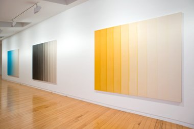
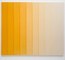
At first glance these paintings appear to be playing with the illusion of light hitting a fluted column, but then you realise that the implied volumetric mass is more vertically flat and planar than you thought - that it is more oval than circular in cross section - and that the stripes slightly overlap, causing them to become more like butted together tilted weatherboards where one edge is consistently raised. The space has a gentle curve. A slight bend.
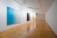
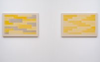
Upstairs at Two Rooms Simon Morris presents five paintings using diluted acrylic: three large paintings featuring twenty regular vertical bands, and two much smaller works featuring stacked up horizontal strips.
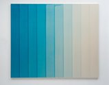
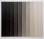
The bulk of the show is the suite of three gradated stripe paintings, work that gradually decreases saturation and tone within their vertical bands of watery colour so that the last band is clear. At first glance these appear to be playing with the illusion of light hitting a fluted column, but then you realise that the implied volumetric mass is more vertically flat and planar than you thought - that it is more oval than circular in cross section - and that the stripes slightly overlap, causing them to become more like butted together tilted weatherboards where one edge is consistently raised. The space has a gentle curve. A slight bend.
These large works are related to some other vertical band tonal paintings Morris exhibited about three years ago: they were smaller, with no overlap, and like these about a daily ritual. The big works have more physical impact and illusionistically are more intriguing, plus their angled rigid stripes are very pronounced rhythmically. The slow horizontal bend plays off against the stiff, unforgiving and repetitive verticality. Gradual versus abrupt.
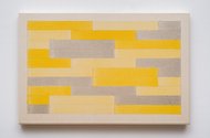
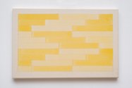
Morris’ other paintings, that look a little like weekly time-planners, explore - using only two or three colours - the dynamics of ABC repetition where a horizontally measured module is used sequentially, and where at the end of each line it doubles back in the opposite direction, not starting again from the other end.
His system relies on the same length being applied to the module when it breaks into two sections at the end of each line, working its way back below, descending down the canvas. Repeated stacking configurations of triple-lined clusters emerge, like steps.
Several earlier projects by Morris have used the same modular system. However this time - instead of being spread out on white walls - it is condensed and compacted onto the small canvases like strata. You can study the patterns, analysing the coincidental formations that result from the relationship of the linear module with the length of the stretcher. Understanding the seesawing directional process behind the bar formation is crucial.
John Hurrell
Recent Comments
Owen Pratt
That's the problem with contemporary culture - too many nouns used as verbs.
John Hurrell
Three words: 'Water Colour Painting' serve as the show's title, not as technical info on the work's production. ie. it ...
Owen Pratt
perhaps the haps, but at small risk of spoiling the party, what exactly is the joke? A guy walks into ...

 Two Rooms presents a program of residencies and projects
 Advertising in this column
This Discussion has 5 comments.
Comment
Owen Pratt, 1:18 p.m. 1 August, 2013 #
Very beautiful.
Only bones to pick are the title or the medium take your pick, it may be of small consequence but these works are not watercolours, they are acrylic.
It may be possible to work on this scale with watercolour paints but it would provide a few problems; paper size, control of the wash and conservation. I think elephant is the biggest commonly available cotton rag paper available, which is OK for w/c painting but is really designed for printmaking. Wash control on this scale could be challenging I suspect even Morris's stablemate Joachim Bandau would struggle with such a series of washes. And they would, traditionally, need framing under glass.
John Hurrell, 1:30 p.m. 1 August, 2013 #
Owen, you are being too literal and missing the humour of Morris' title which emphasises the dilution of pigment and acrylic binder with water. Michael Harrison is another artist who likes to confuse his audience with watercolourlooking acrylic.
Owen Pratt, 8:14 p.m. 1 August, 2013 #
perhaps the haps, but at small risk of spoiling the party, what exactly is the joke?
A guy walks into a gallery with a show called 'watercolour painting' and it's acrylic. geddid...
and why would an artist run interference on such beautiful works?
John Hurrell, 9:07 a.m. 2 August, 2013 #
Three words: 'Water Colour Painting' serve as the show's title, not as technical info on the work's production. ie. it doesn't say 'watercolour'.
The title is part of the work, embedded into the comprehension of the displayed object - just as the catalogue info is. The title tells us that water plays a crucial part in the treatment of colour, and label tells us how it was done.
Owen Pratt, 10:18 a.m. 2 August, 2013 #
That's the problem with contemporary culture - too many nouns used as verbs.
Participate
Register to Participate.
Sign in
Sign in to an existing account.