John Hurrell – 3 September, 2017
The occasional arbitrary quality of Bennett's colour choices muddles the narrative in terms of categorisation, but underlines the movement and the artist's Godlike control. With such an emphasis, not only repetitive human behaviour is subject to mocking satire but also the ticks of art production, the controlling ethos of animation design, the mind of the artist him-or-herself.
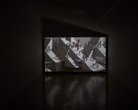
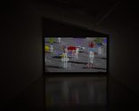
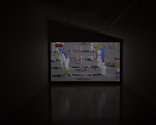
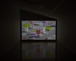
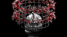
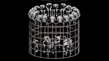
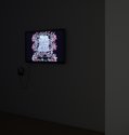
In this latest moving image presentation from Gregory Bennett—upstairs in Two Rooms’ long gallery—there are two videos: the longer 13 minutes animated film Nature Morte on the end wall, and the shorter 8 minutes production Torsade III on a monitor near the top of the stairs.
For the former, to appreciate it properly you need to sit or stand a lot closer than the position of the one seat there indicates. It pays to be sneaky and move it closer a few yards, so the experience is more immersive.
These two recent works are very different:
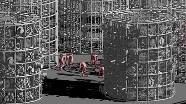
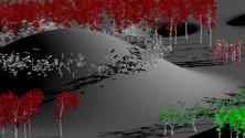
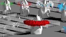
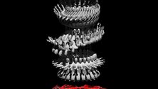
Torsade III has a black background field while slowly ‘panning’ upwards through hovering rings, aligned in a tower formation, that support lines of naked men moving organically in Busby Berkley-style co-ordinated motion; Nature Morte has a grey backdrop of deep orthogonal space, while the ‘camera movement’ spirals back and forth horizontally.
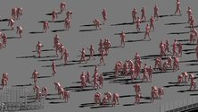
Torsade III has queues of robotic male dancers densely packed around the perimeter of each circular story, while in Nature Morte, the fitness-crazed bodies briskly trot around in fixed (repeatable) choreographic configurations, lie on the ground doing push-ups, or climb and descend steep staircases.
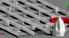
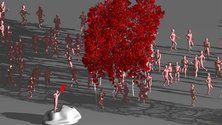
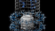
That in a sense Bennett is a kinetic artist who uses animation—not moving ‘real’ sculpture—for articulated android movement, here is the point, motion coordinated with concurrent movement of waving trees (leaves, or when inverted: roots), tapping and pounding machinery, and revolving cylinders or cubes nestled inside skeletal towers or gridded up oblongs. The constant visual pulse of different simultaneously throbbing components drives it along.
Both videos are loops, but one is in portrait format, the other landscape. The compositional structure of Nature Morte in particular transmutes over a period of a quarter of an hour, images first emerging from the bottom lefthand corner, expanding and spreading to dominate the entire horizontal screen for over fourteen minutes, and then finally shrinking to disappear out of the bottom righthand corner.
There is a playfulness about this emergence and withdrawal that bookends the work. It gives the video shape and drive. The sequencing within acquires an importance that allows different sections of figures—with buildings, orchards and machinery—to become distinctive and memorable, each portion acquiring its own significance so that it is looked forward to next time.
Bennett‘s colours hover in front of the rendered forms, and are flat and not volumetrically integrated as a plastic component. They are deliberately synthetic so that humans and, say, trees (sometimes on different parts of the same screen) are the same hue (in this case pale blue).
This sporadic arbitrary quality muddles the narrative in terms of categorisation, but underlines the movement and the artist’s Godlike control. With such an emphasis, not only repetitive human behaviour is subject to mocking satire but also the ticks of art production, the controlling ethos of animation design, the mind of the artist him-or-herself.
John Hurrell

 Advertising in this column
 Two Rooms presents a program of residencies and projects
This Discussion has 0 comments.
Comment
Participate
Register to Participate.
Sign in
Sign in to an existing account.