John Hurrell – 20 May, 2019
This is distinctly strange painting, a variety that is willfully fiddly, but also cognisant of formal properties, as well as illusionistic manipulation that embraces verisimilitude—and pop up narratives the viewer is enticed to invent.
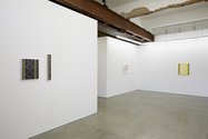
Marlee McMahon is a Melbourne artist currently showing in Auckland. The icy and ultra-pristine ‘abstract’ images she presents are subtle and require careful viewing, yet in a sense they are ‘realist’ as much as ‘formalist,’ static video game parts as much as paint-rendered graphic design. Elements with rendered dividing batons suggest the ornamentation of furniture such as the door frames of small cupboards, or else the vertical pilasters of deeply receding, high-ceilinged drawing rooms. Whether flat, wide or deep, illusory space is the central preoccupation.
Though they are made using cut-into masking tape, where she has left light-catching edges, the eight Carbonated works exploit illusory depth that contradicts these slivers of reflected light caught on the picture-plane surface. McMahon never uses digitally printed motifs (like Billy Apple) or fastidious signwriting techniques (like Gordon Walters), but because of her occasional use of semi-gloss varnishes, she delights in leaving traversing horizonal or diagonal bands as traces—especially when there is a dark rectangular field. These come and go according to your position: they are evanescent—but a calculated irritant.
Most of these deliberately puzzling works have subtly tinted or (the opposite) optically invasive borders, or else serrated ‘napkin’ edges that enclose vertical oblongs. You have to stand really close to realise how compositionally busy (with clever tonal matching) they are. They exude a belief that more is more—and emphatically not that less is more.
McMahon’s paintings are playful with their repetitive design elements, a seeming aberration of some strategic board game that lacks counters, yet dominated by perpendicular, horizontal, or diagonal vectors, with no circles. They allude to restraint but deny it, for any hints at impending logic are not followed through. The ubiquitous peculiar diagrammatic ethos is too quirky for any accurate sense of formalism.
Conveniently they can be sorted into four pairs. They all have evocative (slyly funny) titles, and all encourage wild associations:
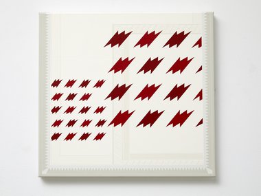
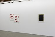
M-Tooth and Designer Sale (M-Tooth)
Both of these feature quivering angular alignments, hovering configurations of diagonally squashed M letters. One is a single canvas and the other is two canvases butted together, one that is larger, with grids of burnt sienna M-teeth (diagrammatic pointy molars with roots?), interspersed on the left with much smaller very pale grey ones.
In the smaller single-canvas work, as with the larger ‘diptych’, an empty space in the righthand side of the grid creates a negative tension. However here there are two brown grids, the one on the left much smaller. The faint lacy borders that are impossible to photograph, mock the seriousness of the apparent ascetism.
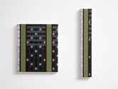
Clearasil and KitKat for One
These two paintings look like one work with two parts, but in fact they don’t go together. The skinny one on the right, though eccentric and extremely clinical, is a vertical strip rich in associations, such as butted together kitchen tiles, computer keyboards, ‘snap-off’ KitKat biscuits for a lonely glutton, or an aerial view of a row of houses beside a thin rectangular park.
Clearasil on the left is a square, much wider, and has two narrow ‘parks’. It alludes to pimple-camouflage that is required after too much sugar, skin layers in dermal cross-section, with hints of severely pixelised human tissue, flipped and spread out over a food-preparation bench. Science Fiction meets teenage angst.
Pillow Chocolate and Cavity
These two dark paintings have considerable depth within their frames. Chocolate blocks dance the limbo halfway up Pillow Chocolate. They jiggle and bob around the thin horizontal (stringlike) line, while the light on the pieces of chocolate changes its position from top to bottom, as if originally from a spot that moves along a tracking circuit fixed to the frame.
Cavity might be referring to the price paid for excessive chocolate consumption, but the outer frame seems made of warning barriers intended to protect council road repairs (but reflected as if in front of a sheet of dark perspex), and the title a giant, all consuming, bottomless pit.
Ticket and Sunbleached Sodastream
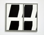
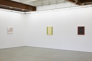
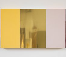
Ticket demonstrates a controlled restricted palette, in black and white, while Sunbleached Sodastream radiates golden yellows and browns that infuse an anaemic and sour stagnant citrus light. These bathe the space in a late afternoon glow. On the latter’s vertical sides we detect twisting angular staircases that double as three pairs of pole-clutching oblong fingered hands.
Ticket though, with its four quarters and enclosing Riley frame, flirts with the viewer’s perception: part Op, part Ellsworth Kelly and part detective playing ‘spot-the-difference’. Not content to rest on its chromatic nuances it also resorts to overkill, dazzling with its shimmering borders, negative spaces and asymmetric partitions—and distracting from its four internal leaning-over (about to crash) parallelograms.
This is distinctly strange design-conscious painting, a variety that is wilfully fiddly, but also cognisant of formal properties, as well as illusionistic manipulation that embraces verisimilitude—and theatrical pop up narratives the viewer is enticed to invent.
John Hurrell




 Advertising in this column
 Two Rooms presents a program of residencies and projects
This Discussion has 0 comments.
Comment
Participate
Register to Participate.
Sign in
Sign in to an existing account.