John Hurrell – 15 May, 2022
In terms of art history, they possibly also refer at times to McCahon's 'Titirangi' paintings of kauri trees, Seurat's 'A Sunday on La Grande Jatte', or Warhol's 'Camouflage' paintings. Although they are usually overtly rhythmic—with repetitive motifs—they don't shimmer; there is no intricate flickering light. The colour is not modulated and the shape edges are sharp. Tonal contrast is used to emphasise clarity, and overall create optical ‘bounce'.
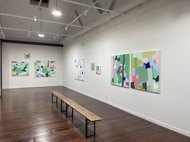
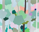
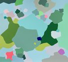
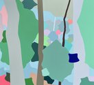
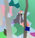
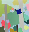
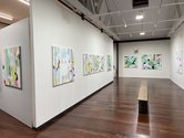
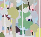
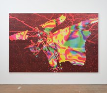
Using mostly pale pastel colours and flat organic shapes associated with Australian woodlands, thirteen variously sized paintings by Sydney artist Clare Brodie dominate the new Scott Lawrie exhibiting space in Mt. Eden.
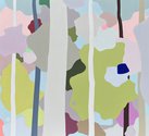
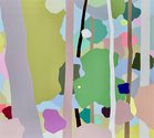
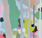
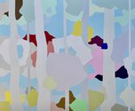
Impeccably executed in matt vinyl these large tidy rhythmic abstractions based on forest vistas have a sweetness linked to animation or paint-by-numbers hobbyists, yet they are more complex in their associations. Rich in overlapping tree forms (clusters of merged leaves hovering around vertically descending trunks), they also allude to army camouflage patterns (especially when trunks are absent), and even maps of Europe, with shapes like that of France or Spain. Others have thin trunks that also look like aerial views of rural roads. A repertoire of ‘national’ shapes seems to regularly reappear, like in stills from a movie.
In terms of art history, they possibly also refer at times to McCahon’s Titirangi paintings of kauri trees, Seurat’s A Sunday on La Grande Jatte, or Warhol’s Camouflage paintings. Although they are usually overtly rhythmic—with repetitive motifs—they don’t shimmer; there is no intricate flickering light. The colour is not modulated and the shape edges are sharp. Tonal contrast is used to emphasise clarity, and overall create optical ‘bounce’.
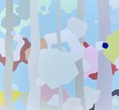
A couple differ from the rest in having large patches of pale blue that suggests sky or sea beyond. They are less claustrophobic in their effect, and suggest a lifting of the canopy, an infusion of air, a vague sense of freedom or breaking out. Sometimes there is a hint of a faint greyish haze.
Although the clusters of dense leaves (as flat shapes) are evenly distributed spatially, the different thicknesses of vertical trunks in comparison generate spatial depth, introducing a more pronounced illusionism (looking through the picture plane), and a sense you are seeing treated documentation of a journey through thick bush.
Some might find these paintings, because of their chromatic flatness, too ‘designy’ and careful (boring even)—with their pale undulating fields peppered with the occasional isolated darker element—but I find their lack of surface texture and use of finely tuned positioning not bland at all. Brodie’s fastidiousness is a real achievement; her placement of suggestive botanical morphological ingredients surprisingly satisfying.
John Hurrell
 Advertising in this column
 Two Rooms presents a program of residencies and projects
This Discussion has 0 comments.
Comment
Participate
Register to Participate.
Sign in
Sign in to an existing account.