John Hurrell – 4 May, 2018
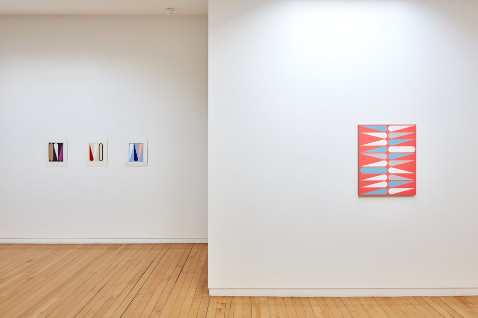
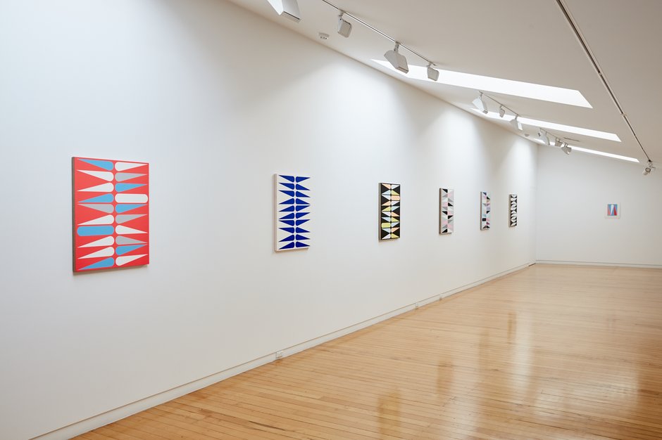
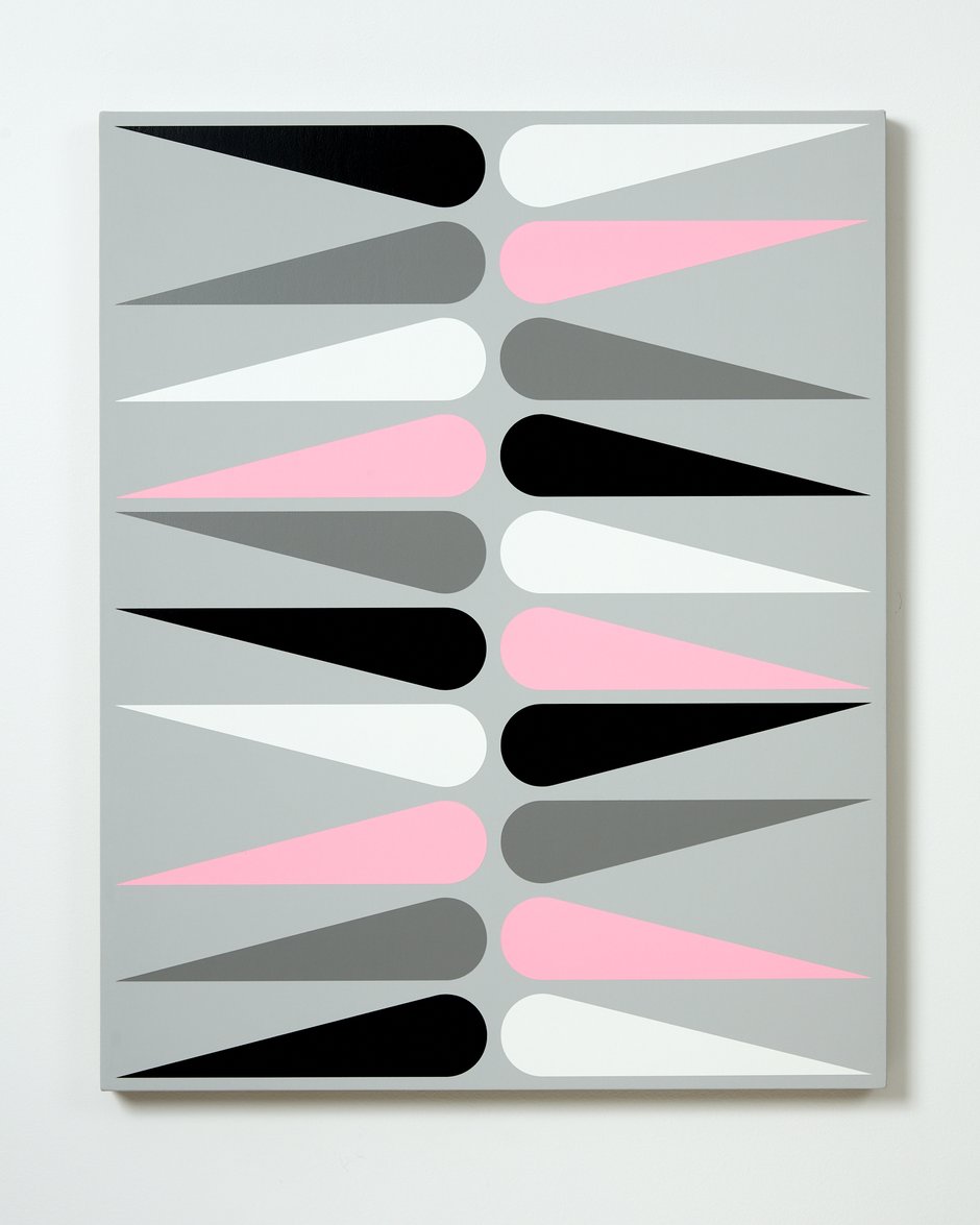
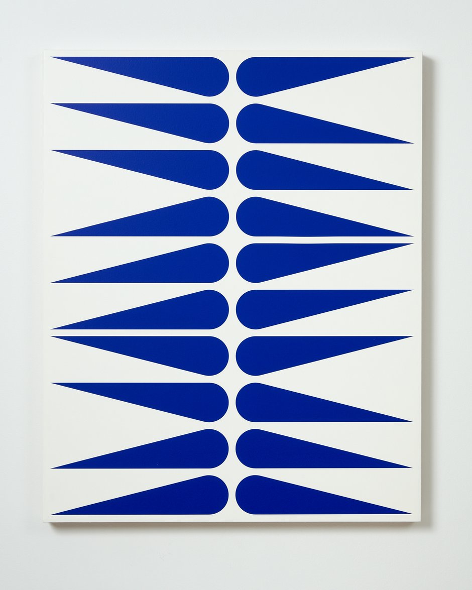
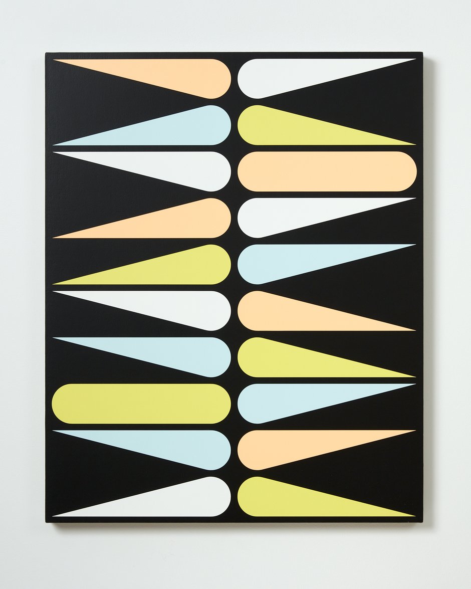
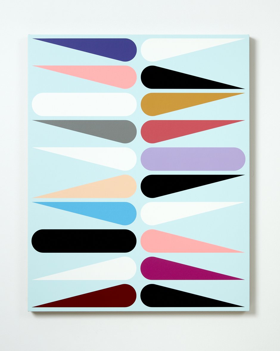
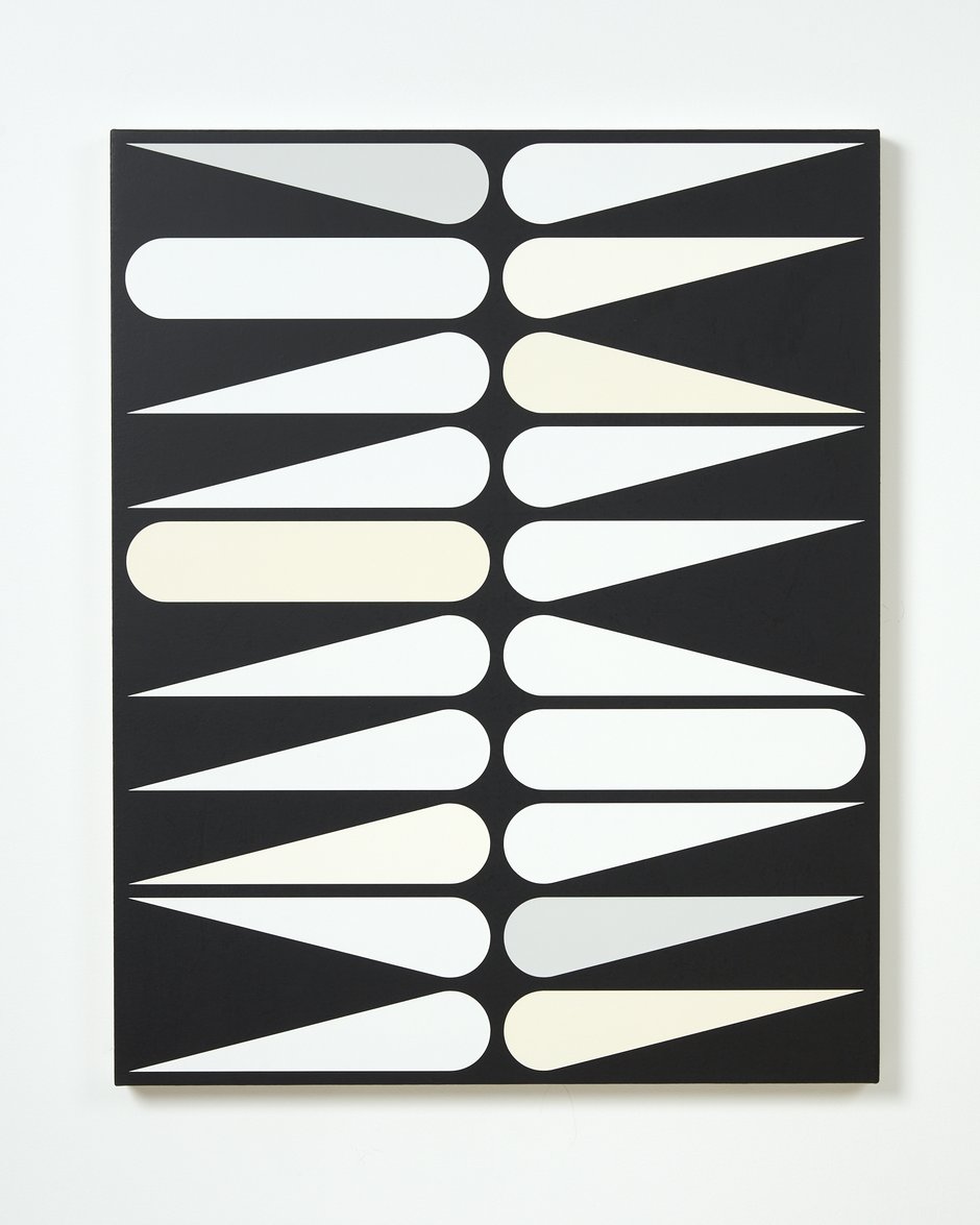
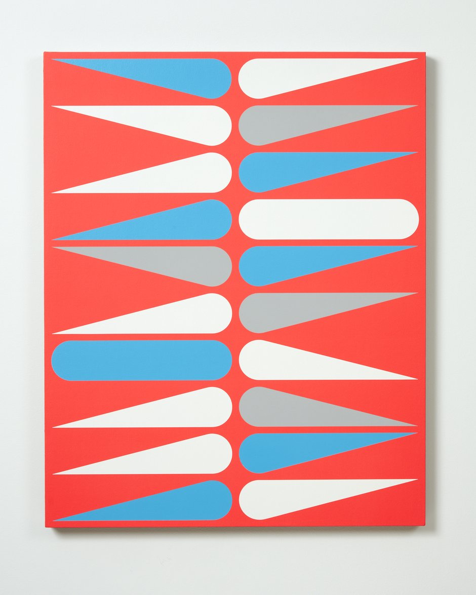
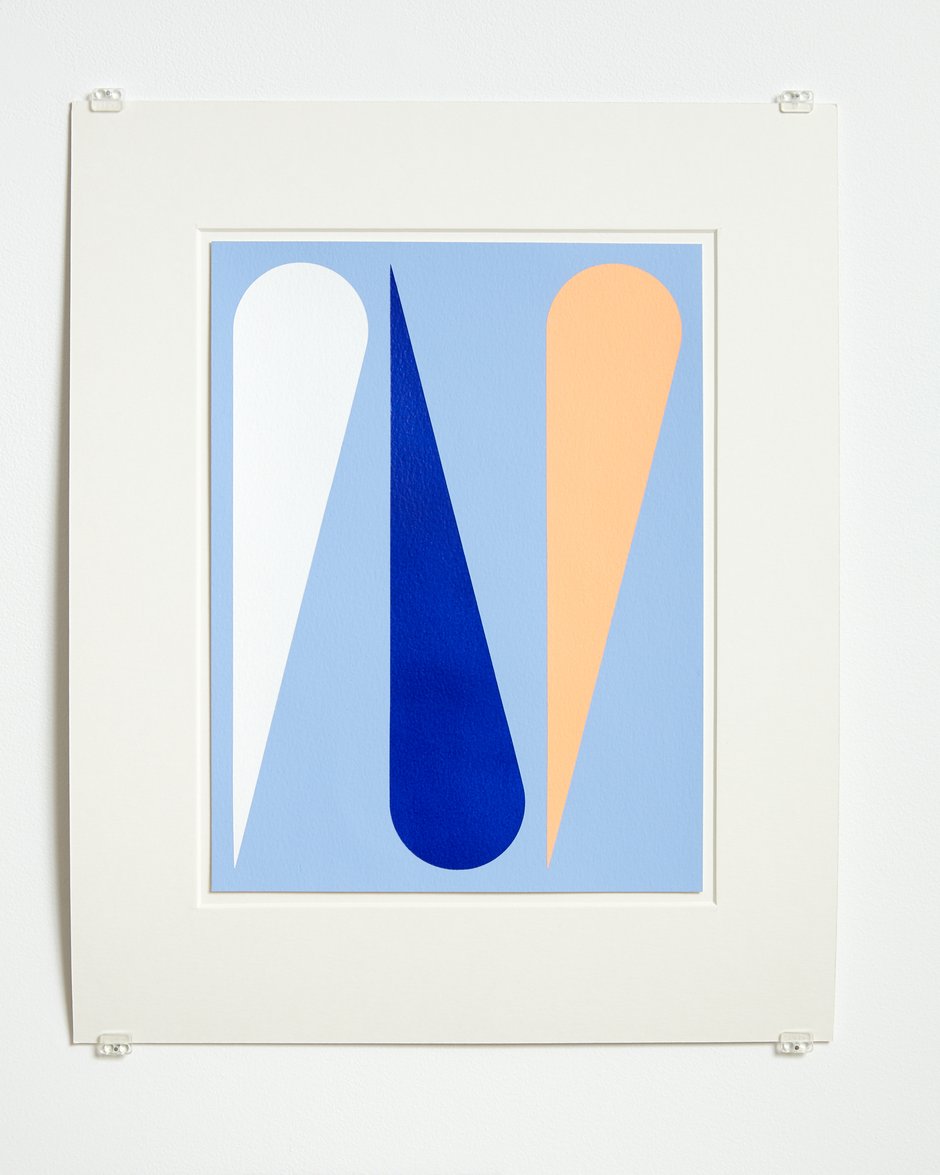
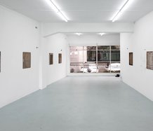
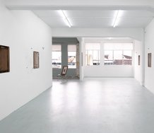
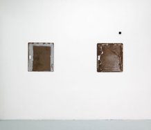
This new show of his—ten new works in the long upstairs Two Rooms gallery—doesn't excite me to the same degree, but they are nevertheless very interesting. They utilise a pinball flipper motif (it could also be a skinny pear, inverted cone, dunce hat, comet tail or tear drop), with the occasional banana box handle (a rectangle with curved sides). In fact the box handle shapes sliced diagonally becomes a flipper. These motifs he has been working with for some time.
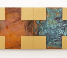
I’m very partial to Jan van der Ploeg’s canvas paintings, particularly his grid works with repetitive motifs, and the two hardcover books in the Auckland Public Library on his many painted murals in Europe and Australasia are fabulous: here the much larger motifs are more spread out, much less compacted. So in terms of canvas works—I’m super keen on the ones with diamond-shaped, acutely angled, spiky, flickering forms, that are related to similar works by artists like Richard Killeen and Kathy Barry. Like with the works of these painters, their piercing angular tactility affects me emotionally, as there is often a physiological viscerality that leads to a mental empathy when your eye ‘touches’ them.
This new show of his—ten works in the long upstairs Two Rooms gallery—doesn’t excite me to the same degree, but they are nevertheless very interesting. They utilise a pinball flipper motif (it could also be a skinny pear, inverted cone, dunce hat, comet tail or tear drop), with the occasional banana box handle (a rectangle with curved sides). In fact the box handle shapes sliced diagonally becomes a flipper. These motifs he has been working with for some time.
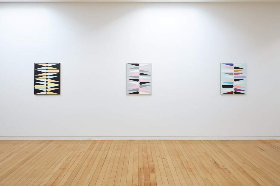
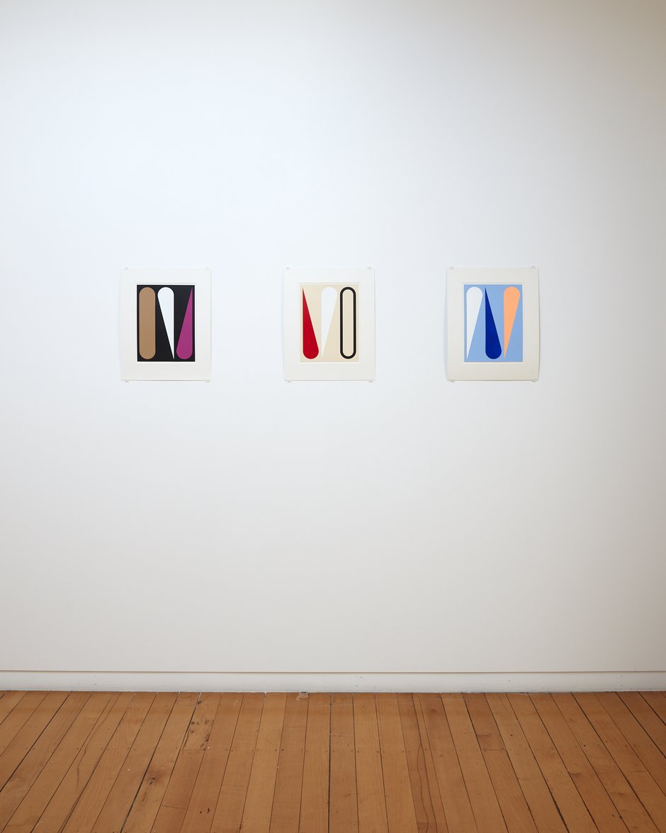
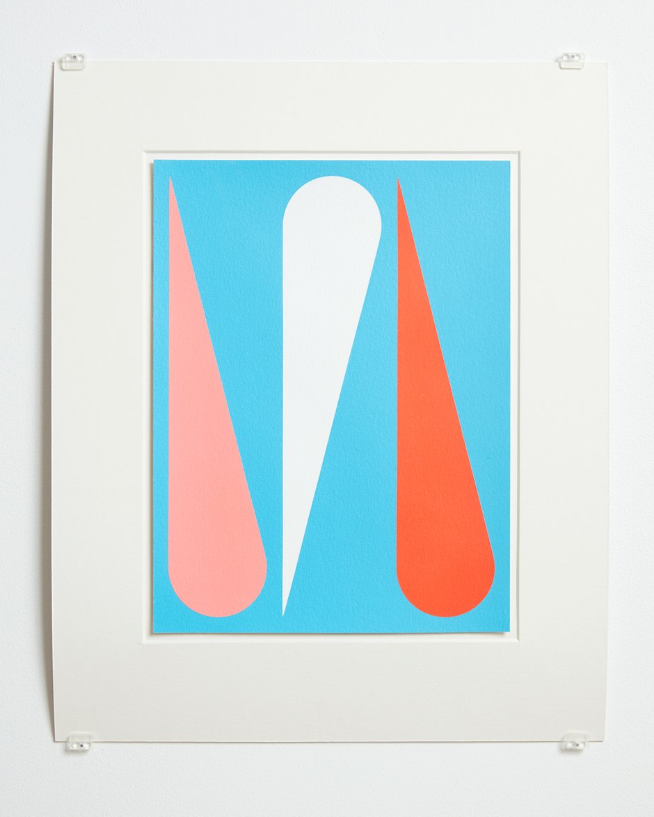
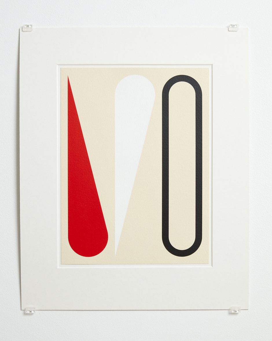
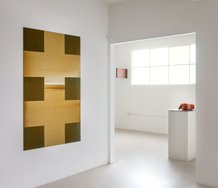
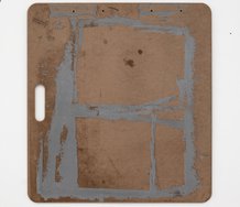
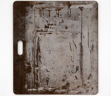
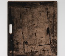
At Two Rooms there are four works on paper, each presenting three vertical motifs, and in the ten modestly-sized canvases, there are twenty motifs (each being one of the two types) positioned sideways, and running with ten each side of a vertical axis.
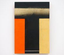
The wide curved bottoms of the flipper motifs are positioned in the vertical centre, while the twitching jabbing tips go very close to the outer sides. The two flipper permutations are aligned so that the long flipper edges are parallel to the top or bottom edges, swivelling from the curved base. Using this system and a variety of different palettes, van der Ploeg can create different spatial tensions around the stretcher edges and looking through, exploiting rhythms between the waving tips, and creating ‘musicalities’ via carefully spaced colour placements.
For my taste I prefer the works with less strident colour options, liking more the chromatically simpler items, with say just blue and white, and paler backgrounds rather than black or deep red. In those the pronounced depth of field behind I consider a distraction, enjoying instead a shallower plane with pale blue or pale grey. The advantage however of the two colour works is that they highlight the spinelike central column and the activating tremulous triangles invading from the side edges. They have a different emphasis.
Of course I have here emphasised the formal aspects, but using flipper, pear, cone, comet or tear drop shapes also invites interpretation if you are so inclined. Perhaps they are ‘about’ chance, play, fecundity, humiliation, astronomy or melancholy (if it is literal meaning you want), the shapes serving as symbolic drivers and leading into narratives about van der Ploeg’s states of mind or musings—beyond the musical Lyrics reference of his show title, or the calculated evasiveness of Untitled individual works.
John Hurrell
 Advertising in this column
 Two Rooms presents a program of residencies and projects
This Discussion has 0 comments.
Comment
Participate
Register to Participate.
Sign in
Sign in to an existing account.